Eloquent Images by Gary Hart
Insight, information, and inspiration for the inquisitive nature photographer
Digital Metering and Exposure

Spring Reflection, El Capitan and Three Brothers, Yosemite
Sony a7R II
Canon 11-24 f/4L with Metabones IV adapter @11mm
1/60 second
F/8
ISO 100
Exposure Basics
Cameras seem to be getting “smarter” every year. So smart, in fact, that for most scenes, duplicating a two-dimensional version of what your eyes see is a simple matter of pointing your camera and clicking the shutter button. That’s fine if all you care about is recording a memory, but not only is there more to photography than approximating “reality,” there are many creative reasons to override the camera’s choices.
For the creative control that elevates your images above the billions of clicks being cranked out every day, letting your camera make photography’s most important decisions ignores an undeniable truth…
Your camera is stupid
Sorry—mine is too. And while I can easily cite many examples, right now it’s just important to understand that your camera thinks the entire world is a middle tone (18% gray, which is basically midway between black and white). Regardless of what its meter “sees,” without intervention your camera will do everything in its power to make your picture a middle tone. Sunlit snowman at noon? Lump of coal at the bottom of your Christmas stocking? It doesn’t matter—if you let your camera decide the exposure, your subject will turn out gray.
Modern technology offers faux-intelligence to help overcome this limitation. Usually called something like “matrix” or “evaluative” metering, this solution compares your scene to a large but finite internal database of choices, returning a metering decision based on the closest match. This works pretty well for conventional “tourist” snaps, but often struggles in the warm or dramatic light artistic photographers prefer—and it knows nothing of creativity. If you want to capture more than documentary “I was here” pictures, you really do need to take full control of your camera’s metering and exposure. Fortunately, this isn’t nearly as difficult as most people fear (or as it once was).
Laying the exposure foundation
The amount of light captured for any given scene varies with the camera’s shutter speed, f-stop, and ISO settings. Photographers measure captured light in “stops,” much as a cook uses a cup (of sugar or flour or chocolate chips or whatever) to measure ingredients in a recipe. Adding or subtracting “stops” of light by increasing or decreasing the shutter speed, f-stop, or ISO makes an image brighter or darker.
The simple beauty of metering is that a stop of light is a stop of light is a stop of light—it’s always the same amount of light, whether you change it with the:
- Aperture: The opening light passes through when the shutter opens, measured in f-stops (though aperture and f-stop are almost always used interchangeably, aperture is the actual opening, while f-stop is the ratio of the focal length to the aperture size we use to measure the amount of light that reaches the sensor). Since f-stop is a ratio, the higher the number, the smaller the aperture. Doubling the f-stop number decreases the light by two stops; halving the f-stop number increases the light by two stops. To memorize f-stops in one-stop increments, I keep track of two overlapping f-stop series, one starting at f/1, the other at f/1.4. Doubling then interleaving the results returns one-stop f-stop increments: f/1, f/1.4, f/2, f/2.8, f/4, f/5.6, f/8, f/11, f/16/, f/22, and so on.
- Shutter speed: The time the shutter is open, allowing light to pass through the aperture to reach the sensor. Doubling the shutter speed (open less time) reduces the light by one stop; halving the shutter speed adds one stop.
- ISO: The sensitivity of the sensor (or film) to light. Doubling the ISO adds one stop of light; halving the ISO subtracts one stop.
But while an aperture stop adds/subtracts the same amount of light as a shutter speed or ISO stop, the resulting picture can still vary significantly.
Your aperture choice determines the picture’s depth of field (DOF), while your shutter speed choice determines whether motion in the frame is stopped or blurred. And while an ISO stop also adds/subtracts the same amount of light as shutter speed and aperture without affecting motion and depth, image quality decreases as the ISO increases. So getting the light right is only part of the exposure objective—you also need to consider how you want to handle any motion in the scene, how much DOF to capture, and the ISO that generates the least noise.
Let’s say you’re photographing autumn leaves in a light breeze. You get the exposure right, but the leaves are slightly blurred at 1/15 second. To freeze that blur, you change your shutter speed to 1/30 second, which also reduces the light reaching the sensor by one stop. To replace that lost light (keep the exposure the same), you could open your aperture by a stop (change the f-stop), double the ISO, or make a combination of fractional f-stop and ISO adjustments that total one stop. Each choice will render a different result, but that’s a creative decision your camera isn’t capable of.
Metering modes
Today’s cameras have the ability to measure, or “meter” the light in a scene before the shutter clicks. In fact, most cameras have many different ways of evaluating a scene’s light. Your camera’s metering mode determines the amount of the frame the meter “sees.” The larger the area your meter measures, the greater the potential for a wide range of tones. Since most scenes have a range of tones from dark shadows to bright highlights, the meter will take an average of the tones it finds in its metering zone.
Metering mode options range from “spot” metering a very small part of the scene, to “matrix” (also known as “evaluative”), which looks at the entire scene and actually tries to guess at what it sees. Each camera manufacturer offers a variety of modes and there’s little consensus on name and function (different function for the same name, same function for different names) among manufacturers, so it’s best to read your camera’s manual to familiarize yourself with its metering modes.
Since I want as much control as possible, I prefer spot metering because it’s the most precise. The spot meter covers the smallest area of the frame possible, an imaginary circle in the center 3% (or so, depending on the camera) of the viewfinder. (Some cameras optionally allow you to spot meter on the current focus point instead of the center of the frame.) When spot metering, I can target the part of the frame I deem most important and base my exposure decision on the light reading there.
Spot metering isn’t available in all cameras (this was more true with older models). In some cameras, the most precise (smallest metering area) metering mode available is “partial,” which covers a little more of the scene, somewhere around 10%.
Regardless of the size of the metering zone, the camera will take an average of what it finds. In some modes that average is evenly extracted from the entire zone, in other modes, the average is biased toward the middle: “center-weighted.”
Exposure modes
Don’t confuse the metering mode with the exposure mode. While the metering mode determines what the meter sees, the exposure mode determines the way the camera handles that information. Most mirrorless and DSLR (digital single lens reflex) cameras offer manual, aperture priority, shutter priority, plus a variety of program or automatic exposure modes. Serious landscape photographers usually forego the full automatic/program modes in favor of the manual (my preference) or aperture/shutter priority modes that offer more control.
If you select aperture or shutter priority mode, you specify the aperture (f-stop) or shutter speed, and the camera sets the shutter speed or f-stop that delivers a middle tone based on what the meter sees. But you’re not done. Unless you really do want the middle-tone result the camera desires (possible but far from certain), you then need to adjust the exposure compensation (usually identified by a +/- symbol) to specify the amount you want your subject to be above or below a middle tone.
For example, if you point your camera’s spot-meter at a bright, sunlit cloud, the camera will only give your picture enough light make the cloud a middle tone—but if you’ve only given your scene enough light to make a white cloud gray, it stands to reason that the rest of your picture will be too dark. To avoid this, you would adjust exposure compensation (the +/- symbol) to instruct your camera to make the cloud brighter than a middle tone by adding two stops of light (or however much light you want to give the cloud to make it whatever tone you think it should be).
Rather than aperture priority, I prefer manual mode because I want control: my camera should not be making decisions for me. And once it’s mastered (it really isn’t hard), I think manual metering is easier. But if you can successfully handle each exposure situation with aperture or shutter priority, you’ll be fine—just stay away from the full automatic modes.
Exposure without (and with) compromise
I always try to use my camera’s best ISO, and the aperture that gives me the sharpest frame. Not just the desired DOF, but also the least diffraction (diffraction is a loss of detail caused when light passes through a small opening and spreads slightly—the smaller the opening, the greater the diffraction softening). But sometimes exposure-setting compromise is the only way to achieve the desired results.
For example, when DOF isn’t a consideration, I keep my f-stop in the f/8-f/11 range because it provides a reasonable amount of DOF, and that’s where lenses tend to be sharpest (least distortion), and diffraction is less of a concern (than it is at smaller apertures). But when I need a specific DOF, or want to capture a sunstar (small aperture), I have no problem compromising my f-stop setting to get there.
And I only compromise my ISO when there’s no other way to achieve a certain motion effect. So while ISO 100 is ideal (for my Sony a7RIV and the majority of other cameras), when the wind blows or I want to freeze moving water, I’ll increase my ISO to achieve the motion and DOF combination I need. And if I want a little more motion blur, I have no problem dropping down to ISO 50 to a allow a longer shutter speed.
The simplest way to minimize the need to compromise image quality is to use a tripod. A tripod removes camera shake from the exposure equation, meaning the only time shutter speed matters is when there’s motion in the scene. And when shutter speed doesn’t matter, you can always use the perfect ISO and aperture by going with whatever shutter speed you need, regardless of its length.
Some scenes are all about compromise, even with a tripod. For example, I’d love to photograph the Milky Way at ISO 100, f/8, 1/100 second, but that would give me a black frame. Since star motion increases with shutter speed, I push the ISO as far as I can without getting unfixable noise, open the aperture as wide as I can without obvious distortion—and I still have to live with a shutter speed that gives me a little star motion. All of these exposure choices are compromises that render less than perfect results, but without them, I’d have no Milky Way image at all.
The old fashioned way to meter
Armed with all this exposure understanding, it’s time to think about the best way to read and capture the light in a scene. For most of my photography life, in manual mode I’d set my camera to its native ISO (or to the ISO/ASA of the film I had loaded), determine my aperture (based on the DOF I want and/or the sharpest f-stop for my lens), point my camera’s spot-meter zone at the area on brightest part of the scene, and dial my shutter speed until it indicated the spot-meter zone is the tone I want. (I chose the brightest part of the scene because I know if I don’t blow it out, nothing in my frame will be lost.)
During my film days, and in my early digital life, that approach served me well. In fact, I think every serious photographer should understand metering well enough to do it this way. But….
With digital photography comes the histogram, which used to feel like cheating, but now has completely changed the way I meter.
Digital Metering
In the film days, we didn’t know if the exposure was right until the pictures were processed. To insure against missing the exposure, we’d bracket exposures by (usually) one stop on either side of what we believed to be the correct exposure. Today, thanks to the histogram, exposure bracketing is rarely necessary.
Histogram explained
The histogram is a graph of the tones in an image, from absolute black to absolute white. Instead of clicking and hoping as we did in the film days, the addition of a histogram on every digital camera (that’s not a smartphone) provides photographers instant feedback on each image’s exposure. Better still, live-view histograms in mirrorless viewfinders, or on DLSR and mirrorless LCD screens, provide that essential exposure feedback before we click the shutter.
While any graph has the potential to evoke flashbacks of high school science trauma, a histogram is really quite simple—simple enough to be read and interpreted in the blink of an eye. And not only is your histogram easy to read, it really is your most reliable source of exposure feedback.
Luminosity histogram
The basic, monochrome histogram that pops up for most images is the luminosity histogram. It measures 256 colorless tones in a scene. The 0 point on the histogram’s far left is absolute black; the 255 point on the far right is absolute white. Starting with black on the left and moving right along the histogram’s horizontal axis, each point (0 to 255) represents the next tone brighter.
When an image is captured on a digital sensor, your camera’s “brain” samples each photosite (the megapixel number used to measure sensor resolution is the sum of the sensor’s individual photosites, or pixels), determining a brightness value. Between the absolute black 0 on the far left and the absolute white 255 on the far right, every brightness value from 1 to 254 is a shade of gray—the higher a photosite’s number, the brighter its tone.
Armed with the brightness values for each photosite in the image, the camera starts building the image’s histogram. Think of the horizontal axis of the histogram as 256 discrete columns, one for each possible brightness value (0-255), with the 0/black column on the far left, and the 255/white column on the far right (they don’t display as individual columns because they’re crammed so close together).
Despite millions of photosites to sample, your camera builds a new histogram for each image virtually instantaneously, stacking each photosite’s brightness value onto its corresponding column on the histogram, like stacking poker chips—the more photosites of a particular brightness value, the higher its corresponding column will spike.
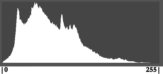
Simple Histogram: Shadows are on the left and highlights are on the right, with the far left (0) absolute black, and the far right (255) absolute white. This histogram shows an exposure with lots of shadows and relatively few highlights.
RGB histogram
While luminosity histogram most of us are familiar with is the luminosity histogram. But each photosite on a conventional sensor actually measures the tone of one of three colors: red, green, and blue (RGB). The RGB histogram uses the same pixel sampling process to separate the luminosity histogram into three separate, more granular, graphs, one for the brightness each color from 0 to 255.
The luminosity histogram shows the detail you captured, but it doesn’t tell you whether you captured all the color. In fact, the luminosity histogram could look fine even when two of the three RGB channels are clipped (cut off, indicating color is lost). So in high dynamic range scene (extreme highlights and shadows), or scenes with an extreme amount of one color (such a brilliant sunset or a backlit poppy), checking the RGB histogram to ensure that none of the image’s color channels are clipped is especially important. The solution for a clipped RGB channel is to reduce the exposure.
How to read a histogram

Evenly distributed histogram

Intentionally bright histogram

Intentionally dark histogram
There’s no such thing as a “perfect” histogram shape. Rather, the histogram’s shape is determined by the distribution of light in the scene, while its left/right distribution (whether the graph is skewed to the left or right) is a function of the amount of exposure you’ve chosen to give your image. The histogram graph’s height is irrelevant—information that appears cut off at the top of the histogram just means the graph isn’t tall enough to display all the photosites possessing that tone (or range of tones) and no adjustment of your image is necessary.
When checking an image’s histogram for exposure, your primary concern should be to ensure that the none of the tone data is cut off on the left (lost shadows) or right (lost highlights). If your histogram appears cut-off on the left side, shadow detail is so dark that it registers as black. Conversely, if your histogram appears cut off on the right side, highlight detail is so bright that it registers as white.
Learn to trust your histogram
Basing the image’s exposure on the way the picture looks on the LCD is the single biggest exposure mistake I see photographers make. The post-capture review image that displays on your camera’s LCD is great for checking composition, but the range of tones you can see in your review image varies with many factors, such as the review screen’s brightness setting, the amount of ambient light striking the LCD, or how your camera processes the jpeg file it creates for the preview (even if you shoot raw only, a small jpeg is created to display on the LCD). Even more important, because there’s more information captured than the LCD preview can show, even in the best conditions, you’ll never know how much recoverable data exists in the extreme shadows and highlights by relying on the LCD preview.
It’s human nature to try to expose a scene so the picture on the LCD looks good, but an extreme dynamic range image that looks good on the LCD will likely have unusable highlights or shadows. As counterintuitive as it feels, exposing a high dynamic range scene enough to reveal detail in the darkest shadows brightens the entire scene (not just the shadows), likely pushing the image’s highlights to unrecoverable levels. And making an image dark enough on the LCD to salvage bright highlights darkens the entire scene, all but ensuring that the darkest shadows will be too black.
In fact, a properly exposed image (good histogram) of a scene with both bright highlights and dark shadows (high dynamic range), such as a sunrise or sunset, will usually look awful on the LCD (nearly black shadows and white highlights) because there’s information there you can’t see (yet). The histogram provides the only reliable representation of the tones you captured (or, in your live-view LCD display or mirrorless electronic viewfinder, of the tones you’re about to capture).
Live-View Metering
Starting with the live-view screen, and now in mirrorless viewfinders, we can view our histogram before clicking the shutter. So instead of guessing the exposure settings that return the tones we want, we have an actual pre-capture picture of the tones to monitor and adjust. This has greatly simplified my exposure process, and makes manual metering easy for even the most inexperienced photographers.
It really is this simple
Using the pre-capture histogram—almost always in my Sony mirrorless viewfinder, but the histogram on a mirrorless or DSLR LCD screen will work too—I start the exposure process as I always have. In manual exposure mode, I default to my camera’s best ISO (100 for my own and in fact most, but definitely not all, cameras—so check your camera’s native ISO), and the best f-stop for my composition. I don’t touch these settings unless motion in my scene, such as wind or star movement, forces an ISO and/or f-stop compromise. With ISO and f-stop set, I watch my histogram as I slowly adjust my shutter speed until the histogram looks right. Click.
Spare the highlights
In a low or moderate contrast scene, I’ll have a little room on both sides of the histogram (the graph doesn’t bump up against either side)—a very easy scene to expose. But in a high dynamic range scene, the difference between the darkest shadows and brightest highlights might stretch beyond one or both sides of the histogram. When a high dynamic range scene forces me to choose between saving the highlights or the shadows, I almost always bias my exposure choice toward sparing the highlights, carefully dialing the shutter speed until the histogram bumps against the right side.
I think the highlights are more important for a couple of reasons: First, extreme shadows are usually easy to recover than extreme highlights; second, highlights are almost always more important than shadows. That’s because the human eye is reflexively drawn to the brightest areas of the frame, so try to avoid anything important in the shadows of a high dynamic range scene.
The post-capture histogram is usually more reliable than the pre-capture histogram. Usually this doesn’t matter, but in a high dynamic range scene, or any time I push my histogram close to the right side, I verify my exposure by checking the post-capture histogram. Another situation that can sometimes fool the pre-capture histogram is blurred (long exposure) whitewater.
The zebras
Most mirrorless cameras, and many newer DSLRs, offer “zebra” highlight warnings in their pre-capture view. The first time I meter a scene, my camera’s current exposure settings (based on my previous scene) might be far from what the new scene requires. When that’s the case, I push my shutter speed fast until the zebras appear (if my prior exposure was too dark) or disappear (if my prior exposure was too bright), then refine the exposure more slowly while watching the histogram. While these alerts aren’t nearly as reliable as the histogram and should never be relied on for final exposure decisions, I use their appearance as a signal that it’s time to monitor my histogram.
Exposing to the right
“Expose to the right” (ETR) is popular digital exposure technique that attempts to increase the exposure until the histogram is as far to the right as possible without clipping. I’m going to go into great detail about ETR except to say that is a valid approach the does indeed ensure the cleanest image data. Without getting too deep into the technical weeds, it is true that on a digital sensor there is in fact more information captured on the right side of the histogram.
I don’t usually teach ETR to beginners because the margin for error is much smaller on the right side of the histogram, failure (blown highlights) will ruin an image, and I probably won’t be with them long enough for them to master the technique. My advice to anyone trying to employ ETR in their photography is to know your camera well enough to know how far to the right you can push its histogram before the highlights aren’t recoverable. And when exposing to the right, you must-must-must rely on the RGB histogram, regardless of what the luminosity histogram says, to ensure that you haven’t clipped one of the color channels.
All that said, even if you’re not employing the ETR technique, when you see your histogram bunched to the left with a large empty gap on the right, you should increase your exposure until the histogram looks more centered, or even a little skewed to the right.
A picture is worth a thousand words
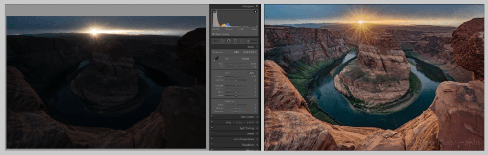
This is two versions of one frame captured at Horseshoe Bend near Page, Arizona. On the left is the way the scene looked at capture; on the right is the way it looked in Lightroom after decreasing Highlights and increasing Shadows and Exposure (before any other processing).
Trusting a histogram over a picture you can actually see requires a leap of faith. I can explain the concept until I’m blue in the face, but the point doesn’t usually hit home without a demonstration. For example, the two versions of Horseshoe Bend with a sunstar are from the same file—on the left is the way the picture looked when I captured it, along with its histogram; on the right is the same picture with just a few minutes of very basic processing in Lightroom (no plugins, blending, or any other elaborate processing).
If I’d have exposed this scene bright enough for the shadows to look good on my LCD (more like my eyes saw them), the highlights would have been hopelessly overexposed (white); if I’d have darkened my highlights enough to look good on my LCD, the shadows would have darkened to an unrecoverable black. I knew my best chance for capturing this high dynamic range scene with a single click was to ignore the LCD and trust the histogram.
Despite an image that didn’t look good at all on my LCD, the histogram on my Sony a7R II showed me that I’d captured virtually all of the scene’s shadows and most of its highlights. And because I captured this image in raw mode, I was confident that I had even more shadow and highlight information than my histogram indicated, a fact instantly confirmed with a rightward tug of Lightroom’s Shadows slider. With minimal processing effort, I was able to achieve final result you see here. (This is why landscape photographers are always begging for cameras with more dynamic range, and also why I use the Sony a7RIV.)
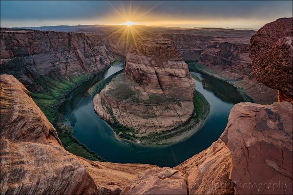
Sunstar, Horseshoe Bend, Arizona
Know your camera
Photographers who shoot raw make exposure decisions with the understanding that the capture exposure is simply the start, and the final exposure is determined by the processing. But the more photons you capture, the greater your latitude for adjustment later.
Trusting the histogram is a great start, but every camera model interprets and displays its exposure information differently. Added to that, the histogram is based on the jpeg the camera displays, so raw shooters always have more image information than their histogram shows—it’s important to know how much more.
With my Sony a7R(x) bodies, I know I’m pretty safe pushing my histogram at least a full stop beyond the left or right (shadows and highlights) histogram boundary. This knowledge enables me to get the most out of even the most challenging high dynamic range scenes.
Practice makes perfect
Like most things in photography, the more you do it, the easier it becomes. For many people reading this, my approach is nothing revolutionary. But if it’s all new to you, or if you feel a little rusty, I suggest that you go out and try it in a low stress situation. Keep working on it whenever you find yourself in a situation where getting the shot doesn’t feel life or death.
When you do get into one of those “Oh my God, look at that!” moments, go back to whatever feels most comfortable to you. I think you’ll find that it won’t take too much practice before the right way is also the most comfortable way.
A Tricky Exposure Collection


, Yosemite")


