Eloquent Images by Gary Hart
Insight, information, and inspiration for the inquisitive nature photographer
Playing With Depth
Posted on September 27, 2020
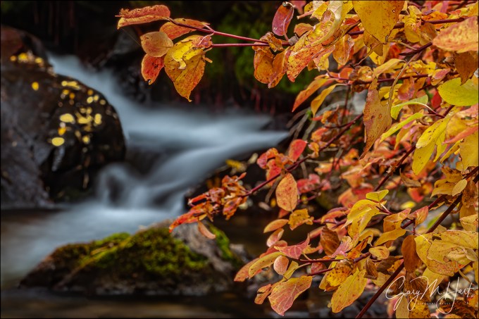
Creekside Color, Mill Creek, Eastern Sierra
Canon EOS-1Ds Mark II
Canon 70-200 f/4 L
4 seconds
F/32
ISO 200
Photography is the futile attempt to squeeze a three-dimensional world into a two-dimensional medium. But just because it’s impossible to truly capture depth in a photograph, don’t think you shouldn’t consider the missing dimension when crafting an image. For the photographer with total control over his or her camera’s exposure variables (which exposure variable to change and when to change it), this missing dimension provides an opportunity to reveal the world in unique ways, or to create an illusion of depth that recreates much of the thrill of being there.
The Illusion of Depth
Sometimes a scene holds so much near-to-far beauty that we want to capture every inch of it. While we can’t actually capture the depth our stereo vision enjoys, we can take steps to create the illusion of depth. Achieving this is largely about mindset—it’s about not simply settling for a primary subject no matter how striking it is. When you find a distant subject to feature in an image, scan the scene and position yourself to include a complementary fore-/middle-ground subjects. Likewise, when you want to feature a nearby object in an image, position yourself to include a complementary back-/middle-ground subjects.
Creative Selective Focus
Most photographers go to great lengths to achieve full front-to-back sharpness, an art in itself. But sometimes I like to solve the missing depth conundrum with what I call creative selective focus: An intentionally narrow depth of field with a carefully chosen focus point to flatten a scene’s myriad out-of-focus planes onto the same thin plane as the sharp subject. This technique can soften distractions into a blur of color and shape, or simply guide the viewer’s eye to the primary subject and soften the background to complementary context.
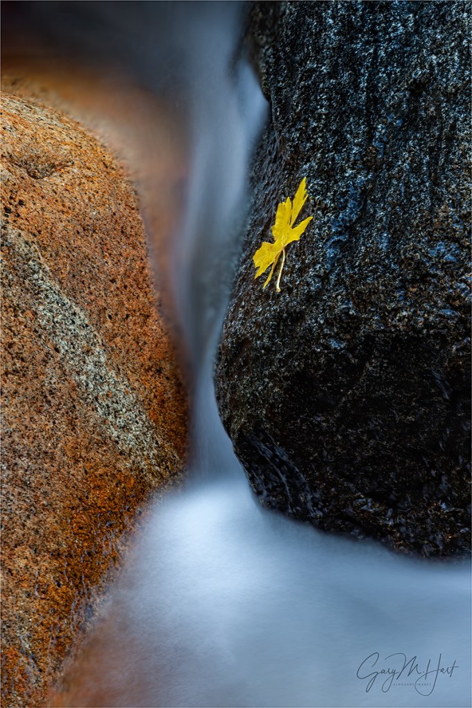
When I use creative selective focus to autumn leaves or spring flowers, I usually take the extreme background blur color and shape approach. In the images below, the soft background serves as a canvas for the primary subject.
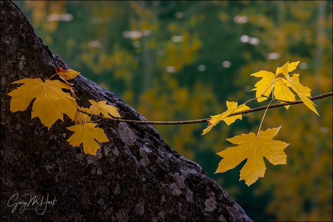
But sometimes I like my soft background to have enough resolution to be more recognizable. When I take this approach, my goal is to signal the part of the scene I want to emphasize by making it sharp, and to use the soft but still recognizable background for context that tells the view something about the location.
A few years ago I wrote an article on this very topic for “Outdoor Photographer” magazine. You can read a slightly updated version of this article in my Photo Tips section: Selective Focus.
About this image: Creekside Color, Mill Creek, Eastern Sierra
With dense aspen groves, reflective beaver ponds, towering peaks, and even a waterfall, Lundy Canyon just north and west of Mono Lake, has long been one of my favorite fall color locations.
I spent this overcast autumn morning wandering the banks of Mills Creek. The thick growth here often makes this easier said than done, but the rewards of battling my way through trees and shrubs usually makes it worth the scrapes and scratches I always seem to go home with.
Even though it was less than 30 feet from the road, I heard this cascade long before I saw it. Once I got my eyes on it, I had to battle further to get a clear view. I especially liked the red leaves, a relative rarity in California, and wanted to feature them. Here I positioned myself so the leaves framed the creek, and turned my polarizer to reduce the leaves’ glossy sheen.
I used a range of f-stops for a variety of background sharpness options. This one used f/32 (maybe my all-time record for smallest aperture), which gave me enough DOF for to make the creek easily recognizable, but also resulted in a 4-second exposure. (Clearly wind was not a factor this morning.)
Here’s my Photo Tips article on using hyperfocal focus techniques to enhance your images’ illusion of depth: Depth of Field.
Playing With Depth


(Really) Big Moon
Posted on September 20, 2020

Lunar Arrival, El Capitan and Clouds Rest, Yosemite
Sony a7RIV
Sony 200-600 G (APS-C crop)
Sony 2x teleconverter
1800mm focal length equivalent
ISO 200
f/13
1/20 second
This is an updated version of the “Big Moon” article from my Photo Tips section,
plus the story of this image (below)
Nothing draws the eye quite like a large moon, bright and bold, above a striking foreground. But something happens when you try to photograph the moon—somehow, a moon that looks to the eye like you could reach out and pluck it from the sky shrinks to a small white speck in a photo. While a delicate accent of moon is great when properly framed above a nice landscape, most photographers like their moons BIG.
Some photographers resort to cheating, plopping a telephoto moon into a wide angle landscape. But armed with basic knowledge bolstered by a little planning, capturing a large moon isn’t hard.
Focal length
Every time there’s a “supermoon,” we’re bombarded with news stories implying that the moon will suddenly double or triple in size, followed by faked images intended to confirm the impossible. But crescent or full, super or not, the moon’s size in an image is almost entirely a function of the focal length the photographer used—photograph it at 16mm and the moon registers as a tiny dot; photograph it at 600mm and your moon dominates the frame.
But a landscape image with a large moon requires more than just a long focal length. If big was all that mattered, you could attach your camera to a telescope, point skyward, and capture a huge moon (not that there’s anything wrong with that). But without a landscape to go with your huge moon, no one would know whether you took the picture on a mountainside in Yosemite, atop a glacier in New Zealand, or beside the garbage cans in your driveway.
Equipment
“Big moon” is a subjective label, but I don’t usually use it unless my focal length was 200mm or longer. And while a 200mm lens is okay for the moon, for me the moon doesn’t really start to jump out of the frame until I approach 400mm.
Prime zooms are super sharp and fast, but for my moon photography I prefer a telephoto zoom for focal length flexibility that enables me to adjust my composition to include or exclude foreground elements. As a Sony Alpha shooter, my default big moon lens that’s almost always in my bag is my Sony 100-400 GM. The Sony 200-600 is sometimes too long, and it’s too big to live in my bag fulltime, but when I know I’ll be photographing the moon rising (or setting) above a location that’s several miles from my foreground subjects, I’ll replace the 100-400 in my bag with the 200-600. And when I want to go nuclear on the moon with either lens, I add the Sony 2X Teleconverter.
Not a Sony shooter? No problem, all the major camera manufacturers offer similar options.
The camera you use makes a difference too. The more resolution you have, the more you can crop (increase the size of the moon) without noticeable quality loss. And since an APS-C sensor has a 50% (-ish) crop built in, until I got my Sony a7RIV, I’d often use my APS-C Sony a6300 to maximize the size of the moon in my images. But now that I have the full frame Sony a7RIV, with 61 megapixels I actually have more resolution in APS-C mode than I had with my a6300.
My own rule for full moon photography is that I must capture both lunar and landscape detail. But a full moon rises at sunset and sets at sunrise, and a crescent moon is only visible shortly before sunrise or after sunset. So your camera’s dynamic range a very important consideration. The darker the sky, the better the moon looks, but the darker the sky, the darker the foreground too. For me it’s time to go home when the foreground becomes so dark that making it bright enough to capture usable detail means blowing out the moon. So the more dynamic range I have, the darker the sky can be. While I don’t know of a camera with as much dynamic range as my a7RIV, all of today’s cameras have pretty decent dynamic range.
And finally, given the extreme focal lengths you’ll be dealing with, don’t even think about trying to shoot a big moon without a sturdy tripod.
Distance yourself
Often the most difficult part of including a large moon with a specific landscape subject is finding a vantage point far enough back to fit the subject and the moon. But the farther back from your foreground subject you can position yourself, the longer the focal length you can use, and the bigger the moon will be.
For example, I love photographing a big moon rising behind Half Dome in Yosemite. But at Yosemite’s popular east-side locations, even 200mm is too close to get the moon and all of Half Dome in my frame. And while Yosemite’s most distant east-facing Half Dome vistas are up to 10 miles away, Half Dome is large so that even at that distance the longest focal length that will include the moon and all of Half Dome isn’t much more than 400mm.
A little easier for me is including a big moon with smaller foreground objects like a prominent tree. Near my home in Northern California are rolling hills topped by solitary oaks that make perfect moon foregrounds when I can shoot up so they’re against the sky. And since these trees are much smaller than Half Dome, even vantage points that are less than a mile away are doable.
Location, location, location
As your focal length increases, your compositional margin for error shrinks. You can’t expect to go out on the evening of a full or crescent moon, look to the horizon, and automatically put the moon in the frame with your planned foreground subject.
Even when the moon and your foreground do align, once the moon appears, you’ll only have a few minutes before it rises out of your telephoto frame. This means extreme telephoto images that include both the moon and a foreground subject are only possible when the moon is right on the horizon, making proper timing essential.
Like the sun, the moon traces a different path across the sky each day. This path changes with each lunar cycle (from full, to new, back to full)—whether the moon is full or crescent, a location that perfectly aligns the moon and foreground one month, will probably be nowhere close the next.
Coordinating all the moving parts (moon phase and position, foreground subject alignment, subject distance, and rise/set timing) requires some planning and plotting. When I started photographing the moon, in the days before smart phones and apps that do the heavy lifting, I had to refer to tables to get the moon’s phase and position in the sky, manually plot the alignment, then apply the Pythagorean theorem to figure the timing of the moon’s arrival above (or disappearance behind) the terrain.
Today there are countless apps that will do this for you. Apps like The Photographer’s Ephemeris and Photo Pills (to name just two of many) are fantastic tools that give photographers access to moonrise/set data for any location on Earth. There is a bit of a learning curve (so don’t wait until the last minute to plan your shoot), but they’re infinitely easier than the old fashioned way.
Depth of field
With subjects so far away, it’s easy to forget about depth of field. But extreme focal lengths mean extremely limited depth of field. Depth of field isn’t a concern when Half Dome is your closest subject and it’s ten miles distant, but when your foreground is an oak tree on a hill that’s a mile away, you absolutely need to consider the hyperfocal distance.
For example, at 800mm and f/11 (with a full frame sensor), the hyperfocal distance is about a mile-and-a-quarter (look it up)—focus on the tree and the moon will be soft; focus on the moon and the tree is soft. But if you can focus on something that’s a little beyond the tree, at maybe one-and-a-half miles away, the image will be sharp from front to back.
When I’m not sure of my subject distance, I estimate as best I can, focus on a point beyond my foreground subject, then review my image magnified to check sharpness. If my focus point is in my frame, great, but I won’t hesitate to remove my camera from the tripod to focus on something in another direction that’s the right distance (if you do this, to prevent refocusing, be sure you use back-button focus or are in manual focus mode when you click your shutter). It’s always best to get the focus sorted out before the moon arrives, a good reason to arrive at a new location well in advance of the moon’s arrival.
Plan ahead
When the moon is a small accent to a wide scene, it’s often enough to just show up on its full or crescent day and shoot it somewhere above your subject. But because the margin of error is so small, planning for a big moon image is best done months in advance.
I identify big-moon candidate locations near home and on the road, and am always on the lookout for more. My criteria are a prominent subject that stands out against the sky, with a distant east or west facing vantage point. Over the years I’ve assembled a mental database ranging from hilltop trees near home, to landscape icons like Half Dome, Mt. Whitney, and Zabriskie Point (Death Valley).
With my subjects identified, I do my plotting (I still do it the old fashioned way) and mark my calendar for the day I want to be there. That often means waiting close to a year for the alignment I want. And if the weather or schedule doesn’t cooperate, my wait can be longer than that.
About this image
On the penultimate evening of last February’s Yosemite Winter Moon photo workshop, I assembled my Yosemite Winter Moon photo workshop group on the granite above Tunnel View to wait for the moonrise we’d been thinking about all workshop. Sunset was 5:30, and I expected the moon to appear behind Cloud’s Rest between a little before 5:35, which meant the sky and landscape would already be starting to darken. The exposure for a post-sunset full moon is trickier than many people realize because capturing detail in both the daylight-bright moon and the rapidly fading landscape requires vigilant scrutiny of the camera’s histogram and highlight alert (blinking highlights). To get everyone up to speed, I used nearly full rising moons on the workshop’s first two nights to teach them to trust their camera’s exposure aids and ignore the image on the LCD (kind of like flying a plane on instruments). With two moonrises under their belts, by this evening I was confident everyone was ready.
I was ready too. In my never-ending quest to photograph the moon as large as possible, I went all-in—none of that wimpy-ass 200mm glass for me, for this moonrise I used every resource in my bag. I set up two tripods: mounted on one was my Sony a7RIII and 100-400 GM lens; on the other tripod was my Sony a7RIV and 200-600, doubled by the 2X teleconverter: 1200mm. But I wasn’t done. Normally I shoot full frame and crop later (for more compositional flexibility), but just for fun, on this night I decided to put my camera in APS-C mode so I could compose the scene at a truly ridiculous 1800mm—I just couldn’t resist seeing what 1800mm looked like in my viewfinder.
While waiting for the moon the group enjoyed experimenting with different compositions using the warm sunset light illuminating Half Dome and El Capitan. I used the time to test the focus at this unprecedented focal length. Waiting for an event like this with a group is one of my favorite things about photo workshops, and this evening was no exception. Between questions and clicks, we traded stories, laughed, and just enjoyed the spectacular view.
The brilliant sliver of the moon’s leading edge peaked above Cloud’s Rest at 5:33. It is truly startling to realize how quickly the moon moves through the frame at 1800mm, so everything after that was kind of a blur. Adjusting compositions and tweaking exposure and focus on two bodies, I felt like the percussionist in a jazz band, but I somehow managed to track the moon well enough to keep it framed in both cameras.
Though I just processed this image yesterday, it’s the earlier of the two big moon images I’ve processed from that shoot. Which one do you like best?
Big Moon


")


Fall Color Photography Tips
Posted on September 13, 2020
Autumn Yin and Yang, Bridalveil Creek, Yosemite
Canon EOS-1Ds Mark II
Canon 70-200 f/4 L
10 seconds
F/13
ISO 100
This is the second of my two-part fall color series
Read part one: The Why, How, and When of Fall Color
Vivid color and crisp reflections make autumn my favorite season for creative photography. While most landscape scenes require showing up at the right time and hoping for the sun and clouds to cooperate, photographing fall color can be as simple as circling your subject until the light’s right. For photographers armed with an understanding of light and visual relationships, and the ability to control exposure, depth, and motion with their camera’s exposure variables, fall color possibilities are virtually unlimited.
Backlight, backlight, backlight
The difference between the front-lit and backlit sides of fall foliage is the difference between dull and vivid color. Glare and reflection make the side of a leaf facing its light source, whether that leaf is in direct sunlight or simply faces an overcast sky, appears flat. But the other side of the same leaf, the side that’s opposite the light from the sun or sky, glows with color.
In the image below (Autumn Reflection, Merced River, Yosemite), my camera has captured the sky-facing side of most of the leaves. But I’ve captured the underside of the leaves on the top-right of the branch—even though it’s an overcast day, can you see how these backlit leaves glow compared to the others?
Autumn Reflection, Merced River, Yosemite
The moral of this story? If you ever find yourself disappointed that the fall color seems washed out, check the other side of the tree.
Isolate elements for a more intimate fall color image
Big fall color scenes are great, but isolating your subject with a telephoto, and/or by moving closer, enables you to highlight and emphasize specific elements and relationships.
- Train your eye to find leaves, groups of leaves, or branches that stand alone from the rest of the tree or scene, or that stand out against a contrasting background.
- Zoom close, using the edges of the frame to eliminate distractions and frame subjects.
- Don’t concentrate so much on your primary subject that you miss complementary background or foreground elements that can balance the frame and provide an appealing canvas for your primary subject.
Selective depth of field is a great way to emphasize/deemphasize elements in a scene
Limiting depth of field by composing close with a large aperture and/or telephoto lens can soften a potentially distracting background into a complementary canvas of color and shape. Parallel tree trunks, other colorful leaves, and reflective water make particularly effective soft background subjects. For an extremely soft background, reduce your depth of field further by adding an extension tube to focus even closer.
Underexpose sunlit leaves to maximize color
Contrary to what many believe, fall foliage in bright sunlight is still photographable if you isolate backlit leaves against a darker background and slightly underexpose them. The key here is making sure the foliage is the brightest thing in the frame, and to avoid including bright sky in the frame. Photographing sunlit leaves, especially with a large aperture to limit DOF, has the added advantage of an extremely fast shutter speed that will freeze wind-blown foliage.
Slightly underexposing brightly lit leaves not only emphasizes their color, it turns everything that’s in shade to a dark background. And if your depth of field is narrow enough, points of light sneaking between the leaves and branches to reach your camera will blur to glowing jewels.


A sunstar is a great way to liven up an image in extreme light
If you’re going to be shooting backlit leaves, you’ll often find yourself fighting the sun. Rather than trying to overcome it, turn the sun into an ally by hiding it behind a tree. A small aperture (f16 or smaller is my general rule) with a small sliver of the sun’s disk visible creates a brilliant sunstar that becomes the focal-point of your scene. Unlike photographing a sunstar on the horizon, hiding the sun behind a terrestrial object like a tree or rock enables you to move with the sun.
When you get a composition you like, try several frames, varying the amount of sun visible in each. The smaller the sliver of sun, the more delicate the sunstar; the more sun you include, the more bold the sunstar. You’ll also find that different lenses render sunstars differently, so experiment to see which lenses and apertures work best for you.


Motion blur
When photographing in overcast or shade, it’s virtually impossible to freeze the motion of rapid water at any kind of reasonable ISO. Rather than fight it, use this opportunity to add silky water to your fall color scenes. There’s no magic shutter speed for blurring water—in addition to the shutter speed, the amount of blur will depend on the speed of the water, your distance from the water, your focal length, and your angle of view relative to the water’s motion.
All blurs aren’t created equal. When you find a composition you like, don’t stop with one click. Experiment with different shutter speeds by varying the ISO (or aperture as long as you don’t compromise the desired depth of field).
Reflections make fantastic complements to any fall color scene
By autumn, rivers and streams that rushed over rocks in spring and summer, meander at a leisurely, reflective pace. Adding a reflection to your autumn scene can double the color, and also add a sense of tranquility. The recipe for a reflection is still water, sunlit reflection subjects, and shaded reflective surface.
When photographing leaves floating atop a reflection, it’s important to know that the focus point for the reflection is the focus point of the reflective subject, not the reflective surface. This is seems counterintuitive, but try it yourself—focus on the leaves with a wide aperture and watch the reflection go soft; then focus on the reflection and watch the leaves go soft.
A wide focal length often provides sharpness from the nearby leaves to the infinite reflection, but sometimes achieving sharpness in your floating leaves and the reflection requires careful hyperfocal focus. And sometimes the necessary depth of field exceeds the camera’s ability to capture it—in this case, I almost always bias my focus toward the leaves and let the reflection go a little soft.
Don’t forget the polarizer
I can’t imagine photographing fall color without a polarizer. Fall foliage has a reflective sheen that dulls its natural color, so a properly oriented polarizer can erase that sheen and bring the underlying natural color into prominence. Not are reflections on the foliage a problem, reflections on nearby water and rocks can pull the eye and distract from your primary subject.
To minimize the scene’s reflection, slowly turn the polarizer until the scene is darkest (the more you try this, the easier it will be to see). If you have a hard time seeing the difference, concentrate your gaze on a single leaf, rock, or wet surface.

Fallen Color, Rock Creek Canyon, Eastern Sierra
A polarizer isn’t an all-on or all-off proposition. When photographing a scene with still water, it’s often possible to maximize a reflection in the water without dialing up the reflection on the leaves. To achieve this, dial the polarizer’s ring and watch the reflection change until you achieve the effect you desire. This technique is particularly effective when you want your reflection to share the frame with submerged feature such as rocks, leaves, and grass. In the image below, I turned my polarizer just enough to reveal the nearby submerged rocks without removing the mountain a trees reflection.

Morning Reflection, North Lake, Eastern Sierra
Nothing communicates the change of seasons like fall color with snow
Don’t think the first snow means your fall photography is finished for the year. Hardy autumn leaves often cling to branches, and even retain their color on the ground through the first few storms of winter. An early snowfall is an opportunity to catch fall leaves etched in white, an opportunity not to be missed. And even after the snow has been falling for a while, it’s possible to find a colorful rogue leaf to accent an otherwise stark winter scene.
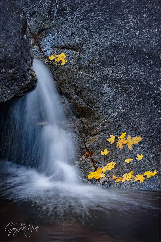
About this image

Autumn Yin and Yang, Bridalveil Creek, Yosemite
People sometimes accuse me of adding or positioning leaves in my frame. Those who know me know I don’t do that, but that doesn’t protect me from their (good natured) abuse. For those who don’t know me and who don’t believe I found this leaf like that, I don’t really know what to say, except to explain that the joy I get from photography comes from discovering natural beauty, and a manufactured scene that isn’t natural has zero appeal to me. (I think this is also why I don’t do composites.) I don’t think it’s wrong to place elements in a frame (or to blend multiple images), as long as it’s done honestly—it’s just not something that interests me. But anyway…
I don’t really understand why people think it’s so unusual to find a leaf (or two, or three…) isolated from its surroundings. I aggressively look for small scenes like this, so it should be no surprise that I have a lot of them in my portfolio. While the position of the leaves in my images is randomly determined by nature (or maybe by the unscrupulous photographer who preceded me at the scene), there’s nothing random about my position when I capture these scenes.
Probably my favorite place to photograph isolated leaves is Bridalveil Creek, just beneath Bridalveil Fall in Yosemite. The entire area is decorated with an assortment of deciduous trees that deposit their leaves liberally among the rocks and cascades each fall. And unlike Yosemite’s other waterfalls, Bridalveil Fall runs year-round. Even in autumn, when it’s often barely more than a trickle, there’s enough water to cascade, splash, and pool among the rocks.
Another great thing about Bridalveil Creek is that its location just beneath Cathedral Rocks and Leaning Tower means it gets very little direct sunlight in autumn. So even when the sun’s out, I can spend hours photographing here in the full shade that’s ideal for this type of photography.
On this cloudy October morning I was doing my usual thing, bounding about on the rocks upstream from the trail looking for single leaves to isolate in my frame. My of the cascades here are active enough to splash and wet the rocks, so when a descending leaf hits a wet rock just right, it sticks like glue. I didn’t see this leaf land and stick, but I’ve seen it happen enough to know this isn’t that unusual.
This cascade was about 20 feet away, above a pool that was deeper than I wanted to wade, so I went to my 70-200 lens. I spent a little time casually working this scene, circling, framing it from a variety of positions using different focal lengths. But when I got to this spot and saw the smooth curves and dark flowing into light, my mind immediately went to the Yin and Yang symbol (okay, so maybe you need use your imagination a bit). I dropped down a bit and refined my composition, then started working on the exposure.
Not only was this spot in full shade, the morning was overcast. With my polarizer on to cut the sheen on the rocks and leaves, I knew that slowing the water enough to capture any detail was virtually impossible, so I went all-in on the motion blur and just turned the water a homogenous white. It turns out this decision actually enhanced the yin/yang effect I was going for.
Workshop Schedule || Purchase Prints || Instagram
To better understand the science and timing of fall color, read
The Why, How, and When of Fall Color
A Gallery of Fall Color


, Yosemite")


:: More photography tips ::
The Why, How, and When of Fall Color
Posted on September 6, 2020
Autumn Cascade, Bridalveil Creek, Yosemite (2005)
Canon EOS-1Ds Mark II
Canon 70 – 200 f/4 L
1 second
F/10
ISO 160
Autumn is right around the corner. To get things started, I’ve updated a previous post that demystifies why, how, and when of fall color.
Few things get a photographer’s heart racing more than the vivid yellows, oranges, and reds of autumn. And the excitement isn’t limited to photographers—to appreciate that reality, just try navigating New England backroads on a Sunday afternoon in the fall.
Innkeeper logic
Despite all the attention, the annual autumn extravaganza is fraught with mystery and misconception. Showing up at at the spot that guy in your camera club told you was peaking at this time last year, you might find the very same trees displaying lime green mixed with just hints of yellow and orange, and hear the old guy behind the counter at the inn shake his head and tell you, “It hasn’t gotten cold enough yet—the color’s late this year.” Then, the next year, when you check into the same inn on the same weekend, you find just a handful of leaves clinging to exposed branches—this time as the old guy hands you the key to your room he utters, “That freeze a couple of weeks ago got the color started early this year—you should have been here last week.”
While these explanations may sound reasonable, they’re not quite accurate. Because the why and when of fall color is complicated, observers resort to memory, anecdote, and lore to fill knowledge voids with partial truth and downright myth. And while we still can’t predict fall color the way we do the whether, science has provided a pretty good understanding of the fall color process.
A tree’s color
The leaves of deciduous trees contain a mix of green, yellow, and orange pigments. During the spring and summer growing season, the volume and intensity of the green chlorophyl pigment overpowers the orange and yellow pigments and the tree stays green. Even though chlorophyl is quickly broken down by sunlight, the process of photosynthesis that turns sunlight into nutrients during the long days of summer continuously replaces the spent chlorophyl.
As the days shrink toward autumn, things begin to change. Cells at the abscission layer at the base of the leaves’ stem (the knot where the leaf connects to the branch) begin the process that will eventually lead to the leaf dropping from the tree: Thickening of cells in the abscission layer blocks the transfer of carbohydrates from the leaves to the branches, and the movement of minerals to the leaves. Without these minerals, the leaves’ production of chlorophyl dwindles and finally stops, leaving just the yellow and orange pigments. Voilà—fall color!
The role of sunlight and weather
Contrary to popular belief, the timing of the onset of this fall color chain reaction depends much more on daylight than it does on temperature and weather. Triggered by a genetically programmed day/night-duration threshold (and contrary to innkeeper-logic), the trees in any given region will commence their transition from green to color at about the same time each year, when the day length drops to a certain point.
Nevertheless, though it doesn’t trigger the process, weather does play a significant part in the intensity, duration, and demise of the color season. Because sunlight breaks down the green chlorophyl, cloudy days after the suspension of chlorophyl creation will slow the chlorophyl’s demise and the coloring process that follows. And while the yellow and orange pigments are present and pretty much just hanging out while they wait all summer for the chlorophyl to relinquish control of the tree’s color, a tree’s red and purple pigments are manufactured from sugar stored in the leaves—the more sugar, the more vivid a tree’s red. Ample moisture, warm days, and cool (but not freezing) nights after the chlorophyl replacement has stopped are most conducive to the creation and retention of the sugars that form the red and purple pigments.
On the other hand, freezing temperatures destroy the color pigments, bringing a premature end to the color display. Drought can stress trees so much that they drop their leaves before the color has a chance to manifest. And wind and rain can wreak havoc with the fall display—go to bed one night beneath a canopy of red and gold, wake the next morning to find the trees bare and the ground blanketed with color.
Since the fall color factors come in a virtually infinite number of possible variations and combinations, the color timing and intensity can vary a lot from year to year. Despite expert advice that seems promise precise timing for the fall color, when planning a fall color trip, your best bet is to try to get there as close as possible to the middle of the color window, then cross your fingers.
About this image
Looking for something to do in this COVID-constrained world, I dialed my way-back machine all the way back to 2005 and landed on this image. I wish I could tell you I have a memory of its capture, but I don’t. I do, however, have lots of general memories of photographing fall color at Bridalveil Creek in Yosemite, just below Bridalveil Fall. Since I’ve never visited Yosemite in autumn without shooting here, when I set out find a fall color image in my archives, I specifically targeted my Bridalveil Creek shoots.
I started by digging up another image from this trip that I’ve always liked, but felt was too soft to share. Given that I virtually never take a single frame of a nice scene, I was pretty confident that I’d find something similar, and crossed my fingers that the sharpness problem was a one-off that I quickly corrected. This is actually the very next image I clicked, and I was very pleased to confirm that it is indeed sharp.
This image is a perfect example of my approach to intimate fall color scenes: Look for color to juxtapose with another feature in the scene. Often that’s a single leaf (no, I do not place leaves, ever), but in this case I accented a nice little cascade with a group of fallen leaves that were plastered against water-soaked granite. And when there’s water motion in the scene, I usually shoot it at a variety of shutter speeds to give myself multiple motion effects to choose between. Looking through my captures from this shoot, I can tell that’s exactly what I did. This image is a 1-second exposure, long enough to blur the cascade, but not so long that I obliterated all detail. And though I have no memory of it, I know I used a polarizer because I always use a polarizer when photographing fall color, and I can tell that the sheen has been removed from the rocks, leaves, and water.
Autumn Intimates
Click an image for a closer look, and to view a slide show.


