Eloquent Images by Gary Hart
Insight, information, and inspiration for the inquisitive nature photographer
Navigating the Path to Exceptional
Posted on May 20, 2025
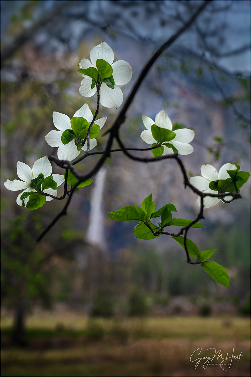
Bridalveil Fall and Dogwood, Valley View, Yosemite
Sony a7R V
Sony 24-105 f/4 G
ISO 800
f/4
1/250 second
Who doesn’t love being exceptional? Exceptional among your friends, or in your camera club, among your peers, or even in the world. Though I suspect the happiest photographers are simply content with being the best possible photographer they can be without measuring themselves against others, what fun is that?
Once upon a time, capturing exceptional images required little more than being at the most beautiful spots during the most spectacular conditions, and having a general sense for composition and metering. Today? Not so much. While there’s nothing wrong with chasing beautiful locations and conditions, these days when you work hard to get someplace special at just the right time, there’s a pretty good chance you won’t be the only one there. (But that doesn’t mean you should stop chasing beauty for beauty’s sake.)
In a world where pretty much everyone carries a camera 24/7, universal access to information makes “expert” guidance just a click away, and there’s virtually no such thing as a “secret” location, I’m afraid the “exceptional” bar just keeps rising. So, instead of settling for beautiful scenes in beautiful conditions (not that there’s anything wrong with that), how can we create images that truly stand out?
Laying the foundation
The key to capturing images that are more creative than cliché starts with understanding the vast difference between your camera’s view of the world and your own. Rather than forcing your camera to see the world as you do, lean into those differences and reveal the world in ways the eye can’t.
Fortunately, the biggest differences between camera and human vision have a corresponding exposure variable to manage them: for depth there’s aperture (f-stop); for motion we have shutter-speed; and ISO gives us control over light sensitivity. Even though you can get a perfect exposure with many combinations of these three exposure variables, there’s often only one combination where all the tumblers fall into place for the perfect combination of depth, motion, and light.
For example, photographing a crashing wave at the beach, (depending on the decisions I make with my exposure variables) the water in a perfectly exposed image could range from individual water droplets frozen in midair, to a homogenous froth of hazy white—or any degree of blur in between. Or, when I photograph a poppy that stands out in a field of wildflowers, my perfectly exposed image could range from every flower sharply defined, to only my subject-poppy sharp and the rest of the flowers some degree of soft—so soft, some are simply shapeless blobs of color.
One more factor to consider before making your depth of field choice, is the difference between humans’ naturally stereoscopic, 3-dimensional view of the world, and the camera’s single lens, 2-dimensional perspective. Even though our cameras can’t render our 3-dimensional world in their 2-dimensional medium, our perspective choices are essential to creating the illusion of depth that elevate an image.
Putting it all together
All of these factors should inform the decisions you make in the field. Instead of settling for the obvious, the path to “exceptional” requires conscious awareness of front-to-back relationships in your frame, and careful, deliberate exposure variable choices to manage the scene’s depth, motion, and light.
Which brings me to this image from last month’s Yosemite Waterfalls and Dogwood photo workshop. For good reason, Valley View (aka, Gates of the Valley for Yosemite purists) is almost certainly second only to Tunnel View on the list of most popular Yosemite photo spots. Which of course is somewhat problematic for those of us seeking to be exceptional.
Pulling into the parking lot here, before you’re even out of the car your eyes are slammed with a view of El Capitan, Cathedral Rocks, and Bridalveil Fall, with the Merced River in the very near foreground. And because the most obvious beauty is very first thing you see at Valley View, many photographers head straight down to the river to claim their version of this classic shot without first considering the other great options here.
For starters, there are three primary places to photograph Valley View: the first, and most obvious, is the view directly in front of the parking area that I just described; next, is the view slightly downstream where, instead of photographing across the river, you can photograph upstream and make El Capitan your prime subject with more foreground options; finally, there’s the view of Bridalveil Fall and its reflection, found just upstream from the parking area.
Each time I arrive at Valley View, I survey the conditions before deciding where to set up. Sometimes the whole scene is fantastic and I stay in front of the parking lot for my version of the shot that’s been taken a million times. But when El Capitan is getting the best light, I usually head strait downstream and try to build a foreground from the rocks, rapids, logs, and grass mounds. And when I want to feature Bridalveil Fall and Cathedral Rocks, I go (just a little) upstream for reflections and maybe a few protruding or submerged rocks. Regardless of my choice, I’m rarely more than 100 feet from my car, but my results are completely different.
Wherever I am, every time I compose a scene, I try to find a foreground that complements my background, or vice versa. At Valley View, my primary subject is almost always in the background (some combination of El Capitan, Cathedral Rocks, and Bridalveil Fall), so I’m usually trying to find a complementary foreground. Looking at the gallery below, you can see that sometimes I succeed, and sometimes I simply settle for a beautiful scene.
Bridalveil Dogwood, Yosemite
What sets today’s image apart in my mind is that my primary subject is in the foreground. I have the dogwood to thank for that. In fact, even though the results are entirely different, this is the very same tree I used for one of my oldest (and still favorite) images.
When I took my original Bridalveil Dogwood image, I visualized the concept (close dogwood subject, soft Yosemite icon background) on my drive to the park, then spent the day driving around until I found this scene.
Since then, that experience has made me very aware of the relationship between this dogwood tree and Bridalveil Fall, and I can’t help checking it out when the dogwood are in bloom. But, aside from the fact that I wasn’t interested in repeating myself, I couldn’t have duplicated that image even if I wanted to, because so much has changed in the last 20+ years.
First, the conditions were completely different. In the original scene, I benefited from clouds that provided softbox light, and a gentle rain and sprinkled water droplets everywhere. This time I was working with a mostly clear sky that, while less than ideal in many ways, made the backlit flowers (technically bracts, but I’m sticking with flower) and leaves light up as if illuminated from within.
The other significant difference was the tree itself, which had grown so much that my once clear line of sight from the flowers to Bridalveil was now clogged with branches, leaves, and other flowers. So instead of getting super-close to one flower, I identified an inverted v-shaped branch sporting a collection of backlit flowers.
Moving back, I shifted until Bridalveil Fall was framed by the flowers. Then I zoomed my 24-105 lens tight and open the aperture wide for maximum background softness. The flowers swaying in a slight breeze, I bumped my ISO to 800 to ensure a fast enough shutter speed. I took a half-dozen or so image, each with micro-adjustments to the composition, until I was satisfied.
Disclaimer
Is this picture “exceptional”? I have no idea. That really isn’t even my call. In fact, many of my images that feel exceptional to me barely register a reaction from others; then I’ll share an image that feels pretty ordinary to me, and people will rave about it. So who knows? But since chasing other people’s definition of exceptional can make you crazy, I just think I’ll call any image that makes me happy exceptional (in my own personal Universe) and leave it at that.
Lots of Yosemite Photo Workshops Here
Valley View: Variations on a Scene
Click any image to scroll through the gallery LARGE


, Yosemite")


Visualize the Future
Posted on May 6, 2024

Twin Falls, Ribbon Fall and Bridalveil Fall, Yosemite
Sony α1
Sony 16-35 f/2.8 GM
ISO 50
f/16
2.5 seconds
Virtually every scene I approach with a camera is beautiful, but a beautiful scene isn’t enough if all the parts don’t work together. Human experience of the world differs greatly from what the camera captures—the photographer’s job is to understand and use those differences.
Ansel Adams and visualization
Most photographers know that Ansel Adams visualized his final print, and the darkroom work necessary to create it, before clicking the shutter. This ability to look into the future of each capture is part of what set Ansel Adams apart from his peers.
But Adams’ extensive darkroom work is often cited by digital photographers defending their over-processesed images. We’ve all heard (and perhaps even uttered ourselves) statements like, “Ansel Adams spent more time in the darkroom than he did in the field,” or “Ansel Adams would love Photoshop.” Perhaps true, but using Ansel Adams’ darkroom mastery to justify extreme Photoshop processing misses a significant point: Adams’ mental picture of the ultimate print was founded upon a synergistic relationship between his own vision and his camera’s vision, coupled with a master’s control of capture variables like composition, light, motion, and depth. In other words, Adams’ gift wasn’t merely his darkroom skills, it was an overarching vision that enabled him to make decisions now based on invisible realities he knew he’d encounter later.
I bring this up because I’m concerned about many photographers’ Photoshop-centric “fix it later” approach that seriously undervalues capture technique. This mindset ranges from simple over-reliance on the LCD for exposure with no real understanding of the histogram or how metering works (shoot-review-adjust, shoot-review-adjust, shoot-review-adjust, until the picture looks okay; or shoot so it looks good, not realizing the exposure is wrong until they get it on their computer), to photographers who channel their disappointment with an image into an overzealous Photoshop transformation, pumping color, adding “effects,” or inserting/removing objects until they achieve the ooooh-factor the image lacks.
The better approach is to understand the potential in a scene while actually viewing it in Nature, camera in hand, then to anticipate the processing the image will require and shoot accordingly. In other words, Photoshop should inform capture decisions, not fix them.
Putting Photoshop in its place
Every image ever captured, film or digital, was processed. Just as the processing piece was easy to ignore when the exposed film you sent to a lab magically returned as prints or slides, many digital shooters, forgetting that a jpeg capture is processed by their camera, brag that their jpeg images are “Exactly the way I shot them.” Trust me, they’re not.
Whether you shoot monochrome film, Fuji Velvia slides, low-compression jpegs, or (especially) the latest smartphone there’s nothing inherently pure about your “unprocessed” image. On the other hand, digital landscape photographers who understand that processing is unavoidable, rather than relinquish control of their finished product to black-box processing algorithms built into the camera, usually opt for the control provided by raw capture and hands-on processing.
Unfortunately, Photoshop’s power makes it difficult for many (myself included) to know where to draw the processing line. And every photographer draws that line in a different place—one photographer’s “manipulation” is another’s “masterpiece.” The reality is, Photoshop isn’t a panacea—its main function should be to complement the creativity already achieved in the camera, and not to fix problems created (or missed) at capture.
While I’m not a heavy Lightroom/Photoshop user, I readily acknowledge that they’re amazing tools that are an essential part of my photography workflow. I particularly appreciate that LR/PS give the me ability to achieve things possible with black and white film and a decent darkroom, but difficult-to-impossible with the color transparencies I shot for over 25 years. Of course processing is an ever-evolving art itself, one I’m still learning. I’m afraid to this day I find myself mortified by some of my earlier processing choices—as I no doubt will be at some later date by processing choices I make today.
Creating an image, from start to finish
Normally when I find myself at a popular Yosemite location like Valley View, I won’t get my camera out unless I can find something that feels truly unique. Last month, not wanting to stray from my workshop group, I was content to observe and assist. But when the clouds draping El Capitan and Cathedral Rocks started turning pink in the evening’s last light, I couldn’t resist.
I raced to my car and grabbed my tripod and Sony a1, already loaded with my 16-35 GM lens, and headed down to the large log embedded along the riverbank, just downstream from the parking lot. This log has been a Valley View fixture for years, but each year it gets nudged a little by spring runoff—some years more than others. I’m sure it will eventually be swept away entirely.
A trio of photographers was already in place on and around the log, but spying a spot I could squeeze into, I scaled the log and tightroped my way toward the small opening. Despite an extreme language mismatch, we were able to pantomime our way into a friendly equilibrium—lots of smiles and pointing, with a mutual thumbs-up for punctuation—that enabled me to set up in a spot that worked for me without disturbing them.
With the light changing quickly, I went right to work, framing up a wide draft version that included the entire Valley View scene: clouds, Ribbon Fall (on the left), El Capitan, Cathedral Rocks, Bridalveil Fall, and the Merced River. I was especially excited to be able to frame the scene with the two prominent waterfalls: well known and year-round Bridalveil on the right, and somewhat anonymous, seasonal Ribbon Fall (Yosemite’s highest vertical drop).
I wasn’t super crazy about the log in the middle of the river, but since it was right in the middle of the scene I wanted to photograph, I decided to lean into it and just make it part of my composition. And while I liked the whitewater, I was less than thrilled by its position in the lower right corner of my frame. Again, just something I’d need to accept and deal with.
Balanced atop my log, I raised my tripod as high it would go to prevent the foreground log’s protruding vertical branch from intersecting the far riverbank. To remove distracting texture from the whitewater, I decided to smooth the water with a long shutter speed, dialing to ISO 50 and stopping down to f/16. Exposure was tricky because the sky still held onto a fair amount of light, while the foreground was darkening fast, so I took care to monitor my histogram until I found a shutter speed that didn’t wash out the color, while still creating a pleasing (to my eyes) motion blur.
The preview image on my LCD looked mostly too dark, with the sky too bright, but I know my camera well enough to know that all the beautiful detail in the shadows and highlights would return like magic in Lightroom. Besides pulling down my highlights and dragging up my shadows, a small color temperature tweak, and some selective dodging/burning, this turned out to be a relatively simple image to process and get to come out exactly as I’d visualized it that evening.
One more thing
Check out the gallery below. All of these images were captured at Valley View. Rather than base my composition on the “standard” shot here, I crafted each to take advantage of whatever conditions were before me at the time. And while a few images do indeed settle for the more conventional composition, my decision to photograph that way was justified (in my mind) by the exceptional conditions that told me I should just get out of the way and let the scene speak for itself. So I guess the moral is, trust your instincts and don’t settle for the obvious—unless the obvious just hits you right over the head and you just can’t ignore it.
Valley View Variety
Click any image to scroll through the gallery LARGE


, Yosemite")


Putting It All Together
Posted on December 19, 2022

Sunset Mirror, Valley View (El Capitan and Bridalveil Fall), Yosemite
Sony α1
Sony 12-24 f/2.8 GM
1/6 second
F/11
ISO 100
Nature’s most spectacular visual moments come thanks to the glorious confluence of its static and dynamic beauty. Nature’s static beauty is its fixed features, the mountains, oceans, lakes, rivers, trees (and more) that inspire us to travel great distances with our cameras, confident in the knowledge that they’ll be there when we arrive. Nature’s dynamic beauty is its transient elements, like the light, clouds, color, weather, and celestial objects, that we try to anticipate—but that often surprises/disappoints us.
Whether it’s lightning at the Grand Canyon, the Milky Way in New Zealand, the northern lights in Iceland, or a moonrise above Yosemite, my photo trips are (selfishly) timed to maximize my chance for those times when the inherently beautiful scenes are blessed with special conditions. And though relying on the fickle whims of Mother Nature means the disappointments are frequent and frustrating, I’ve learned to roll with them because the thrill of success is greater than the frustration of failure.
But for a photographer, just being there isn’t enough, because, as thrilling as the moment might be, doing it justice with a camera usually requires more than just a simple point and click. Often (usually?), adding the best of Nature’s dynamic elements changes the scene enough to actually shift the balance of visual power—what might be the best picture in more typical conditions, suddenly takes backseat to the ephemeral beauty unfolding before us.
Getting the most from Nature’s glorious confluences means quickly identifying the scene’s best features right now, and finding a composition that emphasizes them—even if that means deemphasizing the static element that drew you in the first place. For example, at Valley View in Yosemite, photographers can choose between El Capitan, Bridalveil Fall, or both of the above (not to mention Cathedral Rocks, Leaning Tower, and Ribbon Fall). As I recently blogged, I’ll photograph this scene completely differently depending on the conditions—sometimes ignoring El Capitan or Bridalveil Fall in favor of the other, and other times including both.
And beyond subject choice are decisions like the amount of sky versus foreground to include, horizontal or vertical orientation, wide or tight focal length, polarizer orientation, motion blur in the water, and on and on. All of these choices depend on the conditions, and the way they’re handled can make or break an image.
My Yosemite Winter Moon photo workshops are timed to coincide with a full moon rising above Yosemite Valley at sunset, as well as (fingers crossed) fresh snowfall in Yosemite Valley. Yosemite Valley is the workshop’s known, static commodity; snow and the moon are its dynamic variables. While getting fresh snow is a complete a roll of the dice when scheduling a workshop a year or more in advance, the moon’s phase and position can be predicted with surgical accuracy. But there’s no such thing as a free lunch in photography, so even though I know where to be and when to be there for the moon, I still have to sweat the clouds—especially in winter.
Which is exactly what I did in this month’s workshop. Having billed this as a “winter moon” workshop, I took my students out to a view of Half Dome that aligned perfectly with the first of my three planned sunset moonrises, then watched and waited while Half Dome played games with the clouds and never came out completely. The moon? Not even close. If you read last week’s blog, you know that we finally had a moonrise success on our third and final try. But it’s what happened on the evening in between that stands out most in my memory.
In a static world, for our second sunset I’d have been at another location beside the Merced River, waiting for the moon to crest Half Dome. Because watching the moon rise above Half Dome at sunset is something I hate missing, even when there are lots of clouds, my usual approach is to lean into the moonrise despite the low odds—you just never know when the sky might open and surprise you by revealing the moon (see last week’s blog). But as the time to make the call on our sunset location approached, I could see that the east side of the valley, including Half Dome, appeared hopelessly engulfed by clouds, while the sky on the west side looked much more open. So I reluctantly (and uncharacteristically) pulled the plug on the moonrise and detoured to Valley View for sunset, hoping I wouldn’t regret it.
At Valley View, I instantly saw that the cloud swallowing Half Dome was a blooming cumulus monster that showed no hint of retreating. My decision to blow off the moonrise (somewhat) vindicated, I got my group settled in. While fairly confident we’d get something better than my Plan A Half Dome spot, I didn’t have especially high expectations for anything spectacular.
Pulling out my Sony α1 body, I surveyed the scene. Normally I start at Valley View with my Sony 24-105 f/4 G lens, but with such a nice sky this evening, I reached straight for my Sony 16-35 f/2.8 GM lens.
I see clouds like this one all the time at the Grand Canyon, but rarely in Yosemite—maybe way in the distance, but rarely this close. It only took two frames to realize the 16-35 still wasn’t wide enough, so I returned to my bag for my Sony 12-24 f/2.8 GM lens. Maybe I’ve used this lens at Valley View before, but it’s usually reserved for Yosemite’s closer El Capitan views.
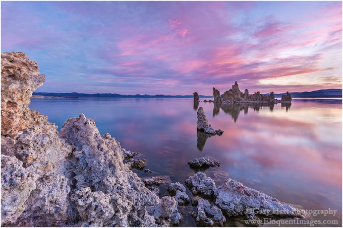
When the cloud lit up and started glowing pink, its reflection switched on too, suddenly making that the scene’s most compelling element. There aren’t many situations where I’d photograph here ultra-wide and vertical, but this time I instantly knew that’s what the scene called for, even if that meant shrinking Valley View’s usually unrivaled landscape features. With my 12 – 24 oriented vertically, not only could I include all of Valley View’s primary static features (El Capitan, Bridalveil Fall, Cathedral Rocks), I could also fit the towering pink cloud and its reflection, top to bottom. To avoid including any of the sticks and leaves at my feet, I dropped lower and moved most of my tripod into the shallow water.
This evening’s show was as brief as it was spectacular. If there’s one takeaway, it’s the reminder the most successful landscape images start with finding a combination of Nature’s static and dynamic elements—identifying a location you want to photograph (static), and figuring out when to be there for the best light, color, sky, or whatever (dynamic). But your job isn’t done until you’ve identified what’s working at that moment, and put it into a composition that does the moment justice.
Natural Confluences
Click any image to scroll through the gallery LARGE


, Yosemite")


Secure Your Borders
Posted on November 28, 2022

Autumn Leaves on the Rocks, Valley View Reflection, Yosemite
Sony a7R IV
Sony 24-105 G
1/40 second
F/16
ISO 100
It’s easy to be overwhelmed at the first sight of a location you’ve longed to visit for years. And since by the time you make it there you’ve likely seen so many others’ images of the scene, it’s understandable that your perception of how the scene should be photographed might be fixed. But is that really the best way to photograph it?
Valley View in Yosemite is one of those hyper-familiar scenes. El Capitan, Bridalveil Fall, and Cathedral Rocks pretty much slap you in the face the instant you land at Valley View, making it easy to miss all the other great stuff here. This month’s workshop group visited Valley View twice, with each visit in completely different conditions, which got me thinking about about the number of ways there are to photograph most scenes, and how it’s easy to miss opportunities if you simply concentrate on the obvious. Most scenes, familiar or not, require scrutiny to determine where the best images are—on every visit.

Sunrise Reflection, El Capitan, Yosemite
On our first visit, Bridalveil Fall was just a trickle lost in deep shadow, so I focused my attention on El Capitan, opting for a vertical frame to emphasize El Cap, the beautiful clouds overhead, and the reflection. When we returned a couple of days later, Bridalveil had been recharged by a recent rain, the soft light was more even throughout the scene, and patches of fallen leaves and pine needles now floated atop the reflection. All this called for a completely different approach.
On this return visit, since I thought there was (just barely) enough water in Bridalveil to justify its inclusion, I went with a horizontal composition. It would have been easy to frame up El Capitan, Bridalveil, and Cathedral Rocks, throw in a little reflection and call it good. But (as my workshop students will confirm) I obsess about clean borders because I think they’re the easiest place for distractions to hide.
So before every click, I do a little “border patrol,” a simple reminder to deal with small distractions on my frame’s perimeter that can have a disproportionately large impact on the entire image. (I’d love to say that I coined the term in this context, but I think I got it from fellow photographer and friend Brenda Tharp—not sure where Brenda picked it up.)
To understand the importance of securing your borders, it’s important to understand that our goal as photographers is to create an image that not only invites viewers to enter, but also persuades them to stay. And the surest way to keep viewers in your image is to help them forget the world outside the frame. Lots of factors go into crafting an inviting, persuasive image—things like compositional balance, visual motion, and relationships are all essential (and topics for another day), but nothing reminds a viewer of the world outside the frame more than an object jutting in or cut off at the edge.
When an object juts in on the edge of a frame, it often feels like part of a different scene is photobombing the image. Likewise, when an object is cut off on the edge of the frame, it can feel like part of the scene is missing. Either way, it’s a subconscious and often jarring reminder of the world beyond the frame. Not only does this “rule” apply to obvious terrestrial objects like rocks and branches, it applies equally to clouds.
And there are other potential problems on the edge of an image. Simply having something with lots of visual weight—an object with enough bulk, brightness, contrast, or anything else that pulls the eye—on the edge of the frame can throw off the balance and compete with the primary subject for the viewer’s attention.
Of course it’s often (usually?) impossible to avoid cutting something off on the edge of the frame, so the next best thing is to cut it boldly rather than to simply trim it. I find that when I do this, it feels intentional and less like a mistake that I simply missed. And often, these strongly cut border objects serve as framing elements that hold the eye in the frame.
To avoid these distractions, I remind myself of “border patrol” and slowly run my eyes around the perimeter of the frame. Sometimes border patrol is easy—a simple scene with just a small handful of objects to organize, all conveniently grouped toward the center, usually requires minimal border management. But more often than not we’re dealing with complex scenes containing multiple objects scattered throughout and beyond the frame. Even when you can’t avoid cutting things off, border patrol makes those choices conscious instead of random, which is almost aways better.
As nice as the Valley View reflection was on this visit, it was sharing space with a disorganized mess of rocks, driftwood, and leaves. Organizing it all into something coherent was impossible, but I at least wanted to have prominent color in my foreground and take care to avoid objects on the edge of my frame that would pull viewers’ eyes away from the scene.
Unfortunately, as I used to tell my kids all the time (they’re grown and no longer listen to me), you can’t always have what you want. In this case, including the best foreground color also meant including an unsightly jumble of wood, rock, and pine needles in the lower right corner. But after trying a lot of different things, I decided this was the best solution—especially since I managed to find a position and focal length that gave me completely clean borders everywhere else in my frame.
I very consciously included enough of the mass in the lower right that it became something of a boundary for that corner of the image (not great, but the best solution possible). I also was very careful to keep an eye on the ever-changing clouds. The light on El Capitan that broke through just as I had my composition worked out felt like a small gift.
Workshop Schedule || Purchase Prints || Instagram
Valley View Variety


No Secrets
Posted on November 6, 2022

Sunrise Reflection, El Capitan, Yosemite
Sony a7RIV
Sony 24-105 G
.6 seconds
F/11
ISO 50
It amuses (and frustrates) me when photographers guard their information like state secrets. Photography isn’t a competition, and I’ve always felt that the more photographers can foster a sense of community, the more everyone benefits. (I will, however, protect locations at risk of being damaged by too much attention.) With that in mind, I’m sharing below some of the photography insights I’ve learned from a lifetime of Yosemite visits, and encourage you to share your own insights, wherever and whatever they may be, when the opportunity arises.
Yosemite FAQs
I get asked all the time, what’s the best season to be in Yosemite? For many reasons, including the fact that everyone defines “best” differently, that’s an impossible question to answer. So instead I try to identify the pros and cons of each season in Yosemite and let the questioners decide for themselves what sounds best to them.
- Winter: Because the crowds have vacated, Yosemite is at its most peaceful in winter. And it’s never more beautiful than when smothered with fresh snow, but in the relatively warm temperatures of Yosemite Valley, snowstorms only happen a few times each winter so I try to time my visits so I can be there during a storm.
- Spring: With its booming waterfalls, vivid greens, mirror-like vernal pools, and ubiquitous dogwood blooms (okay, so technically they’re bracts), spring is classic postcard Yosemite. Spring is also when the crowds return.
- Summer: For tourists only—but if you find yourself in Yosemite on a crowded (understatement) summer day, rising at the first sign of pre-sunrise light will give you at least a couple of hours of glorious peace.
- Autumn: By autumn the crowds have left, and while Yosemite’s waterfalls have fallen silent, the low and slow water turns the Merced River into a reflecting ribbon that splits Yosemite Valley. The resulting mirror reflections of granite monoliths mingling with the season’s red and gold are one of my favorite things to photograph in Yosemite.
Another question I get asked a lot is some version of, “Where in Yosemite should I photograph sunrise/sunset.” Again there’s no absolute answer, so I just try to provide enough information for the questioners to make their own decisions.
- Sunrise: Yosemite is not an inherently good sunrise location. In fact, on a typical California clear sky morning, it’s pretty lousy. That’s because most of Yosemite Valley’s best views face east, toward shaded subjects against the brightest part of the sky. Clouds flip the equation, subduing the bright sky and (fingers crossed) filling it with color. But even the cloudless days aren’t an excuse to stay in bed. On these days try to be in position for the first light on El Capitan, about 15/20 minutes after the “official” (flat horizon) sunrise. And in winter Yosemite Falls also gets beautiful morning light.
- Sunset: Even without clouds, Half Dome gets nice sunset light year-round. In the long-night months (from the autumnal equinox to the vernal equinox) so does El Capitan. In the long-day months (from the vernal equinox to the autumnal equinox), the late light goes to Cathedral Rocks and Bridalveil Fall.
Send in the clouds
Regardless of the season, clouds change everything, especially when storm clouds that swirl about Yosemite’s monoliths. Even high or thin clouds can be difference makers that paint the usually boring sky with color and (if you’re lucky) reflect in foreground water.
Unfortunately, storm clouds often drop all the way to the valley floor, obscuring all the features you traveled to photograph. Rather than giving up, my approach to stormy weather in Yosemite is to wait it out. A clearing storm is the Holy Grail of Yosemite photography, an experience that never gets old, no matter how many times it’s witnessed. And when I say wait it out, I don’t mean just returning to your room and looking outside every once in a while, I mean circling the valley in your car, or parking somewhere with an eye on the sky. Tunnel View is a great spot for this.
My other tip for photographing a clearing storm in Yosemite is not staying in one place too long. If you wait until it’s not beautiful anymore before moving on, you won’t leave until the show’s over everywhere—instead, remind yourself that it’s just as beautiful everywhere else, and move on when you find yourself repeating compositions.
Reflecting on reflections
Regardless of the location or conditions, a reflection can turn an ordinary pretty picture into something special. That’s especially true in Yosemite. Yosemite’s reflection spots change with the season: in spring, they’re best in the vernal pools that form in the meadows, and a small handful of Merced River spots, where it widens (like Swinging Bridge) or pools near the river’s edge; in autumn (and late summer), pretty much the entire Merced River is a mirror. Winter Merced River reflections can be nice too, depending on the weather and amount of runoff.
A lifetime of Yosemite visits helps me pursue its reflections. But even if you don’t know the spots for Yosemite reflections, they’re not hard to find if you keep your eyes open.
The most frequent reflection mistake I see is photographers walking past a reflection because it doesn’t contain an interesting subject. Maximizing reflection opportunities starts with understanding that, just like a billiard ball striking a cushion, a reflection always bounces off the reflective surface at exactly the same angle at which it arrived.
Armed with this knowledge, when I encounter any reflective surface, I scan the area for a reflection-worthy subject and position myself to intercept my target subject’s reflected rays, moving left/right, forward/backward, up/down until my reflection appears. Another important aspect of reflection management is juxtaposing the reflection with submerged or exposed objects in the water.
Putting it all together
These cloud and reflection factors aligned for me in last week’s Yosemite Fall Color and Reflections workshop. Based on the weather forecast when we wrapped up the previous night, I gathered the group early enough for our sunrise departure to swing into Tunnel View for quick survey of Yosemite Valley. If there had been no clouds, clearing storm clouds, or zero-visibility clouds, we’d have stayed there. But when I saw a nice mix of high to mid-clouds, I went with Plan-B and beelined to Valley View.
We arrived more than 30 minutes before sunrise and I was pleased to see only one other car in the parking lot. I’d already brought my group here once, so everyone already had an idea of what they wanted to do—a few went just upstream from the cars to the nice reflection of Cathedral Rocks and Bridalveil Fall; the rest made their way out to the new-ish (last couple of years) and quite conveniently placed logjam that provides a perspective of El Capitan that previously would have required walking on water to achieve.
I left my gear in the car, moving back and forth between the two cohorts and and monitoring the sky. I’ve photographed here so much, I had no plan to this morning, but when the clouds overhead started to pink up, I couldn’t resist. Rather than grabbing my entire camera bag, I just pulled out my tripod and Sony a7R IV with the Sony 24-105 f/4 G lens already attached and trotted down to the natural platform formed by the log jam.
I knew I didn’t have much time, so I quickly found a spot where, by dropping my tripod a little, I could frame El Capitan’s reflection with several of the many protruding rocks. Since Bridalveil Fall wasn’t flowing very strongly, and the light on El Capitan was better, I went with a vertical composition that featured El Capitan only.
The pink was so intense that for a minute or so, it slightly colored the rocks. Before the color faded, I managed to capture several frames with this composition, each with a slightly different polarizer orientation, but I ended up choosing the one that maximized the reflection.
Workshop Schedule || Purchase Prints || Instagram
Yosemite Autumn Reflections
Click any image to scroll through the gallery LARGE


Letting the Scene Speak for Itself
Posted on October 11, 2020
(Or, Channeling My Inner Oz)
Two Seasons, Valley View, Yosemite
Canon EOS 5D Mark III
Canon 17-40 f/4L
1/4 second
F/20
ISO 800
100 mm
With virtually every still camera now equipped with video capability, the last few years have brought an explosion of nature videos. When done well, videos can be extremely powerful, conveying motion and engaging both eyes and ears to reveal the world in a manner that’s closer to the human experience than a still image is. But like other sensory media whose demise has been anticipated following the arrival of something “better,” (with apologies to Mark Twain) let me say that the rumors of still photography’s death have been greatly exaggerated.
Just as I enjoy reading the book more than watching the movie, I prefer the unique perspective of a still image. Though motion in a video may feel more like being there, a still image gives me the freedom to linger and explore a scene’s nooks and crannies, to savor its nuances at my own pace.
In a video my eyes are essentially fixed as the scene moves before them. In a still image, my eyes do the moving, drawn instantly to a dominant subject, or perhaps following lines, real or implied, in the scene the way a hiker follows a trail. But also like a hiker, I can choose to venture cross-country through a still image and more closely scrutinize whatever looks interesting.
The photographer needs to be aware of a still image’s inherent lack of motion, and more importantly, how to overcome that missing component by moving the viewer’s eyes with compositional choices. With this in mind, I usually like my images to have an anchor point, a place for the viewer’s eye to start and/or finish. To do this, I identify the scene’s anchor and other potential elements that might draw the eye, then position myself and frame the scene so those secondary elements guide the eye to (or frame) the primary subject.
 But sometimes a scene stands by itself, as if every square inch fits together like a like a masterful tapestry. When nature gifts a scene like this, rather than imposing myself by offering visual clues to move my viewer’s eye, I like to step back and channel the Wizard of Oz. Specifically, what Dorothy must have felt when she first opened the door of her ramshackle, monochrome world onto the color and wonder of Oz. That’s how these scenes make me feel, and that’s the feeling I want my images to convey.
In a scene filled edge to edge with the awe and wonder of discovery, the last thing the viewer wants is to be told where to go and what to do. (And just look at all the trouble Dorothy got into when she started following the Yellow Brick Road.)
By getting out of the way and letting the scene speak for itself, my viewer has the freedom to explore the entire frame. Of course that’s easier said than done, but in the simplest terms possible, my sole job is to find balance and avoid distractions.
As much as aspiring photographers would love a composition formula that dictates where to locate each element in their frame, moving the eye, finding balance, and avoiding distractions ultimately comes down to feel. Please bear with me as I try to put into words how this inherently intuitive process manifest for me.
Visual weight
To explain the concept of balance and motion in a still image, I use what I call “visual weight (I’ll just shorten it to VW),” which I define as any object’s ability to pull the viewer’s eye—think of it as gravity for the eye.

Nightfall, Full Moon and Yosemite Valley, Yosemite
An object’s VW is subjective, based on a variety of moving targets that include (to a greater or lesser degree) an object’s size, brightness, color, shape, and position in the frame. VW can also be affected by each viewer’s personal connection to the elements in the scene.
Take a wide angle moon for example. The moon is small and colorless (not much VW), but also bright with lots of contrast (high VW). Then factor in the viewer’s personal connection to the moon. If I’m more drawn to the moon than someone else, the moon’s visual weight would be greater to me. Since I can’t worry about what others think when I compose a shot, what you see in my images reflects the VW that a scene’s elements hold for me, and probably explains why I have so many moon images.
Visual Balance
After many years (decades) of doing this, visual balance usually happens intuitively, without conscious thought. But until you reach this point, I have a mental exercise you can apply to your own images, preferably as they appear in your camera’s viewfinder or on its LCD.
Imagine a flat board perfectly balanced horizontally on a fulcrum (like the tip of a pen)—to maintain its equilibrium, any added weight must be counterbalanced by a corresponding weight elsewhere on the board. Visual weight is the virtual equivalent: think of your frame as a print (a stiff, metal print rather than a floppy, paper print) balanced on a fulcrum. Any visible element that pulls the eye tips the frame from horizontal (makes it out of balance) and must be counterbalanced by an element with corresponding visual weight.
Because of the subjective nature of visual weight, your choices might differ from mine. That’s okay—it’s important to be true to your own instincts, which will in fact improve with practice.
Distractions
The VW concept applies to eliminating distractions too. Without getting too deep into the weeds (there are lots of potential distractions in a scene, and ways to deal with them, but that’s a blog for a different day), the idea is to avoid objects that pull the eye away from the essence of the scene (as you see it), or that simply overpower the scene. In the image at the top of this post, flying monkeys emerging from the Merced River might be pretty cool (and could even gain me some notoriety), but they would not serve my goal to convey a sense of wonder and awe and would in fact be a distraction.
Other potential distractions besides flying monkeys are things like branches and rocks that jut into the scene, creating the sense that they’re part of a different scene, just outside the frame. Another common distraction is objects that are mostly in the scene, but trimmed by the edge of the frame. Since it’s virtually impossible to avoid cutting something off on the edge of most frames in nature, I just try to minimize the damage by being very conscious of what’s cut off and how it’s cut, usually trying to cut boldly, down the middle, when possible. I’ve always felt that objects jutting into a scene, or slightly trimmed by the edge, feel like mistakes, while something cut strongly down the middle feels more intentional.
For example

Two Seasons, Valley View, Yosemite
Yosemite seems to be filled with more than its share of scenes that that don’t need my help assembling a composition. At most scenes I start with the simplest composition and work my way to something more complex. I can usually tell when a scene stands by itself when I end up deciding my early compositions are the way to go.
I’d driven to Yosemite on this November morning chasing a fortuitously timed storm that was forecast to drop snow on peak fall color. The day started gray and cold, the valley floor white with wet snow beneath dark clouds that blanketed all of Yosemite’s distinctive features. But by late morning the clouds brightened and started to lift, slowly unpeeling Yosemite Valley’s soaring granite walls and monoliths.
I happened to be at Valley View when the show started in earnest. Because the scene contained everything I was there to photograph—Yosemite icons (El Capitan, Cathedral Rocks, Bridalveil Fall) decorated with snow, fall color, reflection—I started with this composition that took it all in in a pretty straightforward manner. Standing right at river’s edge, I chose horizontal framing because it was the best way to include the icons without diluting them with too much sky and water. Though I didn’t want to go too wide, because there was so much happening top-to-bottom, from clouds to reflection, I went a little wider than I usually do.
The lower half the scene had lots of rocks that I worked to avoid cutting off, finally finding framing that kept my edges completely clean (not always possible). The small rock in the lower left was a little closer to the edge than I’d have liked, but if I’d have gone any wider I’d have introduced spindly branches along the left edge—I chose the lesser of two evils. Likewise, the small rock on the bottom right was also closer to the edge than I preferred, but an entire herd of disorganized rocks massed just beneath my frame prevented me from composing lower. The top of my frame I set just below a distracting (bright) hole in the clouds. I’d have cut the rock on the middle right if I’d have had to, but was fortunate that there was a small break between it and another gang of rocks just off the frame on the right.
The visual balance was more by feel (as it often is). Looking at the image now, I see that offsetting the gap separating El Capitan and Cathedral Rocks, placing it a little left of center, makes the frame feel more balance than if I’d have centered it, but I don’t remember consciously deciding this. To my eye, the balance works for me because El Capitan, the brilliant color, and striking reflection hold more visual weight than the granite, waterfall, and reflection on the other side, so having more of this on the right compensates for this (slightly) lacking VW.
I wish I could defend my decision to use f/20, but I can’t. I only use f/20 when I absolutely have to—or when I was using it for an earlier scene and forgot to set it back to my default f/8 to f/11 range (which is no doubt what happened here).
One more thing
Even though this image is from 2012, it’s brand new, discovered yesterday while mining my raw file archives. The amazing thing to me is that the scene is quite similar, and the composition virtually identical, to an image taken the following year. When I see similar compositions in scenes from entirely different shoots, it tells me that my instincts are guiding me. In both situations these images were my starting point, and I went on to play with more creative compositions later in the shoot. But it just goes to show that sometimes it’s best to let the scene speak for itself.
-

- Autumn Snow, El Capitan, Yosemite
-
- Two Seasons, Valley View, Yosemite
Workshop Schedule || Purchase Prints || Instagram
Letting Nature Speak for Itself
Click an image for a closer look, and to view a slide show


It’s About Time
Posted on December 1, 2019
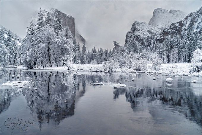
Winter Glaze, Valley View, Yosemite
Sony a7RIII
Sony/Zeiss 24-70 f4
.6 seconds
F/16
ISO 50
Among the many things I’m giving thanks for this Thanksgiving weekend is the return of rain and snow to California. Normally I’d have rearranged my schedule to be in Yosemite for the season’s first snow, but because family trumps photography, I had more important things to do. So Yosemite will just have to be beautiful without me.
As much as I love photographing Yosemite with fresh snow, spending quality time family this weekend was a no-brainer for me. I can’t say that foregoing a photo opportunity has always been so easy (and I’ve been blessed with a family that would have understood had I abandoned them for a day or two to chase the snow), but never let it be said that I’ve learned nothing from my photography career.
In general, being self-employed has time challenges that I’m still learning to manage, but I’m getting better. I do have to admit that sometimes the idea of a 9-5 job with weekends and paid vacations sounds mighty good (I realize I’m speaking in very general terms and don’t mean to offend anyone pinned a cubicle 12 hours per day just to pay the bills), but the bottom line is that I love the flexibility of having complete control of my schedule.
When I left the 9-5 world 15 years ago to pursue this crazy passion, the missing safety net was a great motivator—I was only as successful as the next art show (which I no longer do) or photo workshop. Weekends? Holidays? Irrelevant. And the closest thing I got to a vacation was when my wife and I would travel to a new location to scout for a new workshop.
But as the years go by (is it me, or is time moving faster?), I’ve come to appreciate the autonomy of self employment. I can look at my calendar, whether the day be tomorrow or two years from now, and if nothing’s there, I can do whatever I want. Of course that might mean cramming the things that need to be done into times when others might be watching Netflix from their recliner or body-surfing at the beach, but it’s 100 percent my choice and I love it.
I often tell people that photography must be a source of pleasure, but there’s a difference between happiness and pleasure, and I know now that what I really mean is that photography must make you happy. I probably would have gotten great pleasure from my images had I gone to Yosemite this Thanksgiving weekend, but I know in the long run I’m much happier for my choice to stay home.
A few words about this image
I’d love to give you a detailed description of the entire process that went into photographing this beautiful scene, but I have no specific memory of its capture. I took it at the beginning of a March visit to Yosemite, one of those semi-spontaneous up and back trips I do when the Yosemite forecast calls for snow. I can infer from my exposure settings (specifically, because I was at ISO 50 and f/16) that I was going for a little motion blur to smooth the ripples in the Merced River. But since my shutter speed was .6 seconds, I must have decided that adding a neutral density filter would have robbed the river of some of its texture. (Or maybe I was just too lazy to fish my ND from my bag.) I can also tell by looking at the clouds and the snow on the trees that the snow had just stopped, but not necessarily for good (this is confirmed by the images preceding this one on the card).
The real lesson in this image is the reminder that we all have a lot of unmined gems on our hard drives. I found this one a few weeks ago by employing an approach I often use when I have extra time between trips: picking a previously processed image taken in particularly nice conditions, and revisiting other images from that shoot.
Here are a few other images from that March snow trip
When you make your living from photography, often (usually) the business part of it has to take priority over the photography part, and there just aren’t enough hours in the day for everything. In a perfect world I’d identify and process every single keeper the day after returning from a trip, but that’s simply not possible because of that whole time thing. So possible keepers slip through the cracks and languish on my hard drive(s). But that’s okay, because I never delete anything, and I get comfort from the knowledge that whenever I need a new image, I don’t need to run out with my camera and make one right now.
Not only is this retro photography exercise productive, it’s far more fun than it should be—kind of like finding money on the sidewalk (with none of the guilt about benefiting from someone else’s misfortune).
I still have a couple of spaces in next week’s Yosemite Winter Moon photo workshop
Winter in Yosemite
Click an image for a closer look and to view a slide show.


Low Hanging Fruit
Posted on October 20, 2019

Winter Reflection, Valley View, Yosemite
Sony a7RII
Sony/Zeiss 24-70 f4
10 seconds
F/7.1
ISO 1600

Snowcap, El Capitan, Yosemite
A few days ago I posted an El Capitan in winter image on Instagram. Since it had been nearly three years since that trip, a lot of the specifics of that day had slipped my mind, but when I pulled up the Instagram image’s raw file in Lightroom to check the capture info, a few more of that day’s (so far unprocessed) images caught my eye. The next thing I knew, I was processing this one, and gradually, some of the day’s details returned to me.
Yosemite Valley had been brown and dry beneath an overcast sky when I checked into the lodge the evening prior, but I woke the next morning to a world of white. (This was no surprise—I’d made the trip because snow was forecast.) The snow was still falling after breakfast, and as usually happens in a Yosemite storm, the clouds completely obscured all of Yosemite’s icons. But knowing that the key to photographing snow in Yosemite is to be out in it when the storm breaks, I was quite content to drive into its midst and wait it out. And break it did, turning to flurries with a mix of clouds and blue sky by late morning. The conditions stayed like that the rest of the day and I was in photographer heaven.
I circled Yosemite Valley all day, sometimes targeting specific spots, other times just pulling over when something moved me. By the time the sun set I was pretty certain that I had lots of good stuff on my card, but most important, I was happy. (If just spending time with your subject, regardless of the photographic results, doesn’t make you happy, you probably should be photographing something else.)
On my way out of the park after sunset I made one last stop to photograph this Valley View scene. With its easy access and riverside views of El Capitan, Cathedral Rocks, and Bridalveil Fall, Valley View is low-hanging photography fruit. And it’s especially nice with fresh snow. I’d already stopped here at least once before on that day, capturing last week’s Instagram image late that morning, but I couldn’t resit taking one more peek before heading down the canyon and home.
After the trip I processed a couple of images right away, but like so many of my photo trips, most of the images from this day have languished on a hard drive, victims of the priorities of running a business. This whole experience has been a good reminder of how many unprocessed images I have “in the bank,” waiting to be processed. It has inspired me to make a concentrated effort to go back through my archives to see what might be lurking there. I’ve already excavated a couple besides this one, with more on the way.
And speaking of low hanging fruit, I’ve started by going through my Yosemite snow images, because, well…, how can you go wrong with Yosemite and snow?
Winter is coming
Because winter is right around the corner, and we’ve already entered (just barely) the window when snow is possible in Yosemite, here’s my recipe for photographing Yosemite with snow.
The Early Bird Gets the Snow
If you delay your trip until you hear that it snowed in Yosemite, you’re too late. That’s because Yosemite is only 4,000 feet above sea level and actually warmer in winter than most of the United States. When it does snow there, as soon the snow stops, Yosemite’s relatively mild temperatures collude with sunshine, wind, and gravity to clear the trees in a matter of hours. Not only that, park visitors, driven to shelter by the storm, swarm outside to gape as soon as the snow stops, quickly marring the pristine beauty with footprints, not to mention the mud spread by their boots and tires. In other words, the key to photographing Yosemite with snow is being in the park during the storm (and working fast).
Monitor the weather
All winter I monitor the Yosemite weather forecast for hints of a cold storm. But even this isn’t as simple as you might expect—the single biggest mistake people make when planning a Yosemite snow trip is opening whatever weather site or app is convenient and simply typing in Yosemite. Yosemite Valley is only 4,000 feet above sea level, and virtually the entire rest of the park is higher—up to 13,000 feet elevation. And for some reason, even though Yosemite Valley is where you want to be for snow (and pretty much the only place in Yosemite you can be in winter), most weather resources don’t give the forecast for Yosemite Valley. Instead, they pick some other (random?) elevation that is almost always more likely to get snow than Yosemite Valley. You’d be amazed at how much more frequently snow falls just 500 feet above Yosemite Valley than falls in Yosemite Valley, which means a lot of people end up driving to Yosemite to photograph the snow their weather app promised, then end up marinating all day in a cold rain.
I know there are lots of weather forecast options out there, but most lack the resources of the National Weather Service (or they just use the NWS data). The NWS may not always nail the forecast, but they seem to be more consistent and reliable than any of the other options. But even selecting a generic NWS Yosemite forecast can lead you astray. I recently typed “Yosemite” into the NWS’s forecast input field and was given an assortment of similar options, each of which returned a different location in Yosemite (most not Yosemite Valley). So rather than leave it to chance, to ensure a forecast for the correct elevation, I’ve bookmarked the NWS point forecast for Yosemite Valley.
Chains
When it snows in Yosemite, they do sometimes require chains. Usually 4WD or AWD cars with snow tires are exempt, but not necessarily. Regardless of the conditions, park rules say if you plan to drive in the Yosemite in winter, you must carry chains—even if you have 4WD/AWD. My Subaru Outback is AWD, but when the weather is threatening, I have been asked if I have chains. So they’ve never asked me to prove it, or had to put chains on, but I always carry chains because if they do find that you don’t have chains when they’re required, you’ll need to just park until it chain requirement is lifted.
Driving to Yosemite
Sometimes the chain requirements aren’t for Yosemite Valley, but they do apply to two of the three routes into Yosemite Valley. When a storm is possible, the best way to avoid snow, ice, and chain requirements is to ignore the guidance of your GPS and Google Maps and enter via Mariposa on Highway 140, which comes up the Merced River Canyon and doesn’t ever get as high as 4,000 feet until Yosemite Valley. (Trust me on this.)
That said, any route into Yosemite is subject to closure or restrictions due to slides, flooding, or downed trees. Always check the Yosemite and Caltrans road conditions pages before you leave (I sometimes check them on the way too).
Go-time
Weather in Yosemite is very changeable, and a storm forecast that looked promising one day can completely fizzle the next—or vice versa. Some trips I’ve had a week to prepare for, others I didn’t consider going until I woke up and checked the Yosemite forecast that morning. Because I want to be ready at the drop of a hat, all winter long in the back of my Outback are my chains and a duffle bag with all my cold weather gear: waterproof pants, parka, and shoes, wool hat and gloves, and an umbrella.
When possible, I like to be in Yosemite the day before the snow starts. That said, it isn’t usually difficult to get a room in Yosemite at the last minute when a winter storm threatens, and there have been times when I’ve actually waited until I arrived in the park before booking my room (not necessarily a strategy I’d recommend). Nevertheless, the later I wait to leave, the more likely I’ll be delayed or turned back by a road closure.
Once the snow arrives, rather than hole up in my room, I’m out shooting. Even though Yosemite’s storms often erase all signs of its most recognizable features, stormy weather is a great time to photograph swirling clouds and accumulating snow in glorious (and rare!) solitude. Nice soft light too.
As much as I love photographing Yosemite when snows, the poor visibility and near white-out snowfall can reach a point of diminishing photographic returns. But even then, I don’t go in (or home). Instead, I park at Tunnel View and wait for the weather to clear. Tunnel View is the perfect place to wait out a Yosemite storm because it’s on the west side of Yosemite Valley (where the clearing usually starts), provides an elevated vantage point with a view all the way up the valley to Half Dome, and is spectacular to photograph when the storm clears. It even has decent cell service. And if I’m looking for an excuse to turn on the engine and warm things up, I drive through the tunnel for the view westward, a preview of coming weather.
My final advice for anyone is, when the storm clears, move fast and don’t spend too much time at any one spot, no matter how beautiful it is. It’s a pretty safe bet that if the conditions are beautiful right here, you’re probably missing opportunities elsewhere. The peak conditions, with snow draping every exposed surface, don’t last long, so get your shots and move on—or risk missing out. (This is the voice of experience talking.)
Yosemite Winter Photo Workshop
Yosemite Snow
Click an image for a closer look and to view a slide show.


Mastering Focus (Hyperfocal and Otherwise)
Posted on October 14, 2018

Floating Autumn Leaves, Valley View, Yosemite
Canon EOS-1Ds Mark II
Canon 24-105 f/4 L
1/15 second
F/16
ISO 100
What’s the point?
It seems like one of photography’s great mysteries is achieving proper focus: the camera settings, where to place the focus point, even the definition of sharpness are all sources of confusion and angst. If you’re a tourist just grabbing snapshots, everything in your frame is likely at infinity and you can just put your camera in full auto mode and click away. But if you’re a photographic artist trying to capture something unique with your mirrorless or DSLR camera and doing your best to have important visual elements objects at different distances throughout your frame, you need to stop letting your camera decide your focus point and exposure settings.
Of course the first creative focus decision is whether you even want the entire frame sharp. While some of my favorite images use selective focus to emphasize one element and blur the rest of the scene, most (but not all) of what I’ll say here is about using hyperfocal techniques to maximize depth of field (DOF). I cover creative selective focus in much greater detail in another Photo Tip article: Creative Selective Focus.
Beware the “expert”
I’m afraid that there’s some bad, albeit well-intended, advice out there that yields just enough success to deceive people into thinking they’ve got focus nailed, a misperception that often doesn’t manifest until an important shot is lost. I’m referring to the myth that you should focus 1/3 of the way into the scene, or 1/3 of the way into the frame (two very different things, each with its own set of problems).
For beginners, or photographers whose entire scene is at infinity, the 1/3 technique may be a useful rule of thumb. But taking the 1/3 approach to focus requires that you understand DOF and the art of focusing well enough to adjust your focus point when appropriate, and once you achieve that level of understanding, you may as well do it the right way from the start. That ability becomes especially important in those scenes where missing the focus point by just a few feet or inches can make or break and image.
Where to focus this? Of course 1/3 of the way into a scene that stretches for miles won’t work. And 1/3 of the way into a frame with a diagonal foreground won’t work either.
Back to the basics
Understanding a few basic focus truths will help you make focus decisions:
- A lens’s aperture is the opening that allows light to reach your sensor—the bigger this opening, the more light gets in, but also the smaller your DOF.
- Aperture is measured in f-stops, which is the lens’s focal length divided by the aperture’s diameter; the higher the f-number, the smaller the aperture and the greater the DOF. So f/8 is actually a bigger aperture (with less DOF) than f/11. This understanding becomes second nature, but if you’re just learning it’s helpful to think of f/stops this way: The higher the f-number, the greater the depth of field. Though they’re not exactly the same thing, photographers usually use f-stop and aperture interchangeably.
- Regardless of its current f-stop setting, a camera maximizes the light in its viewfinder by always showing you the scene at the lens’s widest aperture. All this extra light makes it easier to compose and focus, but unless your exposure is set for the widest aperture (which it shouldn’t be unless you have a very specific reason to limit your depth of field), the image you capture will have more DOF than you see in the viewfinder. The consequence is that you usually can’t see how much of your scene is in focus when you compose. Most cameras have a DOF preview button that temporarily closes the lens down to the f-stop you have set—this shows the scene at its actual DOF, but can also darken the viewfinder considerably (depending on how small your aperture is), making it far more difficult to see the scene.
- For any focus point, there’s only one (infinitely thin) plane of maximum sharpness, regardless of the focal length and f-stop—everything in front of and behind the plane containing your focus point (and parallel to the sensor) will be some degree of less than maximum sharpness. As long as the zone of less than perfect sharpness isn’t visible, it’s considered “acceptably sharp.” When that zone becomes visible, that portion of the image is officially “soft.” When photographers speak of sharpness in an image, they’re really talking about acceptable sharpness.
- The zone of acceptable sharpness extends a greater distance beyond the focus point than it does in front of the focus point. If you focus on that rock ten feet in front of you, rocks three feet in front of you may be out of focus, but a tree fifty feet away could be sharp. I’ll explain more about this later.
- While shorter focal lengths may appear to provide more depth of field, believe it or not, DOF doesn’t actually change with focal length. What does change is the size of everything in the image, so as your focal length increases, your functional or apparent DOF decreases. So you really aren’t gaining more absolute DOF with a shorter focal length, it just won’t be as visible. When photographers talk about DOF, they’re virtually always talking about apparent DOF—the way the image looks. (That’s the DOF definition I use here too.)
- The closer your focus point, the narrower your DOF (range of front-to-back sharpness). If you focus your 24mm lens on a butterfly sunning on a poppy six inches from your lens, your DOF is so narrow that it’s possible parts of the poppy will be out of focus; if you focus the same lens on a tree 100 feet away, the mountains behind the tree are sharp too.

Moonset, Mt. Whitney and Whitney Arch, Alabama Hills, California
With subjects throughout my frame, from close foreground to distant background, it’s impossible to get everything perfectly sharp. Here in the Alabama Hills near Lone Pine, California, I stopped down to f/16 and focused at the at the most distant part of the arch. This ensured that all of the arch would be perfectly sharp, while keeping Mt. Whitney and the rest of the background “sharp enough.”
Defining sharpness
Depth of field discussions are complicated by the fact that “sharp” is a moving target that varies with display size and viewing distance. But it’s safe to say that all things equal, the larger your ultimate output and closer the intended viewing distance, the more detail your original capture should contain.
To capture detail a lens focuses light on the sensor’s photosites. Remember using a magnifying glass to focus sunlight and ignite a leaf when you were a kid? The smaller (more concentrated) the point of sunlight, the sooner the smoke appeared. In a camera, the finer (smaller) a lens focuses light on each photosite, the more detail the image will contain at that location. So when we focus we’re trying to make the light striking each photosite as concentrated as possible.
In photography we call that small circle of light your lens makes for each photosite its “circle of confusion.” The larger the CoC, the less concentrated the light and the more blurred the image will appear. Of course if the CoC is too small to be seen as soft, either because the print is too small or the viewer is too far away, it really doesn’t matter. In other words, areas of an image with a large CoC (relatively soft) can still appear sharp if small enough or viewed from far enough away. That’s why sharpness can never be an absolute term, and we talk instead about acceptable sharpness that’s based on print size and viewing distance. It’s actually possible for the same image to be sharp for one use, but too soft for another.
So how much detail do you need? The threshold for acceptable sharpness is pretty low for an image that just ends up on an 8×10 calendar on the kitchen wall, but if you want that image large on the wall above the sofa, achieving acceptable sharpness requires much more detail. And as your print size increases (and/or viewing distance decreases), the CoC that delivers acceptable sharpness shrinks correspondingly.
Many factors determine the a camera’s ability to record detail. Sensor resolution of course—the more resolution your sensor has, the more important it becomes that to have a lens that can take advantage of that extra resolution. And the more detail you want to capture with that high resolution sensor and tack-sharp lens, the more important your depth of field and focus point decisions become.
Hyperfocal focus
The foundation of a sound approach to maximizing sharpness for a given viewing distance and image size is hyperfocal focusing, an approach that uses viewing distance, f-stop, focal length, and focus point to ensure acceptable sharpness.
The hyperfocal point is the focus point that provides the maximum depth of field for a given combination of sensor size, f/stop, and focal length. Another way to say it is that the hyperfocal point is the closest you can focus and still be acceptably sharp to infinity. When focused at the hyperfocal point, your scene will be acceptably sharp from halfway between your lens and focus point all the way to infinity. For example, if the hyperfocal point for your sensor (full frame, APS-C, 4/3, or whatever), focal length, and f-stop combinition is twelve feet away, focusing there will give you acceptable sharpness from six feet (half of twelve) to infinity—focusing closer will soften the distant scene; focusing farther will keep you sharp to infinity but extend the area of foreground softness.
Because the hyperfocal variable (sensor size, focal length, f-stop) combinations are too numerous to memorize, we usually refer to an external aid. That used to be awkward printed tables with long columns and rows displayed in microscopic print, the more precise the data, the smaller the print. Fortunately, those have been replaced by smartphone apps with more precise information in a much more accessible and readable form. We plug in all the variables and out pops the hyperfocal point distance and other useful information
It usually goes something like this:
- Identify the composition
- Determine the closest thing that must be sharp (right now I’m assuming you want sharpness to infinity)
- Dig the smartphone from one of the 10,000 pockets it could be in
- Open the hyperfocal app and plug in the sensor size (usually previously set by you as the default), f-stop, and a focus distance
- Up pops the hyperfocal distance (and usually other info of varying value)
You’re not as sharp as you think
Since people’s eyes start to glaze over when CoC comes up, they tend to use the default returned by the smartphone app. But just because the app tells you you’ve nailed focus, don’t assume that your work is done. An often overlooked aspect of hyperfocal focusing is that app makes assumptions that aren’t necessarily right, and in fact are probably wrong.
The CoC your app uses to determine acceptable sharpness is a function of sensor size, display size, and viewing distance. But most app’s hyperfocal tables assume that you’re creating an 8×10 print that will be viewed from a foot away—maybe valid 40 years ago, but not in this day of mega-prints. The result is a CoC three times larger than the eye’s ability to resolve.
That doesn’t invalidate hyperfocal focusing, but if you use published hyperfocal data from an app or table, your images’ DOF might not be as ideal as you think it is for your use. If you can’t specify a smaller CoC in your app, I suggest that you stop-down a stop or so more than the app/table indicates. On the other hand, stopping down to increase sharpness is an effort of diminishing returns, because diffraction increases as the aperture shrinks and eventually will soften the entire image—I try not to go more than a stop smaller than my data suggests.
Keeping it simple
As helpful as a hyperfocal app can be, whipping out a smartphone for instant in-the-field access to data is not really conducive to the creative process. I’m a big advocate of keeping photography as simple as possible, so while I’m a hyperfocal focus advocate in spirit, I don’t usually use hyperfocal data in the field. Instead I apply hyperfocal principles in the field whenever I think the margin of error gives me sufficient wiggle room.
Though I don’t often use the specific hyperfocal data in the field, I find it helps a lot to refer to hyperfocal tables when I’m sitting around with nothing to do. So if I find myself standing in line at the DMV, or sitting in a theater waiting for a movie (I’m a great date), I open my iPhone hyperfocal app and plug in random values just to get a sense of the DOF for a given f-stop and focal length combination. I may not remember the exact numbers later, but enough of the information sinks in that I accumulate a general sense of the hyperfocal DOF/camera-setting relationships.
Finally, something to do
Unless I think I have very little DOF margin for error in my composition, I rarely open my hyperfocal app in the field. Instead, once my composition is worked out and have determined the closest object I want sharp—the closest object with visual interest (shape, color, texture), regardless of whether it’s a primary subject.
- If I want to be sharp to infinity and my closest foreground object (that needs to be sharp) is close enough to hit with my hat, I need a fair amount of DOF. If my focal length is pretty wide, I might skip the hyperfocal app, stop down to f/16, and focus a little behind my foreground object. But if I’m at a fairly long focal length, or my closest object is within arm’s reach, I have very little margin for error and will almost certainly refer to my hyperfocal app.
- If I could hit my foreground object with a baseball and my focal length is 50mm (or so) or less, I’ll probably go with f/11 and just focus on my foreground object. But as my focal length increases, so does the likelihood that I’ll need to refer to my hyperfocal app.
- If it would take a gun to reach my closest object (picture a distant peak), I choose an f-stop between f/8 and f/11 and focus anywhere in the distance.
Of course these distances are very subjective and will vary with your focal length and composition (not to mention the strength of your pitching arm), but you get the idea. If you find yourself in a small margin for error focus situation without a hyperfocal app (or you just don’t want to take the time to use one), the single most important thing to remember is to focus behind your closest subject. Because you always have sharpness in front of your focus point, focusing on the closest subject gives you unnecessary sharpness at the expense of distant sharpness. By focusing a little behind your closest subject, you’re increasing the depth of your distant sharpness while (if you’re careful) keeping your foreground subject within the zone of sharpness in front of the focus point.
And finally, foreground softness, no matter how slight, is almost always a greater distraction than slight background softness. So, if it’s impossible to get all of your frame sharp, it’s usually best to ensure that the foreground is sharp.
Some examples

A hat’s toss away: The closest pool was about 6 feet from my lens. I stopped down to f/20 (smaller than I generally like to go) and focused on the back of the pool on the left, about 10 feet away.

A baseball throw away: The little clump of wildflowers (lower right) was about 35 feet away and the trees started another 35 feet beyond that. With a focal length of 55mm, I dialed to f/11 and focused on the most distant foreground tree, getting everything from the flowers to Half Dome sharp.

Honey, fetch my rifle: With everything here at infinity I knew could focus on the trees or moon confident that the entire frame would be sharp. In this case I opted for f/8 to minimize diffraction but still in my lens’s sharpest f-stop range, and focused on the tree.
Why not just automatically set my aperture to f/22 and be done with it? I thought you’d never ask. Without delving too far into the physics of light and optics, let’s just say that there’s a not so little light-bending problem called “diffraction” that robs your images of sharpness as your aperture shrinks—the smaller the aperture, the greater the diffraction. Then why not choose f/2.8 when everything’s at infinity? Because lenses tend to lose sharpness at their aperture extremes, and are generally sharper in their mid-range f-stops. So while diffraction and lens softness don’t sway me from choosing the f-stop that gives the DOF I want, I try to never choose an aperture bigger or smaller than I need.
Now that we’ve let the composition determine our f-stop, it’s (finally) time to actually choose the focus point. Believe it or not, with this foundation of understanding we just established, focus becomes pretty simple. Whenever possible, I try to have elements throughout my frame, often starting near my feet and extending far into the distance. When that’s the case I stop down focus on an object slightly behind my closest subject (the more distant my closest subject, the farther behind it I can focus).
When I’m not sure, or if I don’t think I can get the entire scene sharp, I err on the side of closer focus to ensure that the foreground is sharp. Sometimes before shooting I check my DOF with the DOF preview button, allowing time for my eye to adjust to the limited light. And when maximum DOF is essential and I know my margin for error is small, I don’t hesitate to refer to the DOF app on my iPhone.
A great thing about digital capture is the instant validation of the LCD—when I’m not sure, or when getting it perfect is absolutely essential, after capture I pop my image up on the LCD, magnify it to maximum, check the point or points that must be sharp, and adjust if necessary. Using this immediate feedback to make instant corrections really speeds the learning process.
Sometimes less is more
The depth of field you choose is your creative choice, and no law says you must maximize it. Use your camera’s limited depth of field to minimize or eliminate distractions, create a blur of background color, or simply to guide your viewer’s eye. Focusing on a near subject while letting the background go soft clearly communicates the primary subject while retaining enough background detail to establish context. And an extremely narrow depth of field can turn distant flowers or sky into a colorful canvas for your subject.
 In this image of a dogwood blossom in the rain, I positioned my camera to align Bridalveil Fall with the dogwood and used an extension tube to focus extremely close. The narrow depth of field caused by focusing so close turned Bridalveil Fall into a background blur (I used f/18 to the fall a little more recognizable), allowing viewers to feast their eyes on the dogwood’s and raindrop’s exquisite detail.
 An extension tube on a macro lens at f/2.8 gave me depth of field measured in fractions of an inch. The gold color in the background is more poppies, but they’re far enough away that they blur into nothing but color. The extremely narrow depth of field also eliminated weeds and rocks that would have otherwise been a distraction.
There’s no substitute for experience
No two photographers do everything exactly alike. Determining the DOF a composition requires, the f-stop and focal length that achieves the desired DOF, and where to place the point of maximum focus, are all part of the creative process that should never be left up to the camera. The sooner you grasp the underlying principles of DOF and focus, the sooner you’ll feel comfortable taking control and conveying your own unique vision.
About this image

Floating Autumn Leaves, Valley View, Yosemite
Yosemite may not be New England, but it can still put on a pretty good fall color display. A few years ago I arrived at Valley View on the west side of Yosemite Valley just about the time the fall color was peaking. I found the Merced River filled with reflections of El Capitan and Cathedral Rocks, framed by an accumulation of recently fallen leaves still rich with vivid fall color.
To emphasize the colorful foreground, I dropped my tripod low and framed up a vertical composition. I knew my hyperfocal distance at 24mm and f/11 would be 5 or 6 feet, but with the scene ranging from the closest leaves at about 3 feet away out to El Capitan at infinity, I also knew I’d need to be careful with my focus choices. For a little more margin for error I stopped down to f/16, then focused on the nearest rocks which were a little less than 6 feet away. As I usually do when I don’t have a lot of focus wiggle room, I magnified the resulting image on my LCD and moved the view from the foreground to the background to verify front-to-back sharpness.
Workshop Schedule || Purchase Prints
Playing with Depth: A Gallery of Focus
Click an image for a closer look and slide show. Refresh the screen to reorder the display.


Improve Your Fall Color Photography
Posted on September 27, 2018
Autumn Snow, El Capitan, Yosemite
Canon EOS-5D Mark III
24-105L
1/15 second
F/16
ISO 100
As we enter the fall color photography season, I’m revisiting and revising previous articles. This is the second in the series.
Improve Your Fall Color Photography
Vivid color and crisp reflections make autumn my favorite season for creative photography. While most landscape scenes require showing up at the right time and hoping for the sun and clouds to cooperate, photographing fall color is often a simple matter of circling the scene until the light’s right. For the photographers who understand this, and know how to control exposure, depth, and motion with their cameras, great fall color images are possible any time of day, in any light.
Backlight, backlight, backlight
The difference between the front-lit and backlit sides of fall foliage is the difference between dull and vivid color. When illuminated by direct sunlight, the side of a leaf opposite the sun throbs with color, as if it has its own source of illumination, while the same leaf’s lit side appears flat—if you ever find yourself thinking that the fall color seems washed out, check the other side of the tree.
While the backlight glow isn’t as pronounced in shade/overcast, when the leaves are illuminated by light that’s spread evenly across the sky, even diffuse sunlight is far more pronounced one side of the leaves than the other, giving the side of a leaf that’s opposite the sky (the side getting less light) a subtle but distinct glow when compared to its skyward side.

Forest Autumn, Yosemite
Isolate elements with a telephoto for a more intimate fall color image
Big fall color scenes are great, but a telephoto or macro enables you to highlight and emphasize elements and relationships. Train your eye to find leaves, groups of leaves, or branches that stand out from the rest of the scene. Zoom close, using the edges of the frame to eliminate distractions and frame subjects. And don’t concentrate so much on your primary subject that you miss complementary background or foreground elements to balance the frame and provide an appealing canvas for your subject.

Solitary Leaf, Bridalveil Creek, Yosemite
Selective depth of field is a great way to emphasize/deemphasize elements in a scene
Limiting depth of field with a large aperture on a telephoto lens can soften a potentially distracting background into a complementary canvas of color and shape. Parallel tree trunks, other colorful leaves, and reflective water make particularly effective soft background subjects. For an extremely soft background, reduce your depth of field further by adding an extension tube to focus closer.
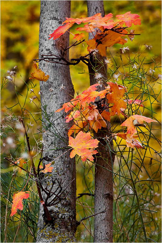
Autumn Bouquet, Zion National Park
Underexpose sunlit leaves to maximize color
Contrary to what many believe, fall foliage in bright sunlight is still photographable if you isolate backlit leaves against a darker background and slightly underexpose them. The key here is making sure the foliage is the brightest thing in the frame, and to avoid including any sky in the frame. Photographing sunlit leaves, especially with a large aperture to limit DOF, has the added advantage of an extremely fast shutter speed that will freeze wind-blown foliage.

Leaves and Reflection, Convict Lake, Eastern Sierra
Slightly underexposing brightly lit leaves not only emphasizes their color, it turns everything that’s in shade to a dark background. And if your depth of field is narrow enough, points of light sneaking between the leaves and branches to reach your camera will blur to glowing jewels.

Autumn Light, Yosemite
A sunstar is a great way to liven up an image in extreme light
If you’re going to be shooting backlit leaves, you’ll often find yourself fighting the sun. Rather than trying to overcome it, turn the sun into an ally by hiding it behind a tree. A small aperture (f16 or smaller is my general rule) with a small sliver of the sun’s disk visible creates a brilliant sunstar that becomes the focal-point of your scene. Unlike photographing a sunstar on the horizon, hiding the sun behind a terrestrial object like a tree or rock enables you to move with the sun.
When you get a composition you like, try several frames, varying the amount of sun visible in each. The smaller the sliver of sun, the more delicate the sunstar; the more sun you include, the more bold the sunstar. You’ll also find that different lenses render sunstars differently, so experiment to see which lenses and apertures work best for you.

Autumn Light, North Rim, Grand Canyon

Autumn Glow, Cook’s Meadow, Yosemite
Polarize away the foliage’s natural sheen
Fall foliage has a reflective sheen that dulls its natural color. A properly oriented polarizer can erase that sheen and bring the underlying natural color into prominence. To minimize the scene’s reflection, slowly turn the polarizer until the scene is darkest (the more you try this, the easier it will be to see). If you have a hard time seeing the difference, concentrate your gaze on a single leaf, rock, or wet surface.

Fallen Color, Rock Creek Canyon, Eastern Sierra
A polarizer isn’t an all-on or all-off proposition. Slowly dial the polarizer’s ring and watch the reflection change until you achieve the effect you desire. This is particularly effective when you want your reflection to share the frame with submerged feature such as rocks, leaves, and grass.

Morning Reflection, North Lake, Eastern Sierra
Blur water with a long exposure
When photographing in overcast or shade, it’s virtually impossible to freeze the motion of rapid water at any kind of reasonable ISO. Rather than fight it, use this opportunity to add silky water to your fall color scenes. There’s no magic shutter speed for blurring water—in addition to the shutter speed, the amount of blur will depend on the speed of the water, your distance from the water, your focal length, and your angle of view relative to the water’s motion. When you find a composition you like, don’t stop with one click. Experiment with different shutter speeds by varying the ISO (or aperture as long as you don’t compromise the desired depth of field).
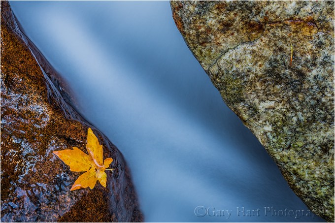
Autumn Leaf, Bridalveil Creek, Yosemite
Reflections make fantastic complements to any fall color scene
By autumn, rivers and streams that rushed over rocks in spring and summer, meander at a leisurely, reflective pace. Adding a reflection to your autumn scene can double the color, and also add a sense of tranquility. The recipe for a reflection is still water, sunlit reflection subjects, and shaded reflective surface.
When photographing leaves floating atop a reflection, it’s important to know that the focus point for the reflection is the focus point of the reflective subject, not the reflective surface. This is seems counterintuitive, but try it yourself—focus on the leaves with a wide aperture and watch the reflection go soft. Achieving sharpness in your floating leaves and the reflection requires an extremely small aperture and careful focus point selection. Often the necessary depth of field exceeds the lens’s ability to capture it—in this case, I almost always bias my focus toward the leaves and let the reflection go soft.

Autumn Reflection, El Capitan, Yosemite

Fallen Leaves, Valley View, Yosemite
Nothing communicates impending winter like fall color with snow
Don’t think the first snow means your fall photography is finished for the year. Hardy autumn leaves often cling to branches, and even retain their color on the ground through the first few storms of winter. An early snowfall is an opportunity to catch fall leaves etched in white, an opportunity not to be missed. And even after the snow has been falling for a while, it’s possible to find a colorful rogue leaf to accent an otherwise stark winter scene.

Fall into Winter, Bridalveil Fall, Yosemite

First Snow, El Capitan, Yosemite
Workshop Schedule || Purchase Prints
To better understand the science and timing of fall color, read
“A simple how and when of fall color“
A Gallery of Fall Color

, Yosemite")


:: More photography tips ::

