Eloquent Images by Gary Hart
Insight, information, and inspiration for the inquisitive nature photographer
The Third Time’s the Charm
Posted on December 12, 2022

Moonrise and Clouds, Tunnel View, Yosemite
Sony a7R IV
Sony 24-105 G
1/4 second
F/11
ISO 100
Large or small, crescent or full, I love photographing the moon rising above Yosemite. I truly believe it’s one of the most beautiful sights on Earth. The moon’s alignment with Yosemite Valley changes from month-to-month, with my favorite full moon alignment coming in the short-day months near the winter solstice when it rises between El Capitan and Half Dome (from Tunnel View), but I have a plan for each season. Some years the position and timing are better than others, but when everything clicks, I do my best to be there. And if I’m going to be there anyway, why not schedule a workshop? (He asked rhetorically.)
Strike one, strike two
For last week’s Yosemite Winter Moon photo workshop, I’d planned three moonrises, from three increasingly distant vantage points. On our first night, despite the cloudy vestiges of a departing storm, I got the group in position for a moonrise at a favorite Merced River sunset spot, hoping the promised clearing would arrive before the moon. The main feature here is Half Dome, but the clouds had other ideas. Though they eventually relented just enough to reveal Half Dome’s ethereal outline and prevent the shoot from being a complete loss, the moon never appeared. Strike one.
With a better forecast for the second evening, we headed into the park that afternoon with high hopes. But as the sun dropped, the clouds thickened to the point where not only did I fear we’d miss the moon again, I was pretty sure Half Dome would be a no-show as well. So I completely aborted the moonrise shoot and opted for sunset at Valley View, where El Capitan and freshly recharged Bridalveil Fall were on their best behavior. The result was a spectacular sunset that made me look like a genius (phew), but still no moon. Strike two.
Revisiting nature photography’s 3 P’s
Because the right mindset is such an important part of successful photography, many years ago I identified three essential qualities that I call the 3 P’s of Nature Photography:
- Preparation is (among many things) your foundation; it’s the research you do that gets you in the right place at the right time, the mastery of your camera and exposure variables that allow you to wring the most from the moment, and the creative vision, refined by years of experience, and conscious out-side-the-box thinking.
- Persistence is patience with a dash of stubbornness. It’s what keeps you going back when the first, second, or hundredth attempt has been thwarted by unexpected light, weather, or a host of other frustrations, and keeps you out there long after any sane person would have given up.
- Pain is the willingness to suffer for your craft. I’m not suggesting that you risk your life for the sake of a coveted capture, but you do need to be able to ignore the tug of a warm fire, full stomach, sound sleep, and dry clothes, because the unfortunate truth is that the best photographs almost always seem to happen when most of the world would rather be inside.
Most successful images require one or more of these three essential elements. Chasing the moon last week in frigid, sometimes wet, Yosemite got me thinking about the 3 P’s again, and how their application led to a (spoiler alert) success on our third and final moonrise opportunity.
Meanwhile…
As we drove into the Tunnel View parking lot, about 45 minutes before sunset, our chances for the moon looked excellent. There were a few clouds overhead, with more hanging low on the eastern horizon behind Half Dome, but nothing too ominous. My preparation (there’s one) had told me that the moon this evening would appear from behind El Capitan’s diagonal shoulder, about halfway up the face, and that area of the sky was perfectly clear. So far so good.
Organizing my group along the Tunnel View wall, I pointed out where the moon would appear, and reminded them of the previously covered exposure technique for capturing a daylight-bright moon above a darkening landscape. Eventually I set up my own tripod and Sony a7R IV, with my Sony 200 – 600 G lens with the 2X Teleconverter pointed at ground 0. In my pocket was my Sony 24 – 105 G lens, which I planned to switch to as soon as the moon separated from El Capitan. Then we all just bundled up against the elements and enjoyed the view, waiting for the real show…
But, as if summoned by some sinister force determined to frustrate me, the seemingly benign clouds hailed reinforcements that expanded and thickened right before our eyes. Their first victim was Half Dome, and it looked like they’d set their sights on El Capitan next. By the time sunset rolled around, my optimism had dropped from a solid 9 to a wavering 2. I knew the moon was up somewhere behind the curtain and tried to stay positive, but let everyone know that our chances for actually seeing it were no longer very good. I reminded them not to get so locked in on waiting for the moon that they miss out on the beauty happening right now. Ever the optimist, I switched to my 24-105, privately rationalizing that even without the moon, we’d had so much spectacular non-moon photography already, nobody could be unhappy. But still…
At that point it would have been easy to cut our losses, come in out of the cold (pain), and head to dinner. But I have enough experience with Yosemite to know that it’s full of surprises, and never to go all-in on it’s next move. So we stayed. And our persistence (we’ve checked all three now) was rewarded when, seemingly out of nowhere, a hole opened in the clouds and there was the moon. The next 10 minutes were a blur of frantic clicking and excited exclamation as my group enjoyed this gift we’d all just about given up on.
A few full moon photography tips
- Sun and moon rise/set times always assume a flat horizon, which means the sun usually disappears behind the local terrain before the “official” sunset, while the moon appears after moonrise. When that happens, there’s usually not enough light to capture landscape detail in the moon and landscape, always my goal. To capture the entire scene with a single click (no image blending), I usually try to photograph the rising full moon on the day before it’s full, when the nearly full (99% or so illuminated) moon rises before the landscape has darkened significantly.
- The moon’s size in an image is determined by the focal length—the longer the lens, the larger the moon appears. Photographing a large moon above a particular subject requires not only the correct alignment, it also requires distance from the subject—the farther back your position, the longer the lens you can use without cutting your landscape subject.
- To capture detail in a rising full moon and the landscape (in a single click), increase the exposure until the highlight alert appears on your LCD (any more exposure blows out the moon). At that point, you can’t increase the exposure any more, even though the landscape is darkening. You’ll be amazed by how much useable data you’ll be able to pull from the in nearly black shadows in Lightroom/Photoshop (or whatever your processing software). In the image I share above, my LCD looked nearly black except for the single white dot of moon. Eventually the scene will become too dark—exactly when that happens depends on your camera, but if you’re careful, you can keep shooting until at least 15 minutes after sunset.
Learn More
Moon Over Yosemite


Near, Middle, Far
Posted on December 5, 2022

El Capitan and Floating Autumn Leaves, Yosemite
Sony α1
Sony 16-35 f/2.8 GM
1/2 second
F/11
ISO 100
I’m in Yosemite for a workshop so my blogging time is significantly curtailed, but let’s see what happens…
Photography is the futile attempt to render a three dimensional world in a two dimensional medium. It’s “futile” because including actual depth in a photograph is literally impossible. But impossible doesn’t mean hopeless. One of the simplest things photographers can do to elevate their images is think about their scene in three dimensions, specifically how to create the illusion of depth by composing elements at multiple distances from the camera.
Many photographers miss opportunities by simply settling for the beautiful scene before them instead of looking for ways to make it even better. A more productive approach is to start with the beautiful aspect of the scene you want to emphasize (brilliant sunset, backlit flower, towering peak, vivid rainbow, plunging waterfall, whatever), then aggressively seek an object or objects nearer or farther to complement it. Of course that’s sometimes easier said than done, but this near/middle/far mindset should be present for every capture.
Thinking foreground and background is a great start, but merely having objects at varying distances isn’t always enough—you also need to be aware of how those objects guide your viewer’s eye through the frame. We hear a lot of photographers talk about using “leading lines” to move the eye, but a line doesn’t need to be a literal (visible) line to move the eye, because viewers will subconsciously connect objects to create virtual lines.
To help me achieve virtual lines that move the eye, I think in terms of “visual weight”: a quality of an object that tugs the eye like gravity, subconsciously pulling the viewer’s gaze in its direction. These qualities include, among other things: mass, shape, brightness, contrast, color, texture, and sometimes just position in the frame. A single one of these qualities can give an object visual weight, but combining then can be even more effective.
Additionally, an object’s emotional power can boost its visual weight. For example, a small moon can pull the eye more than a larger bright cloud, and Half Dome has more visual weight than a random rock occupying the same amount of frame real estate.
With my primary subject and complementary (eye moving) objects identified, I still need to consider the linear connection between these visual components. I like diagonal relationships because of the visual tension created by moving the eye along multiple planes. While creating these virtual diagonals requires careful positioning, it’s surprising how many photographers just remain planted with their tripod as if it has grown roots—either they don’t see the benefit of repositioning, or don’t think moving is worth the effort.
Whatever the reason, it’s important for photographers to understand the power of shifting position to control foreground and background relationships: move left and your foreground shifts right relative to the background; move right and the foreground shifts left relative to the background. Either way, the closer the foreground is relative to the background, the more dramatic the shift. And contrary to what you might believe, it’s impossible to change foreground/background perspective with focal length—to change perspective, you must change position: forward/backward, left/right, up/down.
An often overlooked shift that can be quite powerful is up/down. Often I’m able to un-merge objects at different distances by simply raising my tripod or climbing atop a nearby rock. Dropping low will emphasize the closest elements, and when my frame has a large and boring empty space (such as a field of weeds or dirt) between the foreground and background, I drop lower to shrink that gap.
It’s taken me a while to figure out the best way to convey these concepts to my photo workshop students. In most workshops, I find that many of the students haven’t picked up their cameras in weeks or months (or years!), so I’ve learned give them time to get back in their creative zone before laying all this stuff on them.
For example, in my Yosemite workshops I usually start with the classic shots that probably drew them to the park in the first place, places like Tunnel View and Valley View, where there are obvious compositions that lead to easy success. At the first image review I give a little talk on composition and moving the eye (among other things), then everyone shares images and I offer my feedback.
By the second day, armed with that foundation and a little Day 1 success, they’re usually ready to challenge their creativity and attack the less heralded spots whose beauty is more subtle. This growth is obvious as soon as the Day 2 image review. I’m frequently blown away by how quickly they’ve refined their inherent creative vision well enough to see beyond the obvious and find compositions that are both beautiful and unique.
One autumn favorite creative spot is the section of the Merced River from the Pohono Bridge upstream to Fern Spring, and even a little beyond. Fern Spring alone, with its stair-step cascades and a small reflecting pool that’s covered with color each fall, has enough to occupy a creative photographer for hours. And just across the road is a trail that skirts the river and traverses a forest filled with colorful maple and dogwood trees. The entire area is chock-full of creative opportunities that include whitewater, still water reflections, and of course (lots of) fall color.
In last month’s Fall Color and Reflections workshop, once I was satisfied that everyone was comfortable with their cameras and starting to trust their creative instincts, I took them to Fern Spring. Once there, I gave them the lay of the land and encouraged them to explore. Early in the workshop my groups tend to stick close to me, but this afternoon I was encouraged to see everyone instantly scatter. That’s always a good sign that they’re starting to get in the zone—even though it means I need to chase each one down to make sure they’re doing okay.
By the time I’d finished my rounds and confirmed that each person had things under control (and fearing that my presence might actually be a distraction), I was left with about 20 minutes to do a little shooting of my own. I quickly grabbed my camera and beelined upstream to a spot that I can’t take a group to because there’s no room for more than one person, no trail to get there, and it’s frighteningly easy to fall in the river. (I’ve had a couple of minor mishaps here that required changing shoes and socks, and maybe spending a couple of hours in pants wet to my calf, but was always grateful it wasn’t worse).
Rather than a standard fall color location, this is a fallen color spot that accumulates leaves that have drifted downstream from elsewhere to float among the rocks. Each year, the quality of the floating color varies from none to lots—not enough water and the leaves don’t make it into the rocks; too much water and the leaves just wash right by to locations downstream.
I was happy to confirm that this was indeed a good year for the floating color. Being in a hurry, I could have very easily snapped off a couple of frames from where I stood and called it good. But often the difference between an image that’s merely a decently executed rendering of a beautiful scene, and an image that stands out for the (often missed) aspects of the natural world it reveals, is the time it takes to identify and connect the scene’s visual relationships. So I took just a little more time to align the elements.
In this case that meant positioning myself so the foreground rocks and leaves aligned with the middle-ground rocks and reflection, which aligned with cloud-shrouded El Capitan in the background. Words cannot express how awkward this position was, requiring a grand total of 5 splayed legs—3 tripod and 2 human. But still it wasn’t quite right—until I dropped my tripod down to about a foot above the water to make the leaves more prominent.
After setting my exposure, I focused on the third small foreground rock, then dialed my polarizer to reduce the reflection on the leaves while retaining the upstream reflection. Click.
Near, Middle, Far
Click any image to scroll through the gallery LARGE


Secure Your Borders
Posted on November 28, 2022

Autumn Leaves on the Rocks, Valley View Reflection, Yosemite
Sony a7R IV
Sony 24-105 G
1/40 second
F/16
ISO 100
It’s easy to be overwhelmed at the first sight of a location you’ve longed to visit for years. And since by the time you make it there you’ve likely seen so many others’ images of the scene, it’s understandable that your perception of how the scene should be photographed might be fixed. But is that really the best way to photograph it?
Valley View in Yosemite is one of those hyper-familiar scenes. El Capitan, Bridalveil Fall, and Cathedral Rocks pretty much slap you in the face the instant you land at Valley View, making it easy to miss all the other great stuff here. This month’s workshop group visited Valley View twice, with each visit in completely different conditions, which got me thinking about about the number of ways there are to photograph most scenes, and how it’s easy to miss opportunities if you simply concentrate on the obvious. Most scenes, familiar or not, require scrutiny to determine where the best images are—on every visit.

Sunrise Reflection, El Capitan, Yosemite
On our first visit, Bridalveil Fall was just a trickle lost in deep shadow, so I focused my attention on El Capitan, opting for a vertical frame to emphasize El Cap, the beautiful clouds overhead, and the reflection. When we returned a couple of days later, Bridalveil had been recharged by a recent rain, the soft light was more even throughout the scene, and patches of fallen leaves and pine needles now floated atop the reflection. All this called for a completely different approach.
On this return visit, since I thought there was (just barely) enough water in Bridalveil to justify its inclusion, I went with a horizontal composition. It would have been easy to frame up El Capitan, Bridalveil, and Cathedral Rocks, throw in a little reflection and call it good. But (as my workshop students will confirm) I obsess about clean borders because I think they’re the easiest place for distractions to hide.
So before every click, I do a little “border patrol,” a simple reminder to deal with small distractions on my frame’s perimeter that can have a disproportionately large impact on the entire image. (I’d love to say that I coined the term in this context, but I think I got it from fellow photographer and friend Brenda Tharp—not sure where Brenda picked it up.)
To understand the importance of securing your borders, it’s important to understand that our goal as photographers is to create an image that not only invites viewers to enter, but also persuades them to stay. And the surest way to keep viewers in your image is to help them forget the world outside the frame. Lots of factors go into crafting an inviting, persuasive image—things like compositional balance, visual motion, and relationships are all essential (and topics for another day), but nothing reminds a viewer of the world outside the frame more than an object jutting in or cut off at the edge.
When an object juts in on the edge of a frame, it often feels like part of a different scene is photobombing the image. Likewise, when an object is cut off on the edge of the frame, it can feel like part of the scene is missing. Either way, it’s a subconscious and often jarring reminder of the world beyond the frame. Not only does this “rule” apply to obvious terrestrial objects like rocks and branches, it applies equally to clouds.
And there are other potential problems on the edge of an image. Simply having something with lots of visual weight—an object with enough bulk, brightness, contrast, or anything else that pulls the eye—on the edge of the frame can throw off the balance and compete with the primary subject for the viewer’s attention.
Of course it’s often (usually?) impossible to avoid cutting something off on the edge of the frame, so the next best thing is to cut it boldly rather than to simply trim it. I find that when I do this, it feels intentional and less like a mistake that I simply missed. And often, these strongly cut border objects serve as framing elements that hold the eye in the frame.
To avoid these distractions, I remind myself of “border patrol” and slowly run my eyes around the perimeter of the frame. Sometimes border patrol is easy—a simple scene with just a small handful of objects to organize, all conveniently grouped toward the center, usually requires minimal border management. But more often than not we’re dealing with complex scenes containing multiple objects scattered throughout and beyond the frame. Even when you can’t avoid cutting things off, border patrol makes those choices conscious instead of random, which is almost aways better.
As nice as the Valley View reflection was on this visit, it was sharing space with a disorganized mess of rocks, driftwood, and leaves. Organizing it all into something coherent was impossible, but I at least wanted to have prominent color in my foreground and take care to avoid objects on the edge of my frame that would pull viewers’ eyes away from the scene.
Unfortunately, as I used to tell my kids all the time (they’re grown and no longer listen to me), you can’t always have what you want. In this case, including the best foreground color also meant including an unsightly jumble of wood, rock, and pine needles in the lower right corner. But after trying a lot of different things, I decided this was the best solution—especially since I managed to find a position and focal length that gave me completely clean borders everywhere else in my frame.
I very consciously included enough of the mass in the lower right that it became something of a boundary for that corner of the image (not great, but the best solution possible). I also was very careful to keep an eye on the ever-changing clouds. The light on El Capitan that broke through just as I had my composition worked out felt like a small gift.
Workshop Schedule || Purchase Prints || Instagram
Valley View Variety


Pandemic Lessons
Posted on November 21, 2022
Autumn Reflection, Three Brothers, Yosemite
Sony a7RIV
Sony 24-105 G
1/13 second
F/11
ISO 100
It feels trite to wait until Thanksgiving week to detail blessings I feel year-round, but there’s nothing like a global pandemic and all its disruptions to refocus priorities. Pre-Covid Thanksgivings were an opportunity to remind myself to appreciate my life by concentrating on the big stuff like good health, a loving family, and a career that lets me travel and (almost) never feels like work. Since Covid, I’m simply grateful for the resumption of family gatherings (large and small), unrestricted travel, and (not insignificantly) the return of the bottom half of everyone’s face—things I swear I’ll never again take for granted.
Another thing I’ve grown to appreciate about my current life, also underscored by the pandemic, is the autonomy of self-employment. While losing workshops was incredibly stressful, once I convinced myself that the lost workshops were simply postponed and not cancelled, I was able to use the downtime productively—without flapping in the ever-changing breeze of government and employer workplace rules.
I do have to admit that sometimes the idea of a 9-to-5 job with weekends and paid vacations sounds mighty good (I’m speaking in very general terms and don’t mean to offend anyone pinned to a cubicle 10 hours per day just to pay the bills—I’ve been there), but the bottom line is that I do love the flexibility of having complete control of my schedule.
When I left the 9-to-5 world to pursue this crazy passion more than 15 years ago, the vanished safety net was a great motivator—I was only as successful as the next art show (which I no longer do) or photo workshop. Weekends? Holidays? Irrelevant. Back then, the closest I got to a vacation was when my wife and I traveled to scout for a new workshop. And alarm clocks? They’re for workshop sunrises only.
But as the years go by (is it me, or is time moving faster?), I’ve come to truly value my freedom—in no small part because I’ve learned how to manage it. Today I can look at my calendar and, if nothing’s there, do whatever I want. And while that might mean cramming the things that must be done into times when others might be in their recliner watching HBO, or sunbathing at the beach, it’s 100 percent my choice and I love it.
The pandemic restrictions also helped me realize that I may have even started to take for granted my home that’s close enough to Yosemite that I can drive there and back in a day. To prevent this in the past, each time I enter the park I’ve always tried to imagine I’m viewing it for the first time, but since the pandemic I’ve been doing this with renewed focus and appreciation and it feels good.
An under-the-radar revelation when my workshops resumed was how much I missed the people. I knew I missed my workshop students, but it surprised me how much I enjoyed their return. This month’s Yosemite Fall Color and Reflections group, a wonderful blend of humor and enthusiasm that made my job easy, did nothing to dispel my enthusiasm.
Since there was a little bit of weather during most of the workshop (nice clouds, a little rain and snow), I deviated from my typical schedule, one day delaying my normal midday break when the conditions were too good to stop, and throughout the workshop adjusting my visits to other locations to account for the special conditions.
The fall color and reflections were in fact spectacular as advertised, but with the waterfalls pretty much their normal autumn dry (Bridalveil Fall was a trickle, Yosemite Falls was just a wet stain with no visible water flowing), we turned to Yosemite’s monoliths for background and reflection subjects.
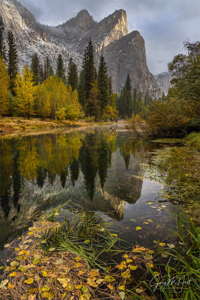
Perhaps Yosemite’s most underrated granite feature is the Three Brothers. While technically not a monolith (a triolith?), the Three Brothers—Lower Brother, Middle Brother, and… (go ahead, guess)…, wrong(!), it’s Eagle Peak—is to my eye one of Yosemite’s most striking features. Nevertheless, despite its towering presence above the heart of Yosemite Valley, many Yosemite visitors never see the Three Brothers. That’s because when viewed from the east, Three Brothers looks an ordinary granite wall that just kind of blends into the scenery, and from most west-side vantage points, it’s blocked by El Capitan. And nowhere in the valley is Three Brothers clearly visible without a small effort (you can’t just pull into a vista and hop out of the car to view it.)
So it’s always fun to walk my groups out to this spot on the Merced River for their first look at Three Brothers. Even here, with the view dominated by El Capitan, I sometimes need to point upstream to the Three Brothers and let them know this will be their only opportunity to photograph it.
On this chilly morning earlier this month we started at the spot with the best El Capitan view (least obstructed by trees) and a decent Three Brothers view. I told the group that about 100 yards downstream they’d get a better Three Brothers view and reflection, as well as a decent (partially tree-obstructed) El Capitan view. I gave them plenty of time for both spots and encouraged them to take advantage of it.
On the morning of our visit, golden cottonwoods colored the reflection that stretched from riverbank to riverbank and was fringed by a sprinkling of leaves. The sky was mostly cloudy, but every once in a while a shaft of sunlight would break through and spotlight part of El Capitan or the Three Brothers for a few seconds. Even though I come here a lot, I found these conditions were too nice to resist taking a few clicks of my own.
I was looking for leaves to put in my foreground when I found this view at the downstream vantage point. Getting out here required some serious mud sloshing (thank you waterproof boots!), but thanks to an encroaching shoreline and photobombing patch of grass, still struggled to get the entire reflection. I finally decided that by elevating my tripod to the max and planting it as far into the river as my arms could reach, I could separate Lower Brother’s reflection from the shoreline and get 2/3 of the brothers—the best I could do. My polarizer I oriented to remove the reflection from the leaves, but was still able to spare enough of the Three Brothers and trees reflection to recover it in Photoshop.
Have a great Thanksgiving! (I realize this is an America-only holiday, but I strongly encourage everyone, holiday or not, to pause from time to time to appreciate their good fortune, whatever it might be.)
Epilogue
I’m also thankful for heated seats and noise cancelling headphones.
Yosemite’s Monoliths
Click any image to scroll through the gallery LARGE


Variations on a Scene
Posted on November 14, 2022
Autumn Leaves and Reflection, Half Dome, Yosemite
Sony α1
Sony 16-35 f/2.8 GM
1.3 seconds
F/11
ISO 100
One million words
January 2023 will mark the start of my (more or less weekly) Eloquent Nature blog’s 13th year. Not counting the 30 or so sporadically created Photo Tips articles, today’s post will be number 710. Doing the math, that actually turns out to be more than 1 blog post per week; at 1500 words per post (a conservative estimate), I’ve written more than 1 million words. Yikes.
According to WordPress, I have nearly 40,000 followers, but so far have resisted the urge to monetize my creation. I have nothing against money (I in fact kind of like it), but haven’t yet found a way to generate dollars from my blogging effort without detracting from the page or cheapening the visitors’ experience. (So, you’re welcome.)
But my motives aren’t entirely altruistic. Writing about creativity and inspiration each week encourages introspection that has given me a clearer understanding of myself and the creative process. And my (obsessive) desire to understand my subjects has cause me to research and ponder countless topics that might otherwise have been off my radar.
My drive to write just seemed to happen organically. I remember in first or second grade, each Monday we’d be assigned a list of spelling words (am I dating myself, or do they still do that?) to learn for the spelling test that always came on Friday. To help us learn that week’s words, the week’s homework assignment was to a create “spelling sentences,” one for each word. Instead of spelling sentences, I would write spelling stories that used every one of a the week’s words—I can’t explain why, except that I thought it was fun.
And ever since, whether it was in school or at work, I somehow became the designated writer—not necessarily because I was better at it, more because I was the most willing to do it. From there it wasn’t much of a leap for that willingness to write to become part of my job description. Eventually I became a tech writer for a large Silicon Valley tech company.
I’ve somehow managed to avoid the trap that befalls many creatives, where merely attempting to monetize their passion robs them of its joy. And I feel extremely lucky to have two creative pursuits, photography and writing, that give me great pleasure and synergistically combine to support me financially.
I’m thinking about this because I’ve decided to (slightly) change my blogging schedule, and I’ve found that a surprising number of people seem to notice when my weekly post is late, even by just a day. (Nothing abusive, more like occasional mild disappointment.) Of course it very much pleases (and surprises) me to hear that people actually look forward to my posts and actually read them.
So what’s this big change? For years my personal commitment was to post a new blog each Sunday. I’ve actually become pretty good at meeting this goal, but as my wife recently pointed out, this commitment pretty much blows up our weekend. Since we both work from home, on schedules entirely of our own making, weekends are really just a state of mind for both of us (there’s a reason we’ve each set our watches to display the day of the week)—I never considered our lost weekends a big deal. But I do have to admit that it would be nice to be a little more in sync with the rest of the world’s weekend state of mind, and have therefore made the radical decision to move my weekly blog day to, wait for it… Monday. Whoa.
(Only a writer would come up with 500 words explaining something that could have been said in 10 words: Effective this week, new blog posts will appear on Mondays.)

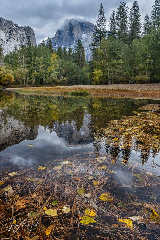
Autumn Leaves and Reflection, Half Dome, Yosemite
So anyway
If you’re still with me (thank you), you’ve probably already forgotten about the image at the top of this post. It’s another product of last week’s incredibly rewarding Yosemite Fall Color and Reflections photo workshop. Rewarding because it was a great group that very much deserved the wonderful photography we enjoyed: nice clouds throughout, a couple of clearing storms, a colorful sunrise (not as common in Yosemite as you’d think), (only) one morning of bright sunlight that came just as we were in the perfect spot for it (Cook’s Meadow elm tree, if you must know), and even a little snow.
And what’s a “fall color and reflections” workshop without actual fall color and reflections? This year’s Merced River was its usual low and slow reflective self, and the fall color was just starting to peak. So yeah, a pretty good week.
The workshop’s final shoot was at one of my favorite Yosemite Valley Half Dome views, just upriver from Sentinel Bridge. I photograph here a lot. A. Lot. So much that I rarely get out my camera when I’m with a group. But I made an exception this time because I liked the clouds hovering around Half Dome, the light was just so darn nice, and I found a foreground I could work with.
Finding unique images at frequently photographed locations is usually some combination of special conditions and/or a new foreground. The conditions this evening, while not spectacular, were definitely good, and I was able to combine that with a static pool in the Merced that had accumulated a colorful assortment of leaves and pine needles. Dropping my tripod/camera to about 2 feet above the ground, I eliminated a large empty gap between the leaves and Half Dome’s reflection to make my foreground about nothing but the best stuff.
Because the group was my priority, after finding my composition, I just left the tripod/camera in place while I worked with them, returning every 5 or 10 minutes to fire off a handful of frames. The clouds around Half Dome were changing rapidly, so even though my composition didn’t change (at all), each session gave me something a little different.
The only other thing that changed with each click was my polarizer orientation. This was one of those catch-22 conundrums where dialing up the reflection with my polarizer also dialed up the reflective (color robbing) sheen on the floating leaves, and brightened the water on which the leaves floated (reducing the contrast between the leaves and their background). Dialing the reflection down to maximize the color of the leaves and blacken the water also nearly erased the Half Dome and clouds reflection.
So with each visit to my camera, I fired at least one frame with the reflection maximized, another with it minimized, and a couple somewhere in between. I found that I could in fact hit a midway point with the polarizer that spared most of the reflection beyond the leaves (Half Dome and the clouds), and reduced most of the reflection on and around the leaves.
-

- Autumn Snow, Half Dome Reflection, Yosemite
-

- Autumn Snow and Reflection, Half Dome, Yosemite
-

- Autumn Reflection, Half Dome, Yosemite
I won’t pretend that I’ve created a brand new take on this frequently photographed view, but I am pretty pleased to have found a new variation on one of my favorite scenes.
See you next Monday…
Yosemite Fall Color and Reflections
Click any image to scroll through the gallery LARGE


No Secrets
Posted on November 6, 2022

Sunrise Reflection, El Capitan, Yosemite
Sony a7RIV
Sony 24-105 G
.6 seconds
F/11
ISO 50
It amuses (and frustrates) me when photographers guard their information like state secrets. Photography isn’t a competition, and I’ve always felt that the more photographers can foster a sense of community, the more everyone benefits. (I will, however, protect locations at risk of being damaged by too much attention.) With that in mind, I’m sharing below some of the photography insights I’ve learned from a lifetime of Yosemite visits, and encourage you to share your own insights, wherever and whatever they may be, when the opportunity arises.
Yosemite FAQs
I get asked all the time, what’s the best season to be in Yosemite? For many reasons, including the fact that everyone defines “best” differently, that’s an impossible question to answer. So instead I try to identify the pros and cons of each season in Yosemite and let the questioners decide for themselves what sounds best to them.
- Winter: Because the crowds have vacated, Yosemite is at its most peaceful in winter. And it’s never more beautiful than when smothered with fresh snow, but in the relatively warm temperatures of Yosemite Valley, snowstorms only happen a few times each winter so I try to time my visits so I can be there during a storm.
- Spring: With its booming waterfalls, vivid greens, mirror-like vernal pools, and ubiquitous dogwood blooms (okay, so technically they’re bracts), spring is classic postcard Yosemite. Spring is also when the crowds return.
- Summer: For tourists only—but if you find yourself in Yosemite on a crowded (understatement) summer day, rising at the first sign of pre-sunrise light will give you at least a couple of hours of glorious peace.
- Autumn: By autumn the crowds have left, and while Yosemite’s waterfalls have fallen silent, the low and slow water turns the Merced River into a reflecting ribbon that splits Yosemite Valley. The resulting mirror reflections of granite monoliths mingling with the season’s red and gold are one of my favorite things to photograph in Yosemite.
Another question I get asked a lot is some version of, “Where in Yosemite should I photograph sunrise/sunset.” Again there’s no absolute answer, so I just try to provide enough information for the questioners to make their own decisions.
- Sunrise: Yosemite is not an inherently good sunrise location. In fact, on a typical California clear sky morning, it’s pretty lousy. That’s because most of Yosemite Valley’s best views face east, toward shaded subjects against the brightest part of the sky. Clouds flip the equation, subduing the bright sky and (fingers crossed) filling it with color. But even the cloudless days aren’t an excuse to stay in bed. On these days try to be in position for the first light on El Capitan, about 15/20 minutes after the “official” (flat horizon) sunrise. And in winter Yosemite Falls also gets beautiful morning light.
- Sunset: Even without clouds, Half Dome gets nice sunset light year-round. In the long-night months (from the autumnal equinox to the vernal equinox) so does El Capitan. In the long-day months (from the vernal equinox to the autumnal equinox), the late light goes to Cathedral Rocks and Bridalveil Fall.
Send in the clouds
Regardless of the season, clouds change everything, especially when storm clouds that swirl about Yosemite’s monoliths. Even high or thin clouds can be difference makers that paint the usually boring sky with color and (if you’re lucky) reflect in foreground water.
Unfortunately, storm clouds often drop all the way to the valley floor, obscuring all the features you traveled to photograph. Rather than giving up, my approach to stormy weather in Yosemite is to wait it out. A clearing storm is the Holy Grail of Yosemite photography, an experience that never gets old, no matter how many times it’s witnessed. And when I say wait it out, I don’t mean just returning to your room and looking outside every once in a while, I mean circling the valley in your car, or parking somewhere with an eye on the sky. Tunnel View is a great spot for this.
My other tip for photographing a clearing storm in Yosemite is not staying in one place too long. If you wait until it’s not beautiful anymore before moving on, you won’t leave until the show’s over everywhere—instead, remind yourself that it’s just as beautiful everywhere else, and move on when you find yourself repeating compositions.
Reflecting on reflections
Regardless of the location or conditions, a reflection can turn an ordinary pretty picture into something special. That’s especially true in Yosemite. Yosemite’s reflection spots change with the season: in spring, they’re best in the vernal pools that form in the meadows, and a small handful of Merced River spots, where it widens (like Swinging Bridge) or pools near the river’s edge; in autumn (and late summer), pretty much the entire Merced River is a mirror. Winter Merced River reflections can be nice too, depending on the weather and amount of runoff.
A lifetime of Yosemite visits helps me pursue its reflections. But even if you don’t know the spots for Yosemite reflections, they’re not hard to find if you keep your eyes open.
The most frequent reflection mistake I see is photographers walking past a reflection because it doesn’t contain an interesting subject. Maximizing reflection opportunities starts with understanding that, just like a billiard ball striking a cushion, a reflection always bounces off the reflective surface at exactly the same angle at which it arrived.
Armed with this knowledge, when I encounter any reflective surface, I scan the area for a reflection-worthy subject and position myself to intercept my target subject’s reflected rays, moving left/right, forward/backward, up/down until my reflection appears. Another important aspect of reflection management is juxtaposing the reflection with submerged or exposed objects in the water.
Putting it all together
These cloud and reflection factors aligned for me in last week’s Yosemite Fall Color and Reflections workshop. Based on the weather forecast when we wrapped up the previous night, I gathered the group early enough for our sunrise departure to swing into Tunnel View for quick survey of Yosemite Valley. If there had been no clouds, clearing storm clouds, or zero-visibility clouds, we’d have stayed there. But when I saw a nice mix of high to mid-clouds, I went with Plan-B and beelined to Valley View.
We arrived more than 30 minutes before sunrise and I was pleased to see only one other car in the parking lot. I’d already brought my group here once, so everyone already had an idea of what they wanted to do—a few went just upstream from the cars to the nice reflection of Cathedral Rocks and Bridalveil Fall; the rest made their way out to the new-ish (last couple of years) and quite conveniently placed logjam that provides a perspective of El Capitan that previously would have required walking on water to achieve.
I left my gear in the car, moving back and forth between the two cohorts and and monitoring the sky. I’ve photographed here so much, I had no plan to this morning, but when the clouds overhead started to pink up, I couldn’t resist. Rather than grabbing my entire camera bag, I just pulled out my tripod and Sony a7R IV with the Sony 24-105 f/4 G lens already attached and trotted down to the natural platform formed by the log jam.
I knew I didn’t have much time, so I quickly found a spot where, by dropping my tripod a little, I could frame El Capitan’s reflection with several of the many protruding rocks. Since Bridalveil Fall wasn’t flowing very strongly, and the light on El Capitan was better, I went with a vertical composition that featured El Capitan only.
The pink was so intense that for a minute or so, it slightly colored the rocks. Before the color faded, I managed to capture several frames with this composition, each with a slightly different polarizer orientation, but I ended up choosing the one that maximized the reflection.
Workshop Schedule || Purchase Prints || Instagram
Yosemite Autumn Reflections
Click any image to scroll through the gallery LARGE


Ready or Not…
Posted on October 30, 2022

Moonrise Through the Trees, Olmsted Point, Yosemite
Sony α1
Sony 100-400 GM
ISO 800
f/16
1/500 second
Let’s review
Consistently finding great photo opportunities isn’t just luck, but neither is it a divine gift. With that in mind, I sometimes refer to “The 3 P’s of nature photography,” describing the effort and sacrifice necessary to consistently create successful landscape images: Preparation, Persistence, and Pain.
- Preparation is your foundation, the research you do that puts you in the right place at the right time, the mastery of your equipment that allows you to wring the most from the moment, and the creative vision honed from prior experience.
- Persistence is patience with a dash of stubbornness. It’s what keeps you going back when the first, second, or hundredth attempt has been thwarted by unexpected light, weather, or a host of other frustrations. Persistence keeps you out there long after any sane person would have given up.
- Pain is the willingness to suffer for your craft. I’m not suggesting that you risk your life for the sake of a coveted capture, but you do need to be able to ignore the lure of sound sleep, a full stomach, dry clothes, and a warm fire, because the unfortunate truth is that the best photographs almost always seem to happen when most of the world would rather be inside.
Of course every once in a while you might come across an image that simply fell into your lap and all you had to do was whip out your smartphone and click. But those images are few and far between, and I daresay are rarely as rewarding as the images you worked for.
Picking a favorite image and trying to assign one or more of the 3 P’s to it is a fun little exercise I sometimes use to remind myself to keep doing the extra work. Take a few minutes to scan your portfolio; ask yourself how many didn’t require at least one of the 3 P’s. (I’ll wait.) …….. See what I mean?
Ready or not, here it comes

Moonrise Through the Trees, Olmsted Point, Yosemite
For this image, I will thank preparation. But, if you know how obsessively I plan my moonrises, not the kind of preparation you might think. Since I started photographing the moon long before The Photographer’s Ephemeris and other moon-plotting apps were available (long before smartphones, in fact), my moonrise/set workflow has always been to just plot everything manually using location-specific moon altitude and azimuth data, combined with topo map software (pretty much the same thing TPE does behind the curtain). But I didn’t do that for this moonrise because the moon wasn’t on my radar this evening.
Guiding my Eastern Sierra workshop group to Olmsted point for the workshop’s final sunset, I hadn’t plotted the moon because this workshop didn’t coincide with the full moon (I’d scheduled it for peak fall color, not the moon), and because the moonrise doesn’t align with any feature of particular interest at Olmsted Point.
But even when the moon isn’t part of my plan, it’s never far from my mind. (This is where the preparation part kicks in.) I always make it a point to know what the moon is doing, both its phase and general rise/set time and direction, whenever I’m out with my camera. Once I got my group situated on the granite at Olmsted Point, I mentally checked on the moon. Knowing that a 90% waxing gibbous moon would be rising in the southeast a couple of hours before sunset, I wondered how long it would take it to crest the ridge above us.
On my iPhone is an app called Theodolite that I can point at any feature to learn its altitude and azimuth in degrees of whatever I point it at. I wouldn’t trust this data enough to engineer a bridge, but since it works without connectivity, it’s perfect for exactly what I wanted to do—get a general idea of when and where the moon would appear. I pointed Theodolite at the ridge (using my phone’s camera, it computes and transposes the various angles on the display), and learned that the ridge rose 8 degrees above my location.
Next I switched to my Focalware app (which also doesn’t require connectivity) and learned that the moon should appear (rise to 8 degrees) a little less than 30 minutes before sunset. Focalware also gives me the moon’s azimuth at any given time, an angle I was able to find on the ridge using Theodolite (by pointing it at the ridge and shifting the view until the crosshairs aligned with the desired azimuth), giving me a general idea of the location on the ridge where the moon would rise.
Not only was I able to alert my group to this bonus moonrise, I was able to tell them when and where to look. The light on Half Dome was so good that some decided to pass on the moon, but those who wanted to photograph it had plenty of time to set up with their desired lens and composition.
For the moon’s appearance, especially when there isn’t an iconic landscape feature to pair it with, I like going long, the longer the better. Even though I had no expectation of using it, I’d still carried my Sony 100-400 GM lens on the short hike out to Olmsted—because, well, you never know. That, combined with my Sony 2X Teleconverter (which I also always carry), gave me 800mm.
There was nothing special about the ridge, so I tried to find a tree (or trees) to juxtapose with the rising moon. Though I knew about where the moon would appear, I wouldn’t know exactly where to point until I actually saw it. So I identified a few potential target trees, then pasted my eyes on the ridge.
By the time the moon rose, the warm light from the setting sun was just about to leave the granite. I raced to the spot that aligned with the first tree I’d identified and went to work. As soon as the moon separated from the ridge, I sprinted along the granite until I could frame it with a pair of trees, shifting slightly after every two or three clicks.
To summarize…
The preparation I credit for this image starts with my general sense of the moon’s phase at rise time. I was also there with all the tools I needed, from my long lens and teleconverter, to a couple of apps that allowed me to get the information I needed on the fly. And finally, because the moon ascends surprisingly fast, it helped a lot to have pre-identified my foreground targets.
Moon Over Yosemite


Just a Dash of Rainbow
Posted on May 22, 2022

Bridalveil Rainbow, Tunnel View, Yosemite
Sony 𝛂1
Sony 24-105 G
1/60 second
F/10
ISO 100
I’ve spent the last week moving, and with my annual Grand Canyon Raft Trip for Photographers launching Tuesday, I haven’t had a lot of time for blogging (and much else). But I’m still committed to posting a new blog each week, so I’m sharing a new image from one of this spring’s Yosemite workshops, and a brief description of its capture. I also dusted off and polished up the Rainbow article from my Photo Tips tab. I’ll be off the grid until May 31, so next week’s post will likely be a little late.
It’s become a tradition to kick off my Yosemite spring workshops with a rainbow on Bridalveil Fall. Though the timing varies with the date, I’ve done it enough to narrow the rainbow’s start down to about a 2 minute window for whatever date I’m there. Not only is this little dash of rainbow a thrilling spectacle and beautiful introduction to Yosemite, it also creates an (unjustified) illusion of genius for the workshop leader.
With rain and maybe even a little snow, this year’s weather forecast for our first day looked great in many ways, but not so much for rainbows. But rainbow or not, Tunnel View is a great spot to start a workshop because it’s the most complete view of all things Yosemite. It’s also the first place Yosemite’s storms clear, so even without sunlight something special might be in store.
The storm was just starting to clear when we arrived and I almost got trampled as my group raced to set up. Between the swirling clouds and Half Dome’s appearance (not always a sure thing during a Yosemite clearing storm), things were already going pretty well when shafts of light broke through to illuminate random parts of the valley and surrounding granite.
I checked my watch and crossed my fingers when I realized that we’d be able to add a rainbow to Bridalveil if the light were to make it there. A couple of minutes later Leaning Tower (the diagonal just to the right of the fall) lit up, and a few seconds later a small patch of light hit the evergreens in front of the fall.
After telling everyone what was about to happen, I set up my composition and said a little prayer that the light would cooperate. The patches of light quickly expanded and merged and there it was. I often shoot this rainbow with a telephoto because the sky is so often blank blue, but the whole scene was so beautiful this afternoon that I went with my Sony 24-105 G lens on my (brand new!) Sony a1.
This was the very first time I’d used this camera, and while I thought I’d set it up to match my Sony a7RIV, I soon discovered that I’d missed a few things. For example, I usually shoot in single shot mode, but my a1 was in fast continuous mode, an oversight that became apparent when my first shutter press (slow and gentle, as always) fired off 6 identical frames before I released my finger. My goodness is this camera fast.
I have so many images of this rainbow that I only photographed it for a couple of minutes—just long enough to be confident that I’d captured something I didn’t have. When I finished shooting I just stood back to watch the rainbow move up the fall—and to listen to the exclamations of marvel from the group.
Fortunately none of my settings oversights were a major hindrance and were quickly corrected. Since that afternoon I’ve used my a1 enough to know that I’m going to love using it, and can’t wait to try it out in the Grand Canyon this week.
Read on to learn about rainbows, how to anticipate them, and how to photograph them…
All About Rainbows
Let there be light
Most people understand that a rainbow is light spread into various colors by airborne water drops. Though a rainbow can feel like a random, unpredictable phenomenon, the natural laws governing rainbow are actually quite specific and predictable, and understanding these laws can help photographers anticipate a rainbow and enhance its capture.
The sun’s visible wavelengths are captured by our eyes and interpreted by our brain. When our eyes take in light comprised of the full range of visible wavelengths, we perceive it as white (colorless) light. Color registers when some wavelengths are more prevalent than others. For example, when light strikes an opaque (solid) object such as a tree or rock, some of its wavelengths are absorbed; the wavelengths not absorbed are scattered (reflected). Our eyes capture this scattered light, send the information to our brains, which interprets it as a color. When light strikes water, some is absorbed, some passes through to reveal the submerged world, and some light is reflected by the surface as a reflection.

Light traveling from one medium to another (e.g., from air into water) refracts (bends). Different wavelengths refract different amounts, causing the light to split into its component colors.
To understand the interaction of water and light that creates a rainbow, it’s simplest to visualize what happens when sunlight strikes a single drop. Light entering a water drop slows and bends, with the shorter wavelengths bending more than the longer wavelengths: refraction. Refraction separates the originally homogeneous white light into the myriad colors of the spectrum: red, orange, yellow, green, blue, indigo, violet (in that order).
But simply separating the light into its component colors isn’t enough to create a rainbow. Actually seeing the rainbow spectrum caused by refracted light requires that the refracted light be reflected back to our eyes somehow.
A raindrop isn’t flat like a sheet of paper, it’s spherical, like a ball. Light that was refracted when it entered the front of the raindrop, continues through to the back of the raindrop, where some is reflected. To view a rainbow, our eyes must be in the correct position to catch this reflected spectrum of color—fortunately, this angle is very consistent and predictable.
Red light reflects at 42 degrees, violet light reflects at 40 degrees, while the other spectral colors reflect back between 42 and 40 degrees. That’s why the top color of the primary rainbow is always red, the longest visible wavelength; the bottom color is always violet, the shortest visible wavelength.
Follow your shadow
Every raindrop struck by sunlight creates a rainbow somewhere. But just as the reflection of a mountain peak on the surface of a lake is visible only when viewed from the angle the reflection bounces off the lake’s surface, a rainbow is visible only when you’re aligned with the 42 – 40 degree angle at which the raindrop reflects light’s refracted spectrum of rainbow colors.
Lucky for most of us, viewing a rainbow requires no knowledge of advanced geometry. To locate or anticipate a rainbow, put your back to the sun and picture an imaginary line originating at the sun, entering the back of your head, exiting between your eyes, and continuing into the landscape in front of you—this line points to the “anti-solar point,” an imaginary point exactly opposite the sun from your viewing position.
It helps to remember that your shadow always points toward the anti-solar point—and toward the center of the rainbow, which forms a 42 degree circle around the line connecting the sun and the anti-solar point. Unless we’re in an airplane or atop a mountain peak, we don’t usually see the entire circle because the horizon gets in the way. So when you find yourself in a mixture sunlight and rain, locating a rainbow is as simple as following your shadow and looking skyward—if there’s no rainbow, the sun’s probably too high.
High or low
Sometimes a rainbow appears as a majestic half-circle, arcing high above the distant terrain; other times it’s merely a small arc hugging the horizon. As with the direction of the rainbow, there’s nothing mysterious about its varying height. Remember, every rainbow would form a full circle if the horizon didn’t get in the way, so the amount of the rainbow’s circle you see (and therefore its height) depends on where the rainbow’s arc intersects the horizon.
While the center of the rainbow is always in the direction of the anti-solar point, the height of the rainbow is determined by the height of the anti-solar point, which will always be exactly the same number of degrees below the horizon as the sun is above the horizon. It helps to imagine the line connecting the sun and the anti-solar point as a fulcrum, with you as the pivot—picture yourself in the center of a teeter-totter: as one seat rises above you, the other drops below you. That means the lower the sun, the more of the rainbow’s circle you see and the higher it appears above the horizon; conversely, the higher the sun, the less of the rainbow’s circle is above the horizon and the flatter (and lower) the rainbow appears.

Assuming a flat, unobstructed scene (such as the ocean), when the sun is on the horizon, so is the anti-solar point (in the opposite direction), and half of the rainbow’s 360 degree circumference will be visible. But as the sun rises, the anti-solar point drops—when the sun is more than 42 degrees above the horizon, the anti-solar point is more than 42 degrees below the horizon, and the only way you’ll see a rainbow is from a perspective above the surrounding landscape (such as on a mountaintop or on a canyon rim).
Of course landscapes are rarely flat. Viewing a scene from above, such as from atop Mauna Kea in Hawaii or from the rim of the Grand Canyon, can reveal more than half of the rainbow’s circle. From an airplane, with the sun directly above you, all of the rainbow’s circle can be seen, with the plane’s shadow in the middle.
Double Your pleasure
Not all of the light careening about a raindrop goes into forming the primary rainbow. Some of the light slips out the back of the raindrop to illuminate the sky, and some is reflected inside the raindrop a second time. The refracted light that reflects a second time before exiting creates a secondary, fainter rainbow skewed 50 degrees from the anti-solar point. Since this is a reflection of a reflection, the colors of the secondary rainbow are reversed from the primary rainbow.
And if the sky between the primary and secondary rainbows appears darker than the surrounding sky, you’ve found “Alexander’s band.” It’s caused by all the light machinations I just described—instead of all the sunlight simply passing through the raindrops to illuminate the sky, some of the light was intercepted, refracted, and reflected by the raindrops to form our two rainbows, leaving less light for the sky between the rainbows.
Waterfalls are easy
Understanding the optics of a rainbow has practical applications for photographers. Not only does it help you anticipate a rainbow before it happens, it also enables you to find rainbows in waterfalls.
A rainbow caused by sunlight on rain can feel random because it’s difficult to know exactly where the rain will fall, when the sun will break through, and exactly where to position yourself to capture the incongruous convergence of rainfall and sunshine. A waterfall rainbow, on the other hand, can be predicted with clock-like precision because we know exactly where the waterfall and sun are at any give time—as long as clouds don’t get in the way, the waterfall rainbow appears with clock-like precision.


Yosemite is my location of choice for waterfall rainbows, but maybe there’s a waterfall or two near you that might deliver. Just figure out when the waterfall gets direct sunlight early or late in the day, then put yourself somewhere on the line connecting the sun and the waterfall. And if you have an elevated vantage point, you’ll find that the sun doesn’t even need to be that low in the sky.
Spring in Yosemite is waterfall rainbow season, and I know exactly where to be and when to be there for both of Yosemite Valley’s major waterfalls. In fact, given the variety of vantage points for viewing each of these falls, I can usually get two or three rainbows on each fall on any given day.
In addition to clouds, there are other variables to deal with. One is the date, because the path and timing of the sun’s arc across the sky changes with each passing week. Another thing that can throw the timing off slightly is the amount of water in the fall—following a wet winter the spring runoff increases, and with it the amount of mist. Generally, the more mist, the sooner the rainbow will appear and the longer it lasts. And finally there’s wind, which spreads the mist and usually improves the rainbow by increasing its size.
While all these variables make it difficult for me share the exact schedule of Yosemite’s waterfall rainbows from the variety of vantage points, I can give you some general guidance: look for a rainbow on Yosemite Falls in the morning, and Bridalveil Fall in the afternoon. And if you don’t mind a short but steep hike, you can also find a rainbow on Vernal Fall in the afternoon.
Moonbows
Understanding rainbow optics can even help you locate rainbows that aren’t visible to the naked eye. A “moonbow” (lunar rainbow) is a rarely witnessed and breathtaking phenomenon that follows all the natural rules of a daylight rainbow. But instead of resulting from direct sunlight, a moonbow is caused by sunlight reflected by the moon.
Moonlight isn’t bright enough to fully engage the cones in your eyes that reveal color, though in bright moonlight you can see the moonbow as an arcing monochrome band. But a camera on a sturdy tripod can use its virtually unlimited shutter duration to accumulate enough light to bring out a moonbow in full living color. Armed with this knowledge, all you need to do is put yourself in the right location at the right time.


Probably the best known moonbow is the one that appears on Yosemite Falls each spring. Usually viewed from the bridge at the base of Lower Yosemite Fall, the best months are April, May, and June, with May probably being the best combination of moonlight angle and ample water.
Unfortunately, this phenomenon isn’t a secret, and the bridge can be quite crowded on spring full moon nights—in high runoff springs, it can also be extremely wet (pack your rain gear). The base of Upper Yosemite Fall can also have a moonbow when viewed from the south side of Cook’s Meadow, especially in wet springs.
Workshop Schedule || Purchase Prints || Instagram
A Gallery of Rainbows
Click an image for a closer look, and to view a slide show.


Watch Your Weight
Posted on May 16, 2022
Half Dome and Moon, Mirror Lake, Yosemite
Sony a7RIV
Sony 24-105 G
1/10 second
F/10
ISO 100
Dynamic vs. static
Photographic composition is all about managing the tension between dynamic and static: the dynamic component is the way the eye moves through the frame, while the static component is the overall balance of the scene’s elements.
To synergize these two potentially conflicting factors, I think in terms the “visual weight” of my frame’s contained elements. Like gravity for the eye, visual weight is the amount each of the scene’s various elements might pull the viewer’s vision toward it. Unlike the measurable weight caused by actual gravity—a constant determined by an object’s mass (I’m talking the Earth-based, Newtonian physics that govern our daily lives)—visual weight is a more subjective quality that can be a function of many things that include the object’s size, brightness, contrast, shape, and color.
On the dynamic side, I use the way the viewers of an image subconsciously connect visually weighted objects and mentally draw virtual lines along which their eyes move. Composing a scene, I first identify the objects that possess visual weight—a rock, flower, tree, mountain, whatever—and work to position them in my frame in ways that guide my viewer’s eyes. Additionally, I generally avoid putting visually weighted objects near the edges of my frame, where they might pull my viewer out of the scene.
For the scene’s static component, visual balance, an approach that works for me to imagining my frame as a perfectly rigid print, laid flat and balanced atop a centered point (like a pencil). As I compose, I want the position of the scene’s visually weighted objects organized on my imaginary balanced print so it will rest perfectly horizontal (no tilt).
Just a dash of moon
The concept of visual weight helped me reconcile a frequent complaint of photographers (and at least one editor who used it to reject an article on moon photography) that the moon appears too small in a landscape image. At some point I realized that the moon’s visual weight, even accounting for its brightness and contrast, was greater than its size alone might suggest. That led me to an essential component of visual weight that I’d overlooked: emotional connection. There is just something about the emotional pull of the moon hovering over a landscape that draws the human eye far more than might be expected from its more tangible physical qualities.
This realization freed me to stop stressing about the size of the moon in my frame. Though I have no problem photographing the moon large when the opportunity presents itself, I also won’t hesitate to leverage a small moon’s emotional weight to elevate a relatively ordinary scene, or enhance an already beautiful scene.
For example
The short hike along Tenaya Lake to Mirror Lake is one of the most popular in Yosemite Valley. Though technically not a lake, each spring (and often in winter and early summer as well) Tenaya Creek brims with snowmelt. Rushing from the high country, Tenaya Creek pauses directly beneath Half Dome, flattening and spreading enough to deliver spectacular reflections.
Even more than the reflections, for me the best part of the Mirror Lake experience is its the neck-craning close-up of Half Dome’s face. When I started thinking about the best way to convey Half Dome’s imposing presence, it occurred to me that letting its looming face dwarf a small moon might be exactly what I need.
I write a lot about my love for photographing the moon large, the bigger the better. But sometimes the moon needs to be small. While the moon here is far from the primary subject it would be in a telephoto image, this image is all about Half Dome. Adding little dash of moon creates a balancing counterweight, helps spice up an otherwise boring sky, and creates a size contrast that emphasizes Half Dome’s massive presence.
Take a look at the images in the gallery below, paying extra attention to the moon’s relationship to Half Dome. In some images the moon is the focal point of the frame, in others it’s a balancing element, and sometimes it’s simply an accent that adds interest to a boring sky.
The Moon and Half Dome
Click an image for a closer look, and to view a slide show.


Making a Scene
Posted on May 9, 2022
Spring Evening, Cathedral Beach, Yosemite
Sony 𝛂1
Sony 24-105 G
1/3 second
F/16
ISO 50
Think about what goes into making a landscape image. If the scenes and conditions are our raw materials, then it would be logical to say that our camera gear is our tools. But in addition to cameras, lenses, and other physical photography hardware, I’d say that our photography toolkit also includes the techniques we employ to deal with nature’s fickle whims.
And speaking of fickle whims, it’s impossible to deny that conditions make some scenes easier than others. But as much as I long for crimson sunsets, vivid rainbows, mirror reflections, and a host of other natural phenomena that can make virtually any shot feel like a slam dunk, these things are not always available when I want to make an image. For me, one of the greatest challenges is overcoming the boring (cloudless) skies that my California home is known (and loved) for. Not only do blank skies add rarely anything to a scene, they’re responsible for harsh light and the extreme dynamic range that even the best cameras struggle to handle. What’s a photographer to do?
For starters, we need to open our mind (and eyes). One of photography’s less heralded gifts is its ability, over time, to teach us to tune-in to nature’s subtleties, and how to leverage conditions that we once viewed as too difficult, into beautiful images. Fortunately, difficult doesn’t mean impossible—in fact, difficult can be downright fun. And the truth is, there are a lot of ways to overcome boring skies. Here are some suggestions:
- Shade: One of my favorite approaches to blank skies is photographing moving water, spring flowers, and fall color in full shade. While not spectacular, shade light is shadowless and easy to work with. It also makes it easy to blur water without a filter.
- Reflection: For the best reflections, look for sunlit subjects (the brighter the better) reflecting in still, shaded water.
- Sunstar: Any time the sun’s up, a sunstar is a readily available addition option for spicing up your scene. Position yourself so all but a small sliver of sun is blocked by an opaque object (such as a tree, rock, or the horizon), dial your f-stop to f/16 or smaller. Note that some lenses deliver sharper, more defined sunstars than others, and in general, wide lenses work best, especially primes and high quality zooms.
- Silhouette: Blank skies at sunrise and sunset are a great opportunity to create silhouettes that emphasize color and shape by eliminating everything in the scene except color and shape. Better still, incorporating a crescent moon (which always rises just before the sun, and sets just after the sun), can take silhouette scenes to the next level.
- Stars: Don’t forget the night sky. Often when I’m disappointed by a lack of clouds at a nice location, I just wait until dark and photograph the scene by moon- or starlight.
- Black and white and infrared: While I don’t photograph B&W and infrared, they are wonderful techniques for dealing with harsh midday light.
For example
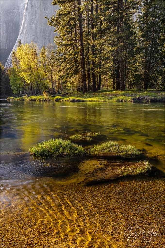
Given their frequency, I’ve become pretty good at making the best of blue sky days in Yosemite. While last month’s Yosemite Waterfalls and Dogwood photo workshop did enjoy a few clouds, we also dealt with a fair amount of blank skies. For our first sunrise we photographed silhouettes and a rising crescent moon. And later in the workshop we spent a couple of hours photographing dogwood in the shade (mixed with a little sunlight) in the Fern Springs / Pohono Bridge area. But I think my favorite blue sky shoot came at Cathedral Beach on the workshop’s penultimate afternoon.
Cathedral Beach is an up-close view of El Capitan right on the Merced River. The low and slow flow of autumn makes a glassy reflection here, and in the months closer to the winter solstice, when the sun is farther south, all of El Capitan gets spectacular late afternoon light. But by mid-spring the river rushes and swirls with snowmelt, and the sun has moved so far north that only El Capitan’s west-facing wall gets late sunlight. But as you can see, all is not lost.
Viewing El Capitan from Cathedral Beach that afternoon, the first thing to catch my eye was the gorgeous light etching the otherwise shaded granite’s vertical plunge. No less spectacular was the brilliant backlight illuminating the cottonwood and grass across the river and reflecting color in the river.
I pulled out my (brand new!) Sony A1 and pondered my lens choice. Since capturing all of El Capitan from this location requires something wider than 24mm, I’d normally go with my Sony 16-35 GM or 12-24 GM lens here. But with no clouds and most of El Capitan in shade, I really wanted to eliminate the sky, most of the granite, and the less interesting surrounding foliage, so I reached for my Sony 24-105G lens.
This scene worked as a horizontal or vertical, but I finally zeroed in on the vertical composition because it was the best way to distill the scene down to its essentials: El Capitan’s edge light, the backlit foliage, the reflection, and the gold-flecked riverbed beneath parallel ripples. I moved along the riverbank until all this good stuff aligned with the set of grassy mounds catching light in the near foreground. I wanted front-to-back sharpness, so I stopped down to f/16 and focused on the most distant of the foreground mounds. And even though I didn’t have a mirror surface, I dialed the reflection up with my polarizer to add a little color to the river.
In Yosemite it’s hard to take a bad picture, but some are more rewarding than others. While I doubt it will be one of those images that goes viral, this image makes me especially happy because finding it and assembling all the components took a little creative effort.
Workshop Schedule || Purchase Prints || Instagram
The Cure for Blank Skies


, California")


