Eloquent Images by Gary Hart
Insight, information, and inspiration for the inquisitive nature photographer
In the Flow
Posted on October 18, 2020

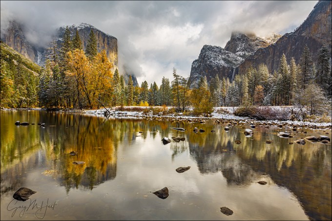
Autumn Drift, Bridalveil Creek, Yosemite || Canon EOS 1DS Mark III :: Canon 70-200 f/4 L :: 15 seconds :: F/16 :: ISO 100
“Natural” is a moving target that shifts with perspective. Humans experience the world as a 360 degree, three-dimentional, five-sense reel that unfolds in an infinite series of connected instants that our brain seamlessly assembles as quickly as it arrives. But the camera discards 80 percent of the sensory input, limits the view to a rectangular box, and compresses all those connected instants into a single, static frame. In other words, it’s impossible for a camera to duplicate human reality—the sooner photographers get that, the sooner they can get to work on expressing the world using their camera’s very different but quite compelling reality.
Despite the creative opportunities the differences between human and photographic vision offers, many photographers expend a great deal of effort trying to force their cameras closer to human reality (HDR, focus blending, and so on)—not inherently wrong, but in so doing they miss opportunities to creatively reveal our natural world. Subtracting the distractions from the non-visual senses, controlling depth of focus, and banishing unwanted elements to the world outside the frame, a camera can distill a scene to its overlooked essentials, offering perspectives that are impossible in person.
Blurred water
Motion is one thing that an image “sees” differently from you and me. But working in a static medium doesn’t mean photographers can’t convey motion, or use motion in a scene to creative effect.
One question I’m frequently asked is, “How do I blur water?” And while there’s no magic formula, no shutter speed threshold beyond which all water blurs, blurring water isn’t that hard (as long as you use a tripod). In fact, when you photograph water in the full shade or cloudy sky conditions I prefer, it’s usually more difficult to freeze moving water than it is to blur it.
The amount of moving-water blur depends on several variables:
- The water’s speed: Whether it’s a flowing river or crashing surf, the faster the water moves, and the greater the blur. And regardless of the speed, white water (surf or whitewater) blurs better than blue or green water.
- The water’s direction of motion relative to your position: Water moving at right angles to your position will blur more than water moving toward or away from your position.
- Your focal length: The longer the focal length, the greater the blur.
- Your distance from the water: Motion blur increases as you move closer
- And of course, the shutter speed: The longer your shutter is open, the greater the blur.
Of these variables, it’s shutter speed that gets the most attention. That’s because focal length and subject distance are compositional considerations, and we usually don’t start thinking about blurring the water until after we have our composition. To achieve a longer shutter speed without overexposing, you need to reduce the light reaching (or detected by) the sensor. There are several tools at your disposal, each with its own advantages and disadvantages:
- Only photograph moving water in overcast or full shade.
- Reduce your ISO (light sensitivity): Many cameras allow you to expand their ISO below their native value (usually, but not always, 100). This capability is often disabled when the camera comes out of the box, so you need to check your manual to see if your camera has a menu setting that enables “expanded ISO” (or whatever your camera manufacturer calls it). Unlike the film days, when a lower ISO (we called it ASA back then) meant better image quality, any ISO value lower than the camera’s native ISO is emulated (manipulated with internal programming) and may result in slightly lower image quality. This degradation isn’t usually enough to make a huge difference, but it’s still something to avoid unless it’s the best way to achieve a longer shutter speed.
- Shrink the aperture (larger f-stop number): A smaller aperture reduces the light that reaches the sensor. It also increases the depth of field, which could be good, bad, or irrelevant. And a smaller aperture increases diffraction, which soften of the image. While this softening isn’t usually a problem unless you’re making big prints, its best to avoid using a smaller aperture than you need. As a general rule, I resist going with an aperture smaller than f/11 (but don’t hesitate to when it’s the only way to achieve my desired effect).
- Add a polarizing filter: In addition to reducing reflections, a polarizer will subtract 1 to 2 stops of light (depending on its orientation). When using a polarizer, you need to be vigilant about orienting it each time you recompose (especially if you change your camera’s horizontal/vertical orientation), and monitoring its effect on the rest of your scene.
- Add a neutral density filter: A neutral density filter is, as its name implies, both neutral and dense. Neutral in that it doesn’t alter the color of your image; dense in that it cuts the amount of light reaching your sensor. While a dark enough ND filter might allow you to blur water on even the brightest of days, it does nothing for the other problems inherent to midday, full sunlight shooting (specifically, extreme dynamic range). ND filters come in variable and fixed-stop versions—the flexibility of variable NDs (the ability to dial the amount of light up and down) means living with the vignetting they add to my wide angle images.
- Don’t even think about any kind of subject blur without a sturdy tripod. For help selecting the right tripod, read the Tripod Selection article in my Photo Tips section.
Other motion blur opportunities
Motion blur opportunities aren’t limited to crashing waves and rushing whitewater. For example, I love using long shutter speeds to smooth the undulations and chop on the surface of an ocean, lake, or flowing river. And a particular favorite approach of mine is blurring something floating atop moving water, like dots of foam or autumn leaves. And my favorite time and place for this is each autumn at Bridalveil Creek in Yosemite. Here, beneath Bridalveil Fall and shaded by Yosemite’s towering granite walls, are countless pools surrounded by colorful trees and fed by tumbling cascades.
The motion of the cascade’s entry and exit creates arcs and spirals of motion in the pool, punctuated by small pockets of stillness near the perimeter. Leaves fall from the trees and land on the water, or flow down from upstream, congregating on the pool’s surface. Some just make a single arced pass before continuing downstream, others join a circular dance that can last for hours. It’s usually impossible to see any organization to the pool’s motion without something floating on the surface, but a long enough exposure with leaves or floating foam will reveal a distinct flow pattern.
After finding a pool adorned with drifting autumn leaves, I set up my tripod and camera, find a composition, and dial in a shutter speed measured in seconds. Depending on the speed of the circulation, sometimes 10-second shutter speeds are enough, but usually I try to go to 20 or 30 seconds. With the help of a neutral density filter, I’ve gone as long as 3 minutes (and maybe longer).
Once the blur patterns reveal themselves in my images, I tweak my composition and shutter speeds accordingly. Because there are usually many leaves, and each leaf takes a slightly different path depending on its size and interaction with other swirling leaves, each click results in a unique image. I’ll sometimes work a single composition for 15 or 20 minutes, collecting as many motion patterns to choose between as possible, before moving on to another composition or scene.
The image I’ve shared here is a 15-second exposure, captured at Bridalveil Creek in 2009. Because this location is always in full shade, and this was a cloudy day, the scene was dark enough that I could slow my shutter enough with just a polarizer. I’ve always felt like a polarizer is essential to remove glare from the water, leaves, and rocks in these scenes, but at the time I always had to decide between a polarizer or neutral density filter—I couldn’t do both. (I now have a Breakthrough 6-stop darkening polarizer that achieves the best of both worlds.)
Workshop Schedule || Purchase Prints || Instagram
World In Motion


, California")


Letting the Scene Speak for Itself
Posted on October 11, 2020
(Or, Channeling My Inner Oz)

Two Seasons, Valley View, Yosemite
Canon EOS 5D Mark III
Canon 17-40 f/4L
1/4 second
F/20
ISO 800
100 mm
With virtually every still camera now equipped with video capability, the last few years have brought an explosion of nature videos. When done well, videos can be extremely powerful, conveying motion and engaging both eyes and ears to reveal the world in a manner that’s closer to the human experience than a still image is. But like other sensory media whose demise has been anticipated following the arrival of something “better,” (with apologies to Mark Twain) let me say that the rumors of still photography’s death have been greatly exaggerated.
Just as I enjoy reading the book more than watching the movie, I prefer the unique perspective of a still image. Though motion in a video may feel more like being there, a still image gives me the freedom to linger and explore a scene’s nooks and crannies, to savor its nuances at my own pace.
In a video my eyes are essentially fixed as the scene moves before them. In a still image, my eyes do the moving, drawn instantly to a dominant subject, or perhaps following lines, real or implied, in the scene the way a hiker follows a trail. But also like a hiker, I can choose to venture cross-country through a still image and more closely scrutinize whatever looks interesting.
The photographer needs to be aware of a still image’s inherent lack of motion, and more importantly, how to overcome that missing component by moving the viewer’s eyes with compositional choices. With this in mind, I usually like my images to have an anchor point, a place for the viewer’s eye to start and/or finish. To do this, I identify the scene’s anchor and other potential elements that might draw the eye, then position myself and frame the scene so those secondary elements guide the eye to (or frame) the primary subject.
 But sometimes a scene stands by itself, as if every square inch fits together like a like a masterful tapestry. When nature gifts a scene like this, rather than imposing myself by offering visual clues to move my viewer’s eye, I like to step back and channel the Wizard of Oz. Specifically, what Dorothy must have felt when she first opened the door of her ramshackle, monochrome world onto the color and wonder of Oz. That’s how these scenes make me feel, and that’s the feeling I want my images to convey.
In a scene filled edge to edge with the awe and wonder of discovery, the last thing the viewer wants is to be told where to go and what to do. (And just look at all the trouble Dorothy got into when she started following the Yellow Brick Road.)
By getting out of the way and letting the scene speak for itself, my viewer has the freedom to explore the entire frame. Of course that’s easier said than done, but in the simplest terms possible, my sole job is to find balance and avoid distractions.
As much as aspiring photographers would love a composition formula that dictates where to locate each element in their frame, moving the eye, finding balance, and avoiding distractions ultimately comes down to feel. Please bear with me as I try to put into words how this inherently intuitive process manifest for me.
Visual weight
To explain the concept of balance and motion in a still image, I use what I call “visual weight (I’ll just shorten it to VW),” which I define as any object’s ability to pull the viewer’s eye—think of it as gravity for the eye.

Nightfall, Full Moon and Yosemite Valley, Yosemite
An object’s VW is subjective, based on a variety of moving targets that include (to a greater or lesser degree) an object’s size, brightness, color, shape, and position in the frame. VW can also be affected by each viewer’s personal connection to the elements in the scene.
Take a wide angle moon for example. The moon is small and colorless (not much VW), but also bright with lots of contrast (high VW). Then factor in the viewer’s personal connection to the moon. If I’m more drawn to the moon than someone else, the moon’s visual weight would be greater to me. Since I can’t worry about what others think when I compose a shot, what you see in my images reflects the VW that a scene’s elements hold for me, and probably explains why I have so many moon images.
Visual Balance
After many years (decades) of doing this, visual balance usually happens intuitively, without conscious thought. But until you reach this point, I have a mental exercise you can apply to your own images, preferably as they appear in your camera’s viewfinder or on its LCD.
Imagine a flat board perfectly balanced horizontally on a fulcrum (like the tip of a pen)—to maintain its equilibrium, any added weight must be counterbalanced by a corresponding weight elsewhere on the board. Visual weight is the virtual equivalent: think of your frame as a print (a stiff, metal print rather than a floppy, paper print) balanced on a fulcrum. Any visible element that pulls the eye tips the frame from horizontal (makes it out of balance) and must be counterbalanced by an element with corresponding visual weight.
Because of the subjective nature of visual weight, your choices might differ from mine. That’s okay—it’s important to be true to your own instincts, which will in fact improve with practice.
Distractions
The VW concept applies to eliminating distractions too. Without getting too deep into the weeds (there are lots of potential distractions in a scene, and ways to deal with them, but that’s a blog for a different day), the idea is to avoid objects that pull the eye away from the essence of the scene (as you see it), or that simply overpower the scene. In the image at the top of this post, flying monkeys emerging from the Merced River might be pretty cool (and could even gain me some notoriety), but they would not serve my goal to convey a sense of wonder and awe and would in fact be a distraction.
Other potential distractions besides flying monkeys are things like branches and rocks that jut into the scene, creating the sense that they’re part of a different scene, just outside the frame. Another common distraction is objects that are mostly in the scene, but trimmed by the edge of the frame. Since it’s virtually impossible to avoid cutting something off on the edge of most frames in nature, I just try to minimize the damage by being very conscious of what’s cut off and how it’s cut, usually trying to cut boldly, down the middle, when possible. I’ve always felt that objects jutting into a scene, or slightly trimmed by the edge, feel like mistakes, while something cut strongly down the middle feels more intentional.
For example

Two Seasons, Valley View, Yosemite
Yosemite seems to be filled with more than its share of scenes that that don’t need my help assembling a composition. At most scenes I start with the simplest composition and work my way to something more complex. I can usually tell when a scene stands by itself when I end up deciding my early compositions are the way to go.
I’d driven to Yosemite on this November morning chasing a fortuitously timed storm that was forecast to drop snow on peak fall color. The day started gray and cold, the valley floor white with wet snow beneath dark clouds that blanketed all of Yosemite’s distinctive features. But by late morning the clouds brightened and started to lift, slowly unpeeling Yosemite Valley’s soaring granite walls and monoliths.
I happened to be at Valley View when the show started in earnest. Because the scene contained everything I was there to photograph—Yosemite icons (El Capitan, Cathedral Rocks, Bridalveil Fall) decorated with snow, fall color, reflection—I started with this composition that took it all in in a pretty straightforward manner. Standing right at river’s edge, I chose horizontal framing because it was the best way to include the icons without diluting them with too much sky and water. Though I didn’t want to go too wide, because there was so much happening top-to-bottom, from clouds to reflection, I went a little wider than I usually do.
The lower half the scene had lots of rocks that I worked to avoid cutting off, finally finding framing that kept my edges completely clean (not always possible). The small rock in the lower left was a little closer to the edge than I’d have liked, but if I’d have gone any wider I’d have introduced spindly branches along the left edge—I chose the lesser of two evils. Likewise, the small rock on the bottom right was also closer to the edge than I preferred, but an entire herd of disorganized rocks massed just beneath my frame prevented me from composing lower. The top of my frame I set just below a distracting (bright) hole in the clouds. I’d have cut the rock on the middle right if I’d have had to, but was fortunate that there was a small break between it and another gang of rocks just off the frame on the right.
The visual balance was more by feel (as it often is). Looking at the image now, I see that offsetting the gap separating El Capitan and Cathedral Rocks, placing it a little left of center, makes the frame feel more balance than if I’d have centered it, but I don’t remember consciously deciding this. To my eye, the balance works for me because El Capitan, the brilliant color, and striking reflection hold more visual weight than the granite, waterfall, and reflection on the other side, so having more of this on the right compensates for this (slightly) lacking VW.
I wish I could defend my decision to use f/20, but I can’t. I only use f/20 when I absolutely have to—or when I was using it for an earlier scene and forgot to set it back to my default f/8 to f/11 range (which is no doubt what happened here).
One more thing
Even though this image is from 2012, it’s brand new, discovered yesterday while mining my raw file archives. The amazing thing to me is that the scene is quite similar, and the composition virtually identical, to an image taken the following year. When I see similar compositions in scenes from entirely different shoots, it tells me that my instincts are guiding me. In both situations these images were my starting point, and I went on to play with more creative compositions later in the shoot. But it just goes to show that sometimes it’s best to let the scene speak for itself.
-

- Autumn Snow, El Capitan, Yosemite
-
- Two Seasons, Valley View, Yosemite
Workshop Schedule || Purchase Prints || Instagram
Letting Nature Speak for Itself
Click an image for a closer look, and to view a slide show


Playing With Depth
Posted on September 27, 2020
Creekside Color, Mill Creek, Eastern Sierra
Canon EOS-1Ds Mark II
Canon 70-200 f/4 L
4 seconds
F/32
ISO 200
Photography is the futile attempt to squeeze a three-dimensional world into a two-dimensional medium. But just because it’s impossible to truly capture depth in a photograph, don’t think you shouldn’t consider the missing dimension when crafting an image. For the photographer with total control over his or her camera’s exposure variables (which exposure variable to change and when to change it), this missing dimension provides an opportunity to reveal the world in unique ways, or to create an illusion of depth that recreates much of the thrill of being there.
The Illusion of Depth
Sometimes a scene holds so much near-to-far beauty that we want to capture every inch of it. While we can’t actually capture the depth our stereo vision enjoys, we can take steps to create the illusion of depth. Achieving this is largely about mindset—it’s about not simply settling for a primary subject no matter how striking it is. When you find a distant subject to feature in an image, scan the scene and position yourself to include a complementary fore-/middle-ground subjects. Likewise, when you want to feature a nearby object in an image, position yourself to include a complementary back-/middle-ground subjects.
Creative Selective Focus
Most photographers go to great lengths to achieve full front-to-back sharpness, an art in itself. But sometimes I like to solve the missing depth conundrum with what I call creative selective focus: An intentionally narrow depth of field with a carefully chosen focus point to flatten a scene’s myriad out-of-focus planes onto the same thin plane as the sharp subject. This technique can soften distractions into a blur of color and shape, or simply guide the viewer’s eye to the primary subject and soften the background to complementary context.
When I use creative selective focus to autumn leaves or spring flowers, I usually take the extreme background blur color and shape approach. In the images below, the soft background serves as a canvas for the primary subject.
But sometimes I like my soft background to have enough resolution to be more recognizable. When I take this approach, my goal is to signal the part of the scene I want to emphasize by making it sharp, and to use the soft but still recognizable background for context that tells the view something about the location.
A few years ago I wrote an article on this very topic for “Outdoor Photographer” magazine. You can read a slightly updated version of this article in my Photo Tips section: Selective Focus.
About this image: Creekside Color, Mill Creek, Eastern Sierra
With dense aspen groves, reflective beaver ponds, towering peaks, and even a waterfall, Lundy Canyon just north and west of Mono Lake, has long been one of my favorite fall color locations.
I spent this overcast autumn morning wandering the banks of Mills Creek. The thick growth here often makes this easier said than done, but the rewards of battling my way through trees and shrubs usually makes it worth the scrapes and scratches I always seem to go home with.
Even though it was less than 30 feet from the road, I heard this cascade long before I saw it. Once I got my eyes on it, I had to battle further to get a clear view. I especially liked the red leaves, a relative rarity in California, and wanted to feature them. Here I positioned myself so the leaves framed the creek, and turned my polarizer to reduce the leaves’ glossy sheen.
I used a range of f-stops for a variety of background sharpness options. This one used f/32 (maybe my all-time record for smallest aperture), which gave me enough DOF for to make the creek easily recognizable, but also resulted in a 4-second exposure. (Clearly wind was not a factor this morning.)
Here’s my Photo Tips article on using hyperfocal focus techniques to enhance your images’ illusion of depth: Depth of Field.
Playing With Depth


Fall Color Photography Tips
Posted on September 13, 2020

Autumn Yin and Yang, Bridalveil Creek, Yosemite
Canon EOS-1Ds Mark II
Canon 70-200 f/4 L
10 seconds
F/13
ISO 100
This is the second of my two-part fall color series
Read part one: The Why, How, and When of Fall Color
Vivid color and crisp reflections make autumn my favorite season for creative photography. While most landscape scenes require showing up at the right time and hoping for the sun and clouds to cooperate, photographing fall color can be as simple as circling your subject until the light’s right. For photographers armed with an understanding of light and visual relationships, and the ability to control exposure, depth, and motion with their camera’s exposure variables, fall color possibilities are virtually unlimited.
Backlight, backlight, backlight
The difference between the front-lit and backlit sides of fall foliage is the difference between dull and vivid color. Glare and reflection make the side of a leaf facing its light source, whether that leaf is in direct sunlight or simply faces an overcast sky, appears flat. But the other side of the same leaf, the side that’s opposite the light from the sun or sky, glows with color.
In the image below (Autumn Reflection, Merced River, Yosemite), my camera has captured the sky-facing side of most of the leaves. But I’ve captured the underside of the leaves on the top-right of the branch—even though it’s an overcast day, can you see how these backlit leaves glow compared to the others?

Autumn Reflection, Merced River, Yosemite
The moral of this story? If you ever find yourself disappointed that the fall color seems washed out, check the other side of the tree.
Isolate elements for a more intimate fall color image
Big fall color scenes are great, but isolating your subject with a telephoto, and/or by moving closer, enables you to highlight and emphasize specific elements and relationships.
- Train your eye to find leaves, groups of leaves, or branches that stand alone from the rest of the tree or scene, or that stand out against a contrasting background.
- Zoom close, using the edges of the frame to eliminate distractions and frame subjects.
- Don’t concentrate so much on your primary subject that you miss complementary background or foreground elements that can balance the frame and provide an appealing canvas for your primary subject.
Selective depth of field is a great way to emphasize/deemphasize elements in a scene
Limiting depth of field by composing close with a large aperture and/or telephoto lens can soften a potentially distracting background into a complementary canvas of color and shape. Parallel tree trunks, other colorful leaves, and reflective water make particularly effective soft background subjects. For an extremely soft background, reduce your depth of field further by adding an extension tube to focus even closer.
Underexpose sunlit leaves to maximize color
Contrary to what many believe, fall foliage in bright sunlight is still photographable if you isolate backlit leaves against a darker background and slightly underexpose them. The key here is making sure the foliage is the brightest thing in the frame, and to avoid including bright sky in the frame. Photographing sunlit leaves, especially with a large aperture to limit DOF, has the added advantage of an extremely fast shutter speed that will freeze wind-blown foliage.
Slightly underexposing brightly lit leaves not only emphasizes their color, it turns everything that’s in shade to a dark background. And if your depth of field is narrow enough, points of light sneaking between the leaves and branches to reach your camera will blur to glowing jewels.


A sunstar is a great way to liven up an image in extreme light
If you’re going to be shooting backlit leaves, you’ll often find yourself fighting the sun. Rather than trying to overcome it, turn the sun into an ally by hiding it behind a tree. A small aperture (f16 or smaller is my general rule) with a small sliver of the sun’s disk visible creates a brilliant sunstar that becomes the focal-point of your scene. Unlike photographing a sunstar on the horizon, hiding the sun behind a terrestrial object like a tree or rock enables you to move with the sun.
When you get a composition you like, try several frames, varying the amount of sun visible in each. The smaller the sliver of sun, the more delicate the sunstar; the more sun you include, the more bold the sunstar. You’ll also find that different lenses render sunstars differently, so experiment to see which lenses and apertures work best for you.


Motion blur
When photographing in overcast or shade, it’s virtually impossible to freeze the motion of rapid water at any kind of reasonable ISO. Rather than fight it, use this opportunity to add silky water to your fall color scenes. There’s no magic shutter speed for blurring water—in addition to the shutter speed, the amount of blur will depend on the speed of the water, your distance from the water, your focal length, and your angle of view relative to the water’s motion.
All blurs aren’t created equal. When you find a composition you like, don’t stop with one click. Experiment with different shutter speeds by varying the ISO (or aperture as long as you don’t compromise the desired depth of field).
Reflections make fantastic complements to any fall color scene
By autumn, rivers and streams that rushed over rocks in spring and summer, meander at a leisurely, reflective pace. Adding a reflection to your autumn scene can double the color, and also add a sense of tranquility. The recipe for a reflection is still water, sunlit reflection subjects, and shaded reflective surface.
When photographing leaves floating atop a reflection, it’s important to know that the focus point for the reflection is the focus point of the reflective subject, not the reflective surface. This is seems counterintuitive, but try it yourself—focus on the leaves with a wide aperture and watch the reflection go soft; then focus on the reflection and watch the leaves go soft.
A wide focal length often provides sharpness from the nearby leaves to the infinite reflection, but sometimes achieving sharpness in your floating leaves and the reflection requires careful hyperfocal focus. And sometimes the necessary depth of field exceeds the camera’s ability to capture it—in this case, I almost always bias my focus toward the leaves and let the reflection go a little soft.
Don’t forget the polarizer
I can’t imagine photographing fall color without a polarizer. Fall foliage has a reflective sheen that dulls its natural color, so a properly oriented polarizer can erase that sheen and bring the underlying natural color into prominence. Not are reflections on the foliage a problem, reflections on nearby water and rocks can pull the eye and distract from your primary subject.
To minimize the scene’s reflection, slowly turn the polarizer until the scene is darkest (the more you try this, the easier it will be to see). If you have a hard time seeing the difference, concentrate your gaze on a single leaf, rock, or wet surface.

Fallen Color, Rock Creek Canyon, Eastern Sierra
A polarizer isn’t an all-on or all-off proposition. When photographing a scene with still water, it’s often possible to maximize a reflection in the water without dialing up the reflection on the leaves. To achieve this, dial the polarizer’s ring and watch the reflection change until you achieve the effect you desire. This technique is particularly effective when you want your reflection to share the frame with submerged feature such as rocks, leaves, and grass. In the image below, I turned my polarizer just enough to reveal the nearby submerged rocks without removing the mountain a trees reflection.

Morning Reflection, North Lake, Eastern Sierra
Nothing communicates the change of seasons like fall color with snow
Don’t think the first snow means your fall photography is finished for the year. Hardy autumn leaves often cling to branches, and even retain their color on the ground through the first few storms of winter. An early snowfall is an opportunity to catch fall leaves etched in white, an opportunity not to be missed. And even after the snow has been falling for a while, it’s possible to find a colorful rogue leaf to accent an otherwise stark winter scene.
About this image

Autumn Yin and Yang, Bridalveil Creek, Yosemite
People sometimes accuse me of adding or positioning leaves in my frame. Those who know me know I don’t do that, but that doesn’t protect me from their (good natured) abuse. For those who don’t know me and who don’t believe I found this leaf like that, I don’t really know what to say, except to explain that the joy I get from photography comes from discovering natural beauty, and a manufactured scene that isn’t natural has zero appeal to me. (I think this is also why I don’t do composites.) I don’t think it’s wrong to place elements in a frame (or to blend multiple images), as long as it’s done honestly—it’s just not something that interests me. But anyway…
I don’t really understand why people think it’s so unusual to find a leaf (or two, or three…) isolated from its surroundings. I aggressively look for small scenes like this, so it should be no surprise that I have a lot of them in my portfolio. While the position of the leaves in my images is randomly determined by nature (or maybe by the unscrupulous photographer who preceded me at the scene), there’s nothing random about my position when I capture these scenes.
Probably my favorite place to photograph isolated leaves is Bridalveil Creek, just beneath Bridalveil Fall in Yosemite. The entire area is decorated with an assortment of deciduous trees that deposit their leaves liberally among the rocks and cascades each fall. And unlike Yosemite’s other waterfalls, Bridalveil Fall runs year-round. Even in autumn, when it’s often barely more than a trickle, there’s enough water to cascade, splash, and pool among the rocks.
Another great thing about Bridalveil Creek is that its location just beneath Cathedral Rocks and Leaning Tower means it gets very little direct sunlight in autumn. So even when the sun’s out, I can spend hours photographing here in the full shade that’s ideal for this type of photography.
On this cloudy October morning I was doing my usual thing, bounding about on the rocks upstream from the trail looking for single leaves to isolate in my frame. My of the cascades here are active enough to splash and wet the rocks, so when a descending leaf hits a wet rock just right, it sticks like glue. I didn’t see this leaf land and stick, but I’ve seen it happen enough to know this isn’t that unusual.
This cascade was about 20 feet away, above a pool that was deeper than I wanted to wade, so I went to my 70-200 lens. I spent a little time casually working this scene, circling, framing it from a variety of positions using different focal lengths. But when I got to this spot and saw the smooth curves and dark flowing into light, my mind immediately went to the Yin and Yang symbol (okay, so maybe you need use your imagination a bit). I dropped down a bit and refined my composition, then started working on the exposure.
Not only was this spot in full shade, the morning was overcast. With my polarizer on to cut the sheen on the rocks and leaves, I knew that slowing the water enough to capture any detail was virtually impossible, so I went all-in on the motion blur and just turned the water a homogenous white. It turns out this decision actually enhanced the yin/yang effect I was going for.
Workshop Schedule || Purchase Prints || Instagram
To better understand the science and timing of fall color, read
The Why, How, and When of Fall Color
A Gallery of Fall Color


, Yosemite")


:: More photography tips ::
The Why, How, and When of Fall Color
Posted on September 6, 2020

Autumn Cascade, Bridalveil Creek, Yosemite (2005)
Canon EOS-1Ds Mark II
Canon 70 – 200 f/4 L
1 second
F/10
ISO 160
Autumn is right around the corner. To get things started, I’ve updated a previous post that demystifies why, how, and when of fall color.
Few things get a photographer’s heart racing more than the vivid yellows, oranges, and reds of autumn. And the excitement isn’t limited to photographers—to appreciate that reality, just try navigating New England backroads on a Sunday afternoon in the fall.
Innkeeper logic
Despite all the attention, the annual autumn extravaganza is fraught with mystery and misconception. Showing up at at the spot that guy in your camera club told you was peaking at this time last year, you might find the very same trees displaying lime green mixed with just hints of yellow and orange, and hear the old guy behind the counter at the inn shake his head and tell you, “It hasn’t gotten cold enough yet—the color’s late this year.” Then, the next year, when you check into the same inn on the same weekend, you find just a handful of leaves clinging to exposed branches—this time as the old guy hands you the key to your room he utters, “That freeze a couple of weeks ago got the color started early this year—you should have been here last week.”
While these explanations may sound reasonable, they’re not quite accurate. Because the why and when of fall color is complicated, observers resort to memory, anecdote, and lore to fill knowledge voids with partial truth and downright myth. And while we still can’t predict fall color the way we do the whether, science has provided a pretty good understanding of the fall color process.
A tree’s color
The leaves of deciduous trees contain a mix of green, yellow, and orange pigments. During the spring and summer growing season, the volume and intensity of the green chlorophyl pigment overpowers the orange and yellow pigments and the tree stays green. Even though chlorophyl is quickly broken down by sunlight, the process of photosynthesis that turns sunlight into nutrients during the long days of summer continuously replaces the spent chlorophyl.
As the days shrink toward autumn, things begin to change. Cells at the abscission layer at the base of the leaves’ stem (the knot where the leaf connects to the branch) begin the process that will eventually lead to the leaf dropping from the tree: Thickening of cells in the abscission layer blocks the transfer of carbohydrates from the leaves to the branches, and the movement of minerals to the leaves. Without these minerals, the leaves’ production of chlorophyl dwindles and finally stops, leaving just the yellow and orange pigments. Voilà—fall color!
The role of sunlight and weather
Contrary to popular belief, the timing of the onset of this fall color chain reaction depends much more on daylight than it does on temperature and weather. Triggered by a genetically programmed day/night-duration threshold (and contrary to innkeeper-logic), the trees in any given region will commence their transition from green to color at about the same time each year, when the day length drops to a certain point.
Nevertheless, though it doesn’t trigger the process, weather does play a significant part in the intensity, duration, and demise of the color season. Because sunlight breaks down the green chlorophyl, cloudy days after the suspension of chlorophyl creation will slow the chlorophyl’s demise and the coloring process that follows. And while the yellow and orange pigments are present and pretty much just hanging out while they wait all summer for the chlorophyl to relinquish control of the tree’s color, a tree’s red and purple pigments are manufactured from sugar stored in the leaves—the more sugar, the more vivid a tree’s red. Ample moisture, warm days, and cool (but not freezing) nights after the chlorophyl replacement has stopped are most conducive to the creation and retention of the sugars that form the red and purple pigments.
On the other hand, freezing temperatures destroy the color pigments, bringing a premature end to the color display. Drought can stress trees so much that they drop their leaves before the color has a chance to manifest. And wind and rain can wreak havoc with the fall display—go to bed one night beneath a canopy of red and gold, wake the next morning to find the trees bare and the ground blanketed with color.
Since the fall color factors come in a virtually infinite number of possible variations and combinations, the color timing and intensity can vary a lot from year to year. Despite expert advice that seems promise precise timing for the fall color, when planning a fall color trip, your best bet is to try to get there as close as possible to the middle of the color window, then cross your fingers.
About this image
Looking for something to do in this COVID-constrained world, I dialed my way-back machine all the way back to 2005 and landed on this image. I wish I could tell you I have a memory of its capture, but I don’t. I do, however, have lots of general memories of photographing fall color at Bridalveil Creek in Yosemite, just below Bridalveil Fall. Since I’ve never visited Yosemite in autumn without shooting here, when I set out find a fall color image in my archives, I specifically targeted my Bridalveil Creek shoots.
I started by digging up another image from this trip that I’ve always liked, but felt was too soft to share. Given that I virtually never take a single frame of a nice scene, I was pretty confident that I’d find something similar, and crossed my fingers that the sharpness problem was a one-off that I quickly corrected. This is actually the very next image I clicked, and I was very pleased to confirm that it is indeed sharp.
This image is a perfect example of my approach to intimate fall color scenes: Look for color to juxtapose with another feature in the scene. Often that’s a single leaf (no, I do not place leaves, ever), but in this case I accented a nice little cascade with a group of fallen leaves that were plastered against water-soaked granite. And when there’s water motion in the scene, I usually shoot it at a variety of shutter speeds to give myself multiple motion effects to choose between. Looking through my captures from this shoot, I can tell that’s exactly what I did. This image is a 1-second exposure, long enough to blur the cascade, but not so long that I obliterated all detail. And though I have no memory of it, I know I used a polarizer because I always use a polarizer when photographing fall color, and I can tell that the sheen has been removed from the rocks, leaves, and water.
Autumn Intimates
Click an image for a closer look, and to view a slide show.


You Can’t Always Get What You Want…
Posted on November 17, 2019

Autumn Accent, Half Dome, Yosemite
Sony a7RIV
Sony 24-105 G
1 second
F/16
ISO 100
(Offered with apologies to the Rolling Stones)
I looked that night at the reflection
My focus app in my hand
I pondered my focus selection
About six feet from where I stand
You can’t always get what you want
You can’t always get what you want
You can’t always get what you want
But if you try sometimes, you just might find
You get what you need
What we wanted was clouds; what we got was, well, the opposite of clouds.
Photographers love clouds for the soft light they spread across the landscape, and their potential to add color and drama to the sky. And if you’ve been following my recent blogs, you no doubt know about the wall-to-wall blue skies in last month’s Yosemite Fall Color workshop. But as much as we love them, perfect light and spectacular skies can make photographers lazy. On the other hand, dealing with conditions that are less than ideal can create opportunities that otherwise would have been missed.
Throughout last month’s workshop I strongly encouraged everyone to minimize or eliminate the sky and instead emphasize the reflection (rather than the reflected subject). This approach is especially effective on sunny days because the best reflections usually happen with the subject is fully lit, the brighter the better.
Besides a sunlit subject, the other half of the reflection equation is a shaded reflective surface. Long removed from the fury of the spring snow melt, but not yet bolstered by the winter storm reinforcements, the Merced River’s low and slow autumn flow means reflections at most riverside vantage points. And while Yosemite’s towering granite walls create nice shade in any season if you know where to look, the low sun of autumn and winter spreads the shade farther and longer—by late autumn, some sections of the Merced get little or no sun all day.
Since this was the first Yosemite visit for many in the group, at each photo location I’d suggest starting with the more conventional mirror reflection composition (the primary subject above its inverted counterpart), but then move on to compositions that concentrate on the reflection itself.
One important aspect of reflection-only compositions is (upright) foreground elements to orient the viewer—a solid object between the reflection and the reflective subject to signal that the world is in fact not upside down. Sometimes a small section of the opposite shore works (taking care to avoid direct sunlight that can pull the eye away from the reflection), but I especially like adding foreground elements that mingle with the reflection.
A side benefit of a reflection-only approach is exposure management, because photographing a fully lit primary subject above its shaded reflection creates dynamic range challenges. Even if you can capture the scene’s entire range of light, the sunlit subject and blue sky are often washed out, while the reflection and its surroundings remain relatively dark. Since the human eye is drawn to a scene’s brightest elements, the shaded reflection is easily overshadowed (pun unavoidable). Not only does eliminating the sunlit portion of the scene simplify exposure, it makes the reflection the brightest part of the frame.
I found this little scene beside the Merced River on the workshop’s final shoot. Arriving just as the face of Half Dome started to warm with late light, I scanned the riverbank until I found a pool lined with yellow cottonwood leaves jettisoned by trees just upstream. I started with my Sony 100-400 GM lens on my Sony a7RIV, targeting a tight composition that featured a pair of leaves (faintly visible here floating atop the dark trees reflected near the base of Half Dome) embedded in Half Dome’s face. But I wanted to include more of the colorful leaves and soon switched to my Sony 24-105 f/4 G lens.
This might be a good time to mention the significant difference an even slight position shift can make in a reflection image. From my original vantage point, Half Dome’s reflection was surrounded by a large void of bland, empty water. That was no problem in a tight composition, but from my original upright position, going wide enough to include all the leaves shrunk Half Dome and added a lot of extraneous scene. So I moved back slightly and dropped my camera to near river level, moving the yellow leaves closer to Half Dome, framing the reflection with color and eliminating most of the empty water.
Another essential and often overlooked consideration when photographing reflections is the counterintuitive truth that the focus point for a reflection is the reflective subject, not the reflective surface. That means that in this scene, even though its reflection was bobbing on water no more than ten feet away, because Half Dome was about three miles distant, the reflection’s focus point is infinity (the same as Half Dome). When you stop to consider that I’m also including leaves that are no more than five feet away, it becomes pretty clear that I have depth of field to consider.
My focal length here was around 35mm, and while I wanted Half Dome’s reflection sharp, the leaves had to be sharp. A quick check of my hyperfocal app told me the hyperfocal distance at 35mm and f/16 (the smallest aperture I use unless I have no choice) was around 8 feet (on my full frame Sony body). In extreme depth of field scenes, not only do I want to bias my sharpness to the closer object(s), when the more distant object is a reflection, a little softness is usually tolerable. Given all this, and since most hyperfocal tables are based on a fairly liberal definition of “acceptable sharpness,” to ensure foreground sharpness I focused about six feet into the frame. And as you can see, Half Dome turned out pretty darn sharp too.
Everyone wants spectacular conditions, and while this group may not have gotten what it wanted, after seeing the results of the workshop (both my own and the group’s), it appears that we got just we need.
2020 Yosemite Fall Color Photo Workshop
A Lot of Reflections
Click an image for a closer look and to view a slide show.


Fresh Takes
Posted on November 25, 2018

Half Dome Autumn Reflection, Sentinel Bridge, Yosemite
Sony a7RIII
Sony 24-105 f/4 G
1/8 second
F/11
ISO 100
I love the iconic captures as much as the next person—scenes like Yosemite’s Horsetail Fall in February, Upper Antelope Canyon’s famous light shaft, or McWay Fall’s tumble into the Pacific, are both gorgeous and a thrill to photograph. But standing elbow-to-elbow with hundreds (or thousands!) of photographers, each recording virtually identical images that are already duplicates of thousands of prior images, while nice, doesn’t necessarily stimulate my creative juices.
Iconic for a Reason
Once upon a time photographing even the most popular scenes in solitude wasn’t difficult. The tourists who overwhelm the best known views during the comfortable times of day would vacate just when the photography started getting good. But with the proliferation of digital photographers and easy exchange of information in our connected world, there aren’t many photography secrets anymore, and the opportunities to make unique images have become more challenging than ever. And if you do capture something special, posting it online is sure to immediately draw photographers like cats to a can opener.
Given that Yosemite Valley’s eight square miles attracts over five million visitors each year, you’d think it would be impossible to find unique perspectives. But on even the busiest summer day, rising for sunrise will give you at least a couple of peaceful hours. And of course in Yosemite’s backcountry, while relatively crowded by wilderness standards, solitude is always just a short detour away.
But the iconic spots earned their recognition for a reason, and first-time (or infrequent) Yosemite visitors want to see them too. For my workshops, in addition to sharing with my students a variety of my favorite more hidden Yosemite spots, I’ve learned to take them to the Yosemite locations they’ve come to know from a lifetime time of viewing Yosemite pictures.
The first visits to vistas like Glacier Point, Tunnel View, Valley View, and Sentinel Bridge still inspire the awe they always have. It’s easy for photographers, overcome by the majesty before them, to fall back on their memory of others’ images and settle for their own version of the same thing. Rather than suggest that my students avoid doing this (for many, these images are the very reason they signed up in the first place), I suggest that they start with the iconic shots they know, but don’t make it their goal. Rather, I encourage them to use those familiar imagers as a starting point for a fresh take that’s more uniquely theirs. I won’t pretend that this approach always, or even frequently, results in something that no one has ever captured, but I think everyone’s photography benefits when that is the goal—not just the images captured today, but the ability to see and execute better images tomorrow as well.
In this year’s Yosemite Fall Color and Reflections workshop we spent most of our time bouncing from one beautiful scene to the next. Autumn, with its colorful leaves and ubiquitous reflections, provides more opportunities for unique captures than any other season, and the color this years was fantastic. But that didn’t prevent us from checking off the icons.
Speaking of icons, my rule of thumb in Yosemite is El Capitan in the morning and Half Dome in the afternoon. But after breakfast one morning, one of the cars said they wanted to go check out Sentinel Bridge, one of the best Half Dome reflections in the park. Normally I resist photographing Half Dome in the morning because its face doesn’t get direct sunlight until late afternoon, but on the way to breakfast I’d noticed the cottonwoods upstream were beautifully backlit and I thought it might be worth checking out. So I scrapped my original plans and we detoured back to the bridge (hey, never let it be said that I’m not flexible).
I’m so glad I listened to the votes from the other car that morning because we ended up with one of the workshop’s highlight shoots. Half Dome was in full shade, sky was a bland blue mixed with a few thin clouds, but the backlit trees were off the charts. We all started with the wider, more conventional views, capturing Half Dome and the trees doubled by their reflection. But that doesn’t take long, and soon I was encouraging everyone to keep working it.
When working out a composition, I always try to figure out where the scene’s action is. In this scene the highlight for me was the upstream trees and their reflection. Wanting as little as possible of the fairly boring sky, I went with a horizontal composition. I also thought a horizontal composition would be best for framing the cottonwoods and reflection with the shaded trees on both sides of the river. To leave no ambiguity about what this image is about, I removed the actual Half Dome entirely, leaving its reflection for context only.
With my Sony 24-105 f/4 G on my Sony a7RIII, I zoomed to a composition that put the “action” front and center, making sure to get all of Half Dome’s reflection but minimal sky, balancing the backlit trees and their reflection toward the top of the from, and framing everything with the darker trees on the edges. Depth of field and motion weren’t concern, so I went with my default ISO 100 and f/11, focused, and clicked.
As anyone who has been in one of my workshops knows, the first click is a draft, an image to review and refine. Evaluating the picture on my LCD, I ran my eyes around my frame and made a few micro adjustments to ensure a tight composition without cutting off the tops of the sunlit tree in the top center, the shaded trunks on the left and right, and the cloud above (below?) Half Dome.
Judging from the variety of images shared in the image reviews, this shoot was a highlight for everyone else too. Some found their own takes on this upstream scene, while a few ventured across the road to capture a completely different scene looking downstream. Not a bad result for a location that wasn’t even on my radar for that morning.
Yosemite Photo Workshops
Workshop Schedule || Purchase Prints
Fresh Takes on Yosemite’s Icons
Click an image for a closer look and slide show. Refresh the window to reorder the display.


It’s the People
Posted on November 22, 2018

Floating Color, El Capitan, Yosemite
The ability to earn my living visiting the most beautiful places in the world is plenty of reason for gratitude, but that’s not what I’m thinking about today. Today I’m thinking about all of the people my workshops have connected me with, and all the laughter and learning they have added to my life.
I’d be lying if I said I wasn’t looking forward to the people part of photo workshops when I started, but I had no idea how much of the joy I get from leading photo workshops comes from the people. Over the last dozen or so years, my workshop students have taught me about their countries, professions, hobbies, religions,… I could go on. I’ve watched workshop participants from virtually every continent on Earth (no penguins yet), with wildly diverse values and world views, blend seamlessly and enthusiastically. Observing this, I’ve learned that despite the exterior tensions that seem to divide our world today, humans have far more in common than we imagine.
Like most people, I have my share of strong opinions about the way things in the world should be. But the people I’ve met in my workshops have shown me that a person’s “goodness” is not determined by his or her political views or any other category that we so conveniently like to slot people into. I’ve seen firsthand that no political affiliation, religious preference, gender, sexual orientation, or ethnicity has a monopoly on warmth, passion, generosity, empathy, patience, or humor. Even more encouraging, I don’t think these workshop epiphanies are mine alone. Workshop after workshop, I get to observe a dozen of the most diverse people imaginable not just set aside differences and work side-by-side, but actually form friendships that transcend conventional boundaries, deep friendships that often continue long after the workshop ends.
I went into the photo workshop business fully prepared to teach others, but completely unprepared for the learning others would offer me.
About this image
With the fall color for this year’s Yosemite Fall Color and Reflections workshop peaking, I had to work overtime to balance the need for quality photo time at each stop with my desire to get my group to all the photo spots. On the workshop’s final day we finally made it to Cathedral Beach, a great up-close view of El Capitan that’s always good for reflections in the fall.
With El Capitan in full sunlight, the river in shade, and nothing stirring the water, all the ingredients were in place for a nice reflection. We’d been photographing reflections all week, but I didn’t get the sense that anyone was tiring of them. Drifting cottonwood leaves added to the beauty and the group quickly spread along a hundred yards or so in search of a composition to make their own.
Often shooting a scene like this I start wide, but this afternoon I started with my Sony 100-400 GM lens, playing with close-ups of the leaves and reflection. After wringing every possibility from this approach, I went to the other extreme and switched to my Sony 12-24 G lens. A wide composition needs a strong foreground, usually the closer the better, so I dropped down to river level and started working on variations of this scene.
While the water was calm, I was close enough to the leaves that even the slightest ripples risked motion blur, so to increase my shutter speed I dialed my Sony a7RIII to ISO 400. At 12mm I have a tremendous amount of depth of field, but the leaves were so close that I decided to play it safe and use f/16. After a check check of my hyperfocal app, I focused on a leaf about 18 inches from my camera knowing that would give me sharpness from the closest leave all the way out to El Capitan.
Yosemite Fall Color and Reflections Photo Workshop
Workshop Schedule || Purchase Prints
An El Capitan Gallery
Click an image for a closer look and slide show. Refresh the window to reorder the display.


I Just Love Happy Endings
Posted on October 19, 2018

Autumn Morning, North Lake, Eastern Sierra
Sony a7R III
Sony 16-35 f/2.8 GM
1/4 second
F/16
ISO 100
By the time I made it to North Lake for sunrise, I’d already had a trying morning. After some frustrations with the cars, my Eastern Sierra workshop group had gotten on the road about five minutes later than I’d planned. Fortunately I always schedule a little wiggle room, so we were on track, but still…. Then, just a couple of miles before the turn-off to the lake, I had to swerve to avoid a grapefruit-sized rock in the road, barely avoiding it. Phew. But the middle car in our mini-caravan wasn’t so lucky: Flat tire. Crap.
This year’s group had 13 people (including Don Smith, who was assisting, and me), but this little mishap suddenly dropped us to two cars (10 seats), with sunrise rapidly approaching. Surveying the damage, I decided that rather than make everyone wait, we could still cram all but three of us into the two remaining cars. I sent them up to the lake in Don’s care while I stayed behind with the unfortunate couple and their wounded car. Once everyone was situated at the lake, Don agreed to return in case we weren’t able to replace the tire.
Don pulled up about 20 minutes later, just as I put the finishing touches on the miniature spare. After a brief discussion we decided it wouldn’t be wise to take that (poor excuse for a) tire on the unpaved North Lake road, so the couple decided to return to Bishop to get their tire replaced. Since that would leave us with 11 people to transport with the two remaining cars, Don volunteered to return with them to Bishop while I drove up to North Lake to meet the group.
So I was pretty much worn out by the time I parked, hefted my camera bag onto my back, and started the short walk down to the lake. Making it to the lakeshore right around “official” sunrise, the scene that greeted me was an instant jolt of energy. In nature photography you do your best to time your visit for the best possible conditions, but ultimately have to deal with whatever you’re dealt. The variables we cross our fingers for at North Lake are good color, a crisp reflection, and nice clouds. We hit the trifecta this morning, with peak color from top to bottom across the lake (and everywhere else), water like glass, and a sublime mix of swirling clouds and blue sky. An unexpected bonus was the relatively small number of photographers competing for space at this always popular autumn sunrise spot.
One of the things I like most about North Lake is the variety of fall color here, a rare sight in California. The trees on the slope are a mix of orange and red, while those lining the lake are always vivid yellow. I’ve photographed North Lake a lot over the years, and my own photography during a workshop is never my priority, so I rarely photograph here anymore. But this morning was special and I couldn’t resist, so as I moved around to everyone in the group I found time to fire off a few frames of my own.
The background of the image I share here is a version of the broader, more conventional scene that is usually the starting point for a North Lake fall color composition. (In future posts I’ll share one or two others that I think capture the less obvious essence of the scene.) As always, I worked to find a foreground that complemented the primary scene, finally settling on the tall grass as a frame for the reflection and the the scene beyond—I thought the grass added just enough detail without distracting.) I liked the clouds, but the color was long gone by the time I was able to photograph, so I decided not to include too much sky. Finishing the scene off, I panned left to include a tall, yellow aspen for the left side of my frame. I composed, metered, and focused at eye level, but to get as much reflection as possible, before clicking I elevated my RRS TVC-24L tripod (I love having a tall tripod) to its maximum height, then used the tilting LCD on my Sony a7RIII to restore the composition I’d identified.
Given the way things started out, it would have been very easy to just pack it in and write the morning off as a loss. But despite the difficulties, this turned out to be a wonderful morning of photography for everyone. Just one more reminder that the happiest endings often start with a little hardship.
Eastern Sierra Photo Workshop
Why I Love the Eastern Sierra
Click an image for a closer look and slide show. Refresh the window to reorder the display.


Mastering Focus (Hyperfocal and Otherwise)
Posted on October 14, 2018

Floating Autumn Leaves, Valley View, Yosemite
Canon EOS-1Ds Mark II
Canon 24-105 f/4 L
1/15 second
F/16
ISO 100
What’s the point?
It seems like one of photography’s great mysteries is achieving proper focus: the camera settings, where to place the focus point, even the definition of sharpness are all sources of confusion and angst. If you’re a tourist just grabbing snapshots, everything in your frame is likely at infinity and you can just put your camera in full auto mode and click away. But if you’re a photographic artist trying to capture something unique with your mirrorless or DSLR camera and doing your best to have important visual elements objects at different distances throughout your frame, you need to stop letting your camera decide your focus point and exposure settings.
Of course the first creative focus decision is whether you even want the entire frame sharp. While some of my favorite images use selective focus to emphasize one element and blur the rest of the scene, most (but not all) of what I’ll say here is about using hyperfocal techniques to maximize depth of field (DOF). I cover creative selective focus in much greater detail in another Photo Tip article: Creative Selective Focus.
Beware the “expert”
I’m afraid that there’s some bad, albeit well-intended, advice out there that yields just enough success to deceive people into thinking they’ve got focus nailed, a misperception that often doesn’t manifest until an important shot is lost. I’m referring to the myth that you should focus 1/3 of the way into the scene, or 1/3 of the way into the frame (two very different things, each with its own set of problems).
For beginners, or photographers whose entire scene is at infinity, the 1/3 technique may be a useful rule of thumb. But taking the 1/3 approach to focus requires that you understand DOF and the art of focusing well enough to adjust your focus point when appropriate, and once you achieve that level of understanding, you may as well do it the right way from the start. That ability becomes especially important in those scenes where missing the focus point by just a few feet or inches can make or break and image.

Where to focus this? Of course 1/3 of the way into a scene that stretches for miles won’t work. And 1/3 of the way into a frame with a diagonal foreground won’t work either.
Back to the basics
Understanding a few basic focus truths will help you make focus decisions:
- A lens’s aperture is the opening that allows light to reach your sensor—the bigger this opening, the more light gets in, but also the smaller your DOF.
- Aperture is measured in f-stops, which is the lens’s focal length divided by the aperture’s diameter; the higher the f-number, the smaller the aperture and the greater the DOF. So f/8 is actually a bigger aperture (with less DOF) than f/11. This understanding becomes second nature, but if you’re just learning it’s helpful to think of f/stops this way: The higher the f-number, the greater the depth of field. Though they’re not exactly the same thing, photographers usually use f-stop and aperture interchangeably.
- Regardless of its current f-stop setting, a camera maximizes the light in its viewfinder by always showing you the scene at the lens’s widest aperture. All this extra light makes it easier to compose and focus, but unless your exposure is set for the widest aperture (which it shouldn’t be unless you have a very specific reason to limit your depth of field), the image you capture will have more DOF than you see in the viewfinder. The consequence is that you usually can’t see how much of your scene is in focus when you compose. Most cameras have a DOF preview button that temporarily closes the lens down to the f-stop you have set—this shows the scene at its actual DOF, but can also darken the viewfinder considerably (depending on how small your aperture is), making it far more difficult to see the scene.
- For any focus point, there’s only one (infinitely thin) plane of maximum sharpness, regardless of the focal length and f-stop—everything in front of and behind the plane containing your focus point (and parallel to the sensor) will be some degree of less than maximum sharpness. As long as the zone of less than perfect sharpness isn’t visible, it’s considered “acceptably sharp.” When that zone becomes visible, that portion of the image is officially “soft.” When photographers speak of sharpness in an image, they’re really talking about acceptable sharpness.
- The zone of acceptable sharpness extends a greater distance beyond the focus point than it does in front of the focus point. If you focus on that rock ten feet in front of you, rocks three feet in front of you may be out of focus, but a tree fifty feet away could be sharp. I’ll explain more about this later.
- While shorter focal lengths may appear to provide more depth of field, believe it or not, DOF doesn’t actually change with focal length. What does change is the size of everything in the image, so as your focal length increases, your functional or apparent DOF decreases. So you really aren’t gaining more absolute DOF with a shorter focal length, it just won’t be as visible. When photographers talk about DOF, they’re virtually always talking about apparent DOF—the way the image looks. (That’s the DOF definition I use here too.)
- The closer your focus point, the narrower your DOF (range of front-to-back sharpness). If you focus your 24mm lens on a butterfly sunning on a poppy six inches from your lens, your DOF is so narrow that it’s possible parts of the poppy will be out of focus; if you focus the same lens on a tree 100 feet away, the mountains behind the tree are sharp too.

Moonset, Mt. Whitney and Whitney Arch, Alabama Hills, California
With subjects throughout my frame, from close foreground to distant background, it’s impossible to get everything perfectly sharp. Here in the Alabama Hills near Lone Pine, California, I stopped down to f/16 and focused at the at the most distant part of the arch. This ensured that all of the arch would be perfectly sharp, while keeping Mt. Whitney and the rest of the background “sharp enough.”
Defining sharpness
Depth of field discussions are complicated by the fact that “sharp” is a moving target that varies with display size and viewing distance. But it’s safe to say that all things equal, the larger your ultimate output and closer the intended viewing distance, the more detail your original capture should contain.
To capture detail a lens focuses light on the sensor’s photosites. Remember using a magnifying glass to focus sunlight and ignite a leaf when you were a kid? The smaller (more concentrated) the point of sunlight, the sooner the smoke appeared. In a camera, the finer (smaller) a lens focuses light on each photosite, the more detail the image will contain at that location. So when we focus we’re trying to make the light striking each photosite as concentrated as possible.
In photography we call that small circle of light your lens makes for each photosite its “circle of confusion.” The larger the CoC, the less concentrated the light and the more blurred the image will appear. Of course if the CoC is too small to be seen as soft, either because the print is too small or the viewer is too far away, it really doesn’t matter. In other words, areas of an image with a large CoC (relatively soft) can still appear sharp if small enough or viewed from far enough away. That’s why sharpness can never be an absolute term, and we talk instead about acceptable sharpness that’s based on print size and viewing distance. It’s actually possible for the same image to be sharp for one use, but too soft for another.
So how much detail do you need? The threshold for acceptable sharpness is pretty low for an image that just ends up on an 8×10 calendar on the kitchen wall, but if you want that image large on the wall above the sofa, achieving acceptable sharpness requires much more detail. And as your print size increases (and/or viewing distance decreases), the CoC that delivers acceptable sharpness shrinks correspondingly.
Many factors determine the a camera’s ability to record detail. Sensor resolution of course—the more resolution your sensor has, the more important it becomes that to have a lens that can take advantage of that extra resolution. And the more detail you want to capture with that high resolution sensor and tack-sharp lens, the more important your depth of field and focus point decisions become.
Hyperfocal focus
The foundation of a sound approach to maximizing sharpness for a given viewing distance and image size is hyperfocal focusing, an approach that uses viewing distance, f-stop, focal length, and focus point to ensure acceptable sharpness.
The hyperfocal point is the focus point that provides the maximum depth of field for a given combination of sensor size, f/stop, and focal length. Another way to say it is that the hyperfocal point is the closest you can focus and still be acceptably sharp to infinity. When focused at the hyperfocal point, your scene will be acceptably sharp from halfway between your lens and focus point all the way to infinity. For example, if the hyperfocal point for your sensor (full frame, APS-C, 4/3, or whatever), focal length, and f-stop combinition is twelve feet away, focusing there will give you acceptable sharpness from six feet (half of twelve) to infinity—focusing closer will soften the distant scene; focusing farther will keep you sharp to infinity but extend the area of foreground softness.
Because the hyperfocal variable (sensor size, focal length, f-stop) combinations are too numerous to memorize, we usually refer to an external aid. That used to be awkward printed tables with long columns and rows displayed in microscopic print, the more precise the data, the smaller the print. Fortunately, those have been replaced by smartphone apps with more precise information in a much more accessible and readable form. We plug in all the variables and out pops the hyperfocal point distance and other useful information
It usually goes something like this:
- Identify the composition
- Determine the closest thing that must be sharp (right now I’m assuming you want sharpness to infinity)
- Dig the smartphone from one of the 10,000 pockets it could be in
- Open the hyperfocal app and plug in the sensor size (usually previously set by you as the default), f-stop, and a focus distance
- Up pops the hyperfocal distance (and usually other info of varying value)
You’re not as sharp as you think
Since people’s eyes start to glaze over when CoC comes up, they tend to use the default returned by the smartphone app. But just because the app tells you you’ve nailed focus, don’t assume that your work is done. An often overlooked aspect of hyperfocal focusing is that app makes assumptions that aren’t necessarily right, and in fact are probably wrong.
The CoC your app uses to determine acceptable sharpness is a function of sensor size, display size, and viewing distance. But most app’s hyperfocal tables assume that you’re creating an 8×10 print that will be viewed from a foot away—maybe valid 40 years ago, but not in this day of mega-prints. The result is a CoC three times larger than the eye’s ability to resolve.
That doesn’t invalidate hyperfocal focusing, but if you use published hyperfocal data from an app or table, your images’ DOF might not be as ideal as you think it is for your use. If you can’t specify a smaller CoC in your app, I suggest that you stop-down a stop or so more than the app/table indicates. On the other hand, stopping down to increase sharpness is an effort of diminishing returns, because diffraction increases as the aperture shrinks and eventually will soften the entire image—I try not to go more than a stop smaller than my data suggests.
Keeping it simple
As helpful as a hyperfocal app can be, whipping out a smartphone for instant in-the-field access to data is not really conducive to the creative process. I’m a big advocate of keeping photography as simple as possible, so while I’m a hyperfocal focus advocate in spirit, I don’t usually use hyperfocal data in the field. Instead I apply hyperfocal principles in the field whenever I think the margin of error gives me sufficient wiggle room.
Though I don’t often use the specific hyperfocal data in the field, I find it helps a lot to refer to hyperfocal tables when I’m sitting around with nothing to do. So if I find myself standing in line at the DMV, or sitting in a theater waiting for a movie (I’m a great date), I open my iPhone hyperfocal app and plug in random values just to get a sense of the DOF for a given f-stop and focal length combination. I may not remember the exact numbers later, but enough of the information sinks in that I accumulate a general sense of the hyperfocal DOF/camera-setting relationships.
Finally, something to do
Unless I think I have very little DOF margin for error in my composition, I rarely open my hyperfocal app in the field. Instead, once my composition is worked out and have determined the closest object I want sharp—the closest object with visual interest (shape, color, texture), regardless of whether it’s a primary subject.
- If I want to be sharp to infinity and my closest foreground object (that needs to be sharp) is close enough to hit with my hat, I need a fair amount of DOF. If my focal length is pretty wide, I might skip the hyperfocal app, stop down to f/16, and focus a little behind my foreground object. But if I’m at a fairly long focal length, or my closest object is within arm’s reach, I have very little margin for error and will almost certainly refer to my hyperfocal app.
- If I could hit my foreground object with a baseball and my focal length is 50mm (or so) or less, I’ll probably go with f/11 and just focus on my foreground object. But as my focal length increases, so does the likelihood that I’ll need to refer to my hyperfocal app.
- If it would take a gun to reach my closest object (picture a distant peak), I choose an f-stop between f/8 and f/11 and focus anywhere in the distance.
Of course these distances are very subjective and will vary with your focal length and composition (not to mention the strength of your pitching arm), but you get the idea. If you find yourself in a small margin for error focus situation without a hyperfocal app (or you just don’t want to take the time to use one), the single most important thing to remember is to focus behind your closest subject. Because you always have sharpness in front of your focus point, focusing on the closest subject gives you unnecessary sharpness at the expense of distant sharpness. By focusing a little behind your closest subject, you’re increasing the depth of your distant sharpness while (if you’re careful) keeping your foreground subject within the zone of sharpness in front of the focus point.
And finally, foreground softness, no matter how slight, is almost always a greater distraction than slight background softness. So, if it’s impossible to get all of your frame sharp, it’s usually best to ensure that the foreground is sharp.
Some examples

A hat’s toss away: The closest pool was about 6 feet from my lens. I stopped down to f/20 (smaller than I generally like to go) and focused on the back of the pool on the left, about 10 feet away.

A baseball throw away: The little clump of wildflowers (lower right) was about 35 feet away and the trees started another 35 feet beyond that. With a focal length of 55mm, I dialed to f/11 and focused on the most distant foreground tree, getting everything from the flowers to Half Dome sharp.
Honey, fetch my rifle: With everything here at infinity I knew could focus on the trees or moon confident that the entire frame would be sharp. In this case I opted for f/8 to minimize diffraction but still in my lens’s sharpest f-stop range, and focused on the tree.
Why not just automatically set my aperture to f/22 and be done with it? I thought you’d never ask. Without delving too far into the physics of light and optics, let’s just say that there’s a not so little light-bending problem called “diffraction” that robs your images of sharpness as your aperture shrinks—the smaller the aperture, the greater the diffraction. Then why not choose f/2.8 when everything’s at infinity? Because lenses tend to lose sharpness at their aperture extremes, and are generally sharper in their mid-range f-stops. So while diffraction and lens softness don’t sway me from choosing the f-stop that gives the DOF I want, I try to never choose an aperture bigger or smaller than I need.
Now that we’ve let the composition determine our f-stop, it’s (finally) time to actually choose the focus point. Believe it or not, with this foundation of understanding we just established, focus becomes pretty simple. Whenever possible, I try to have elements throughout my frame, often starting near my feet and extending far into the distance. When that’s the case I stop down focus on an object slightly behind my closest subject (the more distant my closest subject, the farther behind it I can focus).
When I’m not sure, or if I don’t think I can get the entire scene sharp, I err on the side of closer focus to ensure that the foreground is sharp. Sometimes before shooting I check my DOF with the DOF preview button, allowing time for my eye to adjust to the limited light. And when maximum DOF is essential and I know my margin for error is small, I don’t hesitate to refer to the DOF app on my iPhone.
A great thing about digital capture is the instant validation of the LCD—when I’m not sure, or when getting it perfect is absolutely essential, after capture I pop my image up on the LCD, magnify it to maximum, check the point or points that must be sharp, and adjust if necessary. Using this immediate feedback to make instant corrections really speeds the learning process.
Sometimes less is more
The depth of field you choose is your creative choice, and no law says you must maximize it. Use your camera’s limited depth of field to minimize or eliminate distractions, create a blur of background color, or simply to guide your viewer’s eye. Focusing on a near subject while letting the background go soft clearly communicates the primary subject while retaining enough background detail to establish context. And an extremely narrow depth of field can turn distant flowers or sky into a colorful canvas for your subject.
 In this image of a dogwood blossom in the rain, I positioned my camera to align Bridalveil Fall with the dogwood and used an extension tube to focus extremely close. The narrow depth of field caused by focusing so close turned Bridalveil Fall into a background blur (I used f/18 to the fall a little more recognizable), allowing viewers to feast their eyes on the dogwood’s and raindrop’s exquisite detail.
 An extension tube on a macro lens at f/2.8 gave me depth of field measured in fractions of an inch. The gold color in the background is more poppies, but they’re far enough away that they blur into nothing but color. The extremely narrow depth of field also eliminated weeds and rocks that would have otherwise been a distraction.
There’s no substitute for experience
No two photographers do everything exactly alike. Determining the DOF a composition requires, the f-stop and focal length that achieves the desired DOF, and where to place the point of maximum focus, are all part of the creative process that should never be left up to the camera. The sooner you grasp the underlying principles of DOF and focus, the sooner you’ll feel comfortable taking control and conveying your own unique vision.
About this image
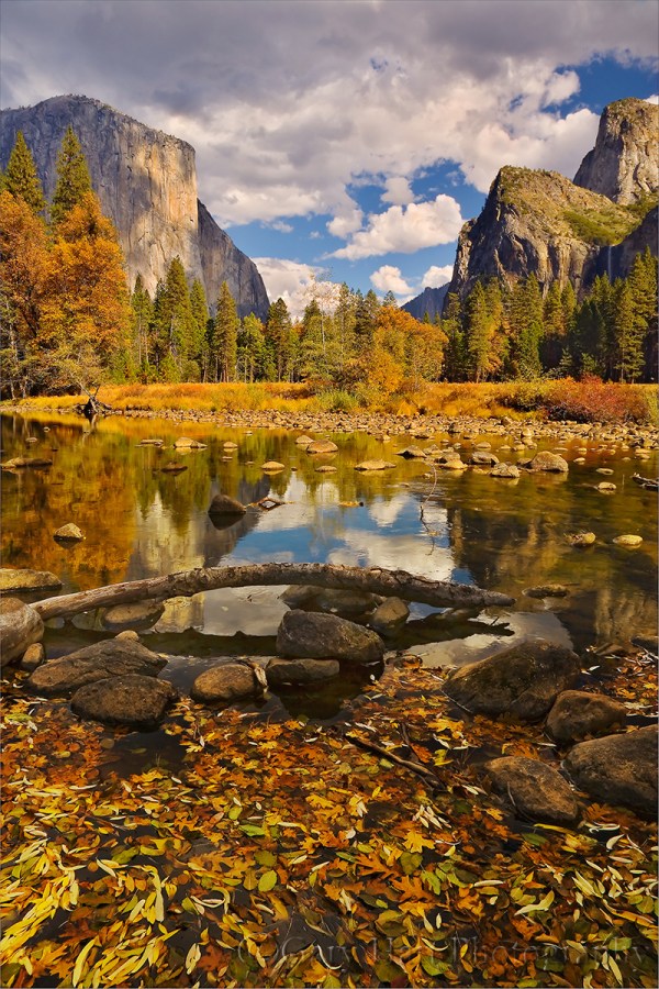
Floating Autumn Leaves, Valley View, Yosemite
Yosemite may not be New England, but it can still put on a pretty good fall color display. A few years ago I arrived at Valley View on the west side of Yosemite Valley just about the time the fall color was peaking. I found the Merced River filled with reflections of El Capitan and Cathedral Rocks, framed by an accumulation of recently fallen leaves still rich with vivid fall color.
To emphasize the colorful foreground, I dropped my tripod low and framed up a vertical composition. I knew my hyperfocal distance at 24mm and f/11 would be 5 or 6 feet, but with the scene ranging from the closest leaves at about 3 feet away out to El Capitan at infinity, I also knew I’d need to be careful with my focus choices. For a little more margin for error I stopped down to f/16, then focused on the nearest rocks which were a little less than 6 feet away. As I usually do when I don’t have a lot of focus wiggle room, I magnified the resulting image on my LCD and moved the view from the foreground to the background to verify front-to-back sharpness.
Workshop Schedule || Purchase Prints
Playing with Depth: A Gallery of Focus
Click an image for a closer look and slide show. Refresh the screen to reorder the display.


