Eloquent Images by Gary Hart
Insight, information, and inspiration for the inquisitive nature photographer
Macro in Spirit
Posted on March 31, 2019
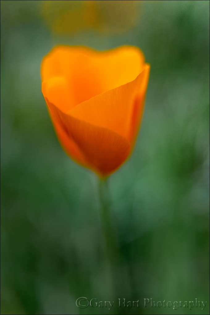
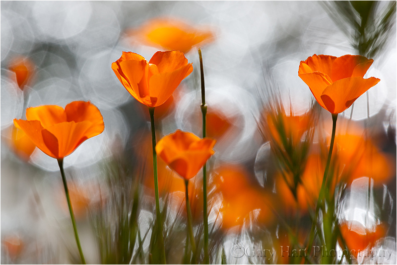
New Poppy, Merced River Canyon, California
It’s poppy season in California, and this is turning out to be a banner year. I’ve already enjoyed one nice poppy shoot, but things are just getting started in Northern California so I hope there are more to come.
When I photograph poppies, I don’t always use my macro lens. Even though my objective is similar to what I’d accomplish with a macro lens—a close view that excludes or blurs surrounding distractions—I often like to experiment with the creative flexibility other lenses provide. This also means that many of my so-called macro images technically aren’t macro at all.
What is macro photography?
The generally accepted definition of a macro image is an image in which the subject is at least as large on the sensor as it is in reality. When we photograph an expansive landscape with a full frame camera, we’re cramming the entire scene onto a 24mm x 36mm (864 mm2) rectangle (“cropped” sensors have even less real estate to work with, while medium format sensors have more). But imagine your landscape includes a single flower, and you want to get a closer look. As you zoom your lens tighter on the flower, or position yourself closer, the amount of the scene you capture shrinks, while everything remaining in the frame expands. Pretty soon the flower occupies most of the frame. Your image doesn’t achieve macro status until the still visible area of the flower spans 864 mm2 or larger.
It’s important to note that many camera manufactures will label a lens’s (or a point-and-shoot camera’s) closest focus point “macro” when all they really mean is just plain “close focus.” Getting closer will make the flower bigger, but unless you can focus close enough to reach that 1:1 threshold, it’s not a true macro.
So, by the generally accepted definition, this close image of a recently sprouted poppy doesn’t qualify as “macro.” But in my mind it’s macro in spirit because I use an intimate perspective with a single point of focus, in this case to emphasize the poppy’s translucent petals and graceful curves. My goal in these pseudo-macro images is make viewers look closer than they normally would, and (I hope) to help viewers see the poppy as more than a pretty gold flower.
To achieve that for this image, I tried something a little different. Shooting this afternoon with my Sony a7RIII, I started with my Sony 100-400 lens to allow a little working distance from the various poppies I targeted, then switched to my Sony 90mm macro to move closer to my subjects. When I wanted to get closer still, I brought out my extension tubes and switched back and forth between these two lenses. But the more time I spent out there, the closer I wanted to get.
Sprawling on the ground to work on this tiny new poppy, for something different I decided to try my 24-105 lens. At 24mm I was able to focus very close, but even wide open I had too much depth of field to properly blur the background, so I did what many say you’re not supposed to do: use extension tubes with a wide angle lens. With this arrangement the focus tolerance was microscopic, but when the poppy finally did snap into focus, my lens was so close they nearly touched.
I’m a tripod evangelist because in my approach to every scene, from macro to landscape, an image is not simply a click, it’s an incremental process: compose, expose, click, evaluate, refine, repeat until satisfied. Refining and repeating a standard landscape without a tripod is difficult enough; with macro and its minuscule tolerances, working without a tripod becomes nearly impossible.
For an image like this one, the tripod provides and another, less heralded advantage. This tiny flower was just a few inches above the ground, forcing me to sprawl in the weeds and awkwardly contort my body to avoid smashing the surrounding poppies. Holding this position as I refined my composition and waited for the breeze to pause was just plain uncomfortable, so every minute or two I had to stand to stretch and rest my cramped and fatigued muscles and joints. But each time I was ready to return to my subject, the composition I’d left was waiting patiently, right there in my viewfinder.
Because of the breeze, I bumped my ISO to 1600, which my a7RIII handles without even breathing hard. Freezing the poppy’s motion at 1/1000 of a second wasn’t hard, but because every time the wind moved the poppy, the focus point changed, I had to wait for the wind to die long enough for the poppy to return to the equilibrium position I’d focused on. The orange blobs you see in the background are more poppies, less than 8 inches away.
Read more about my approach to photographing wildflowers
Workshop Schedule || Purchase Prints
My Favorite Flower


Let There Be Light
Posted on March 27, 2019
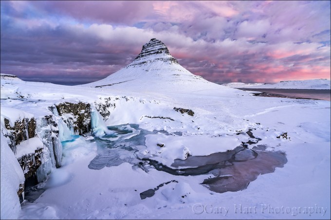
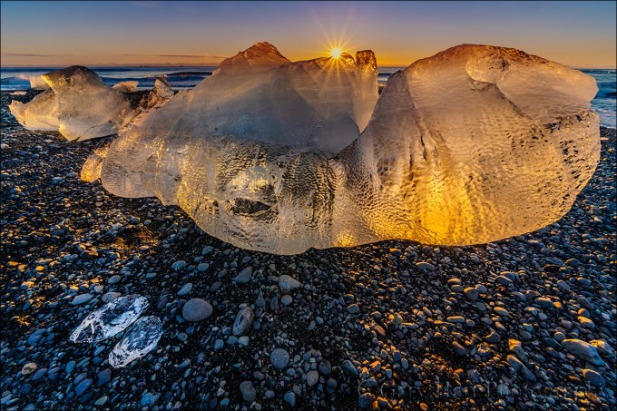
Frozen Sunrise, Kirkjufell, Iceland
Sony a7R III
Sony 16-35 f/2.8 GM
1 second
F/11
ISO 100
In January I made my first visit to Iceland in preparation for the winter workshop I’ll be doing there with Don Smith next January. And after a lifetime spent in the middle latitudes, one thing that was impossible to ignore was the quality of the winter light at 65º (-ish) latitude. Not only do sunrises and sunset last forever, but during our entire visit the sun never rose higher than 8º above the horizon. This got me thinking about light in general, and how we sometimes take it for granted. Or, if we don’t exactly take light for granted, how we often don’t take the time understand this thing that makes or breaks us. So I dusted off an article I wrote several years ago, updated the information there, and added some new images.
You’ll find the story of this Iceland sunrise toward the bottom, just above the gallery.
Photograph: “Photo” comes from phos, the Greek word for light; “graph” is from graphos, the Greek word for write. And that’s pretty much what photographers do: Write with light.
Good light, bad light
Because we have no control over the sun, nature photographers spend a lot of time hoping for “good” light and cursing “bad” light—despite the fact that there is no universal definition of “good” and “bad” light. Before embracing someone else’s good/bad light labels, let me offer that I (and most other serious photographers) could probably show you an image that defies any label you’ve heard. The best definition of good light is light that allows us to do what we want to do; bad light is light that prevents us from doing what we want to do.
Studio photographers’ complete control of the light that illuminates their subjects is a true art that allows them to create their own “good” light. Nature photographers, on the other hand, rely on sunlight and don’t have that control. But knowledge is power: The better we understand light—what it is, what it does, and why/how it does it—the better we can anticipate the light we seek, and deal with the light we encounter.
The qualities of light
Energy generated by the sun bathes Earth in continuous electromagnetic radiation, its wavelengths ranging from extremely short to extremely long (how’s that for specific?). Among the broad spectrum of electromagnetic solar energy we receive are ultraviolet rays that burn our skin (10-400 nanometers), infrared waves that warm our atmosphere (700 nanometers to 1 millimeter), and the visible spectrum—the very narrow range of wavelengths between ultraviolet and infrared that the human eye sees, in the wavelength range between 400 and 700 nanometers.
When all visible wavelengths are present, we perceive the light as white (colorless). But when light interacts with an object, the object absorbs or scatters the light’s wavelengths. The amount and wavelengths of light that’s scattered or absorbed is determined by properties of the object. For example, when light strikes a tree, characteristics of the tree determine which of its wavelengths are absorbed, and the wavelengths not absorbed are scattered. Our eyes capture these scattered wavelengths and send that information to our brains, which translates it into a color.
When light strikes a mountain lake, some is absorbed by the water, allowing us to see the water. Some light bounces back to the atmosphere to create a reflection. The light that isn’t absorbed or reflected by the water light passes through to the lakebed and we see whatever is on the lake’s bottom.
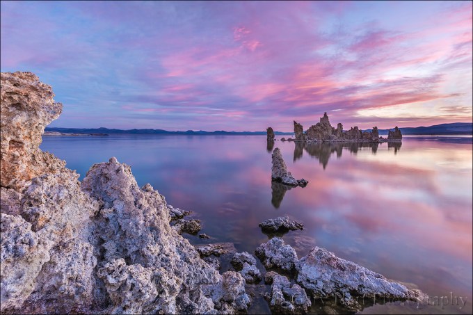
This vivid sunrise was reflected by the glassy surface of Mono Lake, but just enough light made it through to reveal the outline of submerged tufa fragments on the lake bed.
Let’s get specific
Rainbows
For evidence of light’s colors, look no farther than the rainbow. Because light slows when it passes through water, but shorter wavelengths slow more than longer wavelengths, water refracts (bends) light. A single beam of white light (light with an evenly distributed array of the entire visible spectrum) entering a raindrop separates and spreads into its component colors. When this separated light strikes the back of the raindrop, some of it reflects: A rainbow!

Under the Rainbow, Colorado River, Grand Canyon
Blue sky
When sunlight reaches Earth, the relatively small nitrogen and oxygen molecules that are most prevalent in our atmosphere scatter its shorter wavelengths (violet and blue) first, turning the sky overhead (the most direct path to our eyes) blue. The longer wavelengths (orange and red) don’t scatter as easily and travel through more atmosphere—while our midday sky is blue, these long wavelengths are coloring the sunset sky of someone to the east.
In the mountains sunlight has passed through even less atmosphere and the sky appears even more blue than it does at sea level. On the other hand, when relatively large pollution and dust molecules are present, all the wavelengths (colors) scatter, resulting in a murky, less colorful sky (picture what happens when your toddler mixes all the paints in her watercolor set).
Most photographers (myself included) find homogeneous blue sky boring. Additionally, when the sun is overhead, bright highlights and deep shadows create contrast that cameras struggle to handle.
Sunrise, sunset
Remember the blue light that scattered to color our midday sky? The longer orange and red wavelengths that didn’t scatter overhead, continued on. As the Earth rotates, eventually our location reaches the point where the sun is low and the sunlight that reaches us has had to fight its way through so much atmosphere that it’s been stripped of all blueness, leaving only its longest wavelengths to paint our sunrise/sunset sky shades of orange and red.
When I evaluate a scene for sunrise/sunset color potential, I look for an opening on the horizon for the sunlight to pass through, pristine air (such as the clean air immediately after a rain) that won’t muddy the color, and clouds overhead and opposite the sun, to catch the color.
Overcast and shade
Sunny days are generally no fun for nature photographers. In full sunlight, direct light mixed with dark shadows often forces nature photographers to choose between exposing for the highlights or the shadows (or to resort to multi-image blending). So when the sun is high, I generally hope for clouds or look for shade.
Clouds diffuse the omni-directional sunlight—instead of originating from a single point, overcast light is spread evenly across the sky, filling shadows and painting the entire landscape in diffuse light. Similarly, whether caused by a single tree or a towering mountain, all shadow light is indirect. While the entire scene may be darker, the contrast range in shade is easily handled by a camera.
Flat gray sky or deep shade may appear dull and boring, but it’s usually the best light for midday photography. When skies are overcast, I can photograph all day—rather than seeking sweeping landscapes, in this light I tend to look for more intimate scenes that don’t include the sky. And when the midday sun shines bright, I try to find subjects in full shade. Overcast and shade is also the best light for blurring water.
Another option for midday light is high-key photography that uses the overexposed sky as a brilliant background. Putting a backlit subject against the bright sky, I simply meter on my subject and blow out the sky.
Leveraging light
Whether I’m traveling to a photo shoot, or looking for something near home, my decisions are always based on getting myself there when the conditions are best. For example, in Yosemite I generally prefer sunset because that’s when Yosemite Valley’s most photogenic features get late, warm light; Mt. Whitney, on the other side of the Sierra, gets its best light at sunrise; and I’ll only the lush redwood forests along the California coast in rain or fog.
Though I plan obsessively to get myself in the right place at the right time, sometimes Nature throws a curve, just to remind me (it seems) not to get so locked in on my subject and the general tendencies of its light that I fail to recognize the best light at that moment. If I drive to Yosemite for sunset light on Half Dome and am met with thick overcast, I don’t insist on photographing Half Dome. Instead, I detour some of my favorite deep forest spots, like Fern Spring or Bridalveil Creek.
Other times finding the best light is simply a matter of turning around and looking the other direction. Mono Lake is one of those places that reminds me to keep my head on a constant swivel, or risk getting so caught up on the sunrise in front of me that I miss the rainbow behind me.
About this image

Frozen Sunrise, Kirkjufell, Iceland
This view of Kirkjufell and Kirkjufellsfoss on Snæfellsnes Peninsula is the Tunnel View of Iceland—even though you’ve already seen a million pictures from this very location, every photographer who visits Iceland wants their own version. (Not that there’s anything wrong with that.)
Don Smith and I were here in January, scouting for our 2020 Iceland Winter Sights and Northern Lights photo workshop. Hiring a local guide to show us around, we gave him complete autonomy over our schedule (and even if we did know enough about Iceland to tell him what we wanted to see, we couldn’t have pronounced it anyway). We’d spent the prior day driving to the peninsula, dodging snowflakes, and helping dig stranded Canadians (who should know better!) out of roadside ditches. But the weather gods smiled on us this morning, and I would say that our first sunrise was a harbinger of good fortune ahead.
On this first morning I was still trying to wrap my head around a 10:30 a.m. sunrise (a brilliant idea that should be adapted worldwide) when we pulled up to Kirkjufellsfoss. (And just so we’re clear, the mountain is Kirkjufell, the waterfall is Kirkjufellsfoss.) I immediately recognized the scene, though in most of the images I’ve seen of Kirkjufellsfoss, the water was liquid and the surrounding landscape was green.
Snow and ice dominated this morning, which I thought was pretty cool because it gave us the opportunity to capture the scene at least somewhat differently from the way it’s typically done. The biggest problem I had to deal with was working around the dozen or so other photographers, and waiting for selfie-wielding tourists to vacate the scene (thank you Content Aware Fill).
Sometime during this sunrise show an Iceland sunrise fact that dawned on me (see what I did there) is how long twilight lasts at 65º latitude. I’m talking quality light that starts at least an hour before sunrise and just keeps going and going and going. When we finally packed up our gear, nearly an hour after sunrise, there was still color in the sky. We left not because the shooting was poor, but because we had other sights to see. In fact, the pink you see here lasted so long, I pretty much ran out of ways to photograph it. I guess another way of putting this would be that an Iceland sunrise is over faster than you can say Kirkjufellsfoss on Snæfellsnes Peninsula. (But of course, so was the Mueller investigation.)
Light at its finest
Click an image for a closer look, and to view a slide show


Yosemite in a Raindrop
Posted on March 24, 2019
Yosemite in a Raindrop, Valley View, Yosemite
Sony a7RIII
Sony 100-400 GM
15mm extension tube
ISO 3200
f/20
1/200 second
I’ve been to Valley View in Yosemite about a million times. For those not familiar with Yosemite Valley, Valley View (sometimes called Gates of the Valley) is the classic view of El Capitan, Cathedral Rocks, and Bridalveil Fall, with the Merced River in the foreground, that represents Yosemite in countless calendars, postcards, and advertisements. Though all this attention is justified, after a million visits and counting (okay, so maybe I’m exaggerating just a little), you’d think it would be easy to take Valley View’s beauty for granted. But I don’t get tired of visiting here, not ever.

Valley View, Yosemite
Like most spots in Yosemite, the scene at Valley View varies greatly with the season and weather. In spring, Bridalveil Fall explodes from beneath Cathedral Rocks, and the surrounding forest is dotted with blooming dogwood. In autumn, rocks dot the Merced River, and colorful leaves mingle with glassy reflections. And on still winter mornings, a low mist hugs Bridalveil Meadow just across the river, while churning clouds surrounding El Capitan after a storm are a sight to behold. Nevertheless, I’m often content to keep my camera in the bag and just privately appreciate Valley View’s majesty.
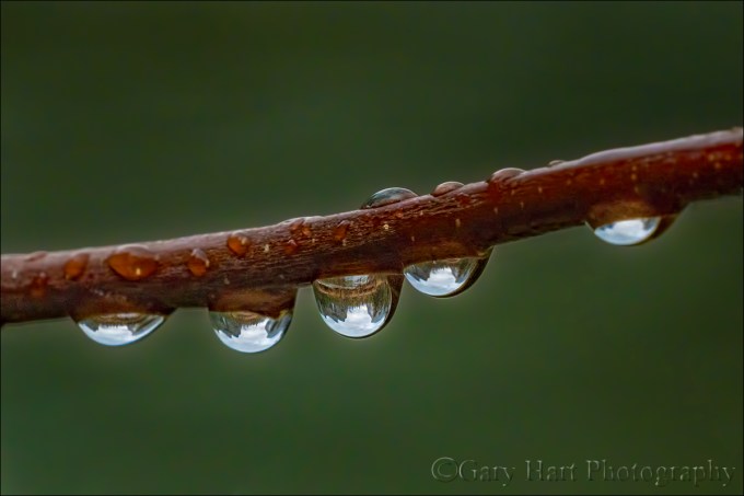
But I’m a photographer, and sometimes it’s hard to experience this beauty passively. On those visits when I’m moved to photograph Valley View, I challenge myself to find something that hasn’t been done a million times. The final morning of last week’s Yosemite Moonbow and Wildflowers photo workshop was gray and damp, with occasional sprinkles lingering from a heavier overnight rain. We’d been here earlier in the workshop (in different conditions), and I hadn’t planned to photograph this time, but spotting raindrops clinging to the branches of the shrubs that line the river, I recognized a unique opportunity.
If you know optics, you know that a convex shape bends outward (so water striking its surface would run off; water striking a concave surface would pool inside). Due to this curvature, photons passing through a convex lens are diverted toward the center, where they converge and cross to create an inverted image at the point of convergence (focal point).
In fact, the human eye is a convex lens, projecting its inverted image onto the back its sphere, an image your brain promptly reverses. And photographic lenses are a complex arrangement of convex lens elements that ultimately project onto your camera’s sensor an upside-down image that’s flipped for display by the camera’s firmware.
Compared to these two examples, a dangling raindrop is elegant simplicity. Bound by surface tension, water molecules naturally form a spherical shape that is flattened or stretched slightly by gravity. Because water molecules form an electrostatic bond with foreign surfaces as well, they also adhere to things like leaves and branches, sometimes appearing to defy gravity. This small gift from nature turns a raindrop into a natural convex lens. Courtesy of this natural lens, those who peer closely into a water drop will see an inverted microcosm of the surrounding world, a view that changes with the viewing angle.
There’s potential beauty inside every water drop, but on this morning at Valley View I was in the fortuitous position to photograph raindrops holding one of the most beautiful scenes on Earth. I found a quintet of raindrops lining a branch that had nothing behind it but river. Tiptoeing close, I aligned myself and the raindrops with the Valley View scene and extended my tripod to branch level. I started with my Sony 90mm on my Sony a7RIII, adding extension tubes to get even closer. After working with this combination for a few minutes, I switched to my Sony 100-400 GM (still with extension tubes).
The image you see here is from the 100-400. Depth of field with such a close focus point is paper thin, so I stopped down to f/20 and bumped I my ISO to 3200 to ensure a shutter speed fast enough to minimize the risk of motion blur. To focus, I magnified the raindrop scene in my mirrorless viewfinder. Exposing to avoid blowing out the bright highlights in the (inverted) sky also darkened the river, creating the ideal background.
Join my 2020 Yosemite Moonbow and Wildflowers photo workshop
Workshop Schedule || Purchase Prints
The Many Views of Valley View


Creative Selective Focus (revisited)
Posted on March 16, 2019

Champagne Glass Poppies, Merced River Canyon, California
Canon 10D
Canon 100mm f2.8 macro
f/2.8
Kenko 20mm extension tube
ISO 100
1/1000 second
After a winter that didn’t seem like it would ever end, spring has finally arrived in California. With poppies springing up throughout the state, and the dogwood bloom right around the corner, this seemed like a good time to update my Creative Selective Focus article.
In this day of ubiquitous cameras, automatic exposure modes, free information, and powerful processing tools, taking a good picture has never been easier. But capturing a great photo, an image with enough uniqueness to stand out from the rapidly expanding crowd, seems to be getting harder and harder.
It seems that some photographers have decided to attack this problem by risking life and limb to chase increasingly exotic subjects. This is great for those with the time, money, and physical ability to allow it, but there are other opportunities closer to home.
One of photography’s most accessible and underutilized paths to unique images is creative depth control. Anyone with a camera can compose the two-dimensional, left/right/up/down aspect of a scene. But in a photograph, the front/back plane—the scene’s depth that we human’s take for granted—is missing. Conveying this missing depth requires abstract vision and camera control beyond the ability of most casual photographers.
While skilled photographers frequently go to great lengths to maximize front to back sharpness—depth of field (DOF)—many ignore the ability of limited DOF to:
- Guide the viewer’s eye to a particular subject
- Provide the primary subject a complementary background that doesn’t compete
- Provide background context for a subject (such as its location, time of day, or season)
- Smooth or eliminate a busy and distracting background
- Create an image that no one will ever be able to duplicate
They call it “bokeh”
We call an image’s out of focus background its “bokeh.” While it’s true that bokeh generally improves with the quality of the lens, as with most things in photography, at least as important than the lens is the photographer behind it. More than anything, achieving compelling bokeh starts with understanding how your camera sees the world, and how to translate that vision to your photos. The image’s focus point, its depth of field (a function of the sensor size, f-stop, focal length, and focus distance), and the characteristics of the blurred background (color, shapes, lines) are all under the photographer’s control.
No special equipment required
Compelling bokeh doesn’t require special or expensive equipment—chances are you have everything you need in your bag already. Most macro lenses are fast enough (large aperture) to limit DOF, have excellent optics that provide pleasing bokeh, and allow for extremely close focus (which shrinks DOF). And a telephoto lens near its longest focal length has a very shallow DOF when focused close.
Many of my selective focus images are accomplished without a macro or even a particularly fast lens. Instead, preferring the compositional flexibility of a zoom, I opt for my 70-200 and 100-400 lenses.
Extension tubes
One piece of equipment that will allow you to shrink your DOF without breaking the bank is an extension tube. An extension tubes is an empty (no optics) cylinder that attaches between the camera and lens to shift the focus range closer to the camera: with an extension tube you can focus closer, but you can no longer focus to infinity. Most extension tubes pass communication between the camera and lens so you can still meter and autofocus.
Not only are extension tubes relatively inexpensive, depending on the lens, they enable you to focus as close or closer than you could have with a macro lens. Extension tubes can also be stacked—the more extension, the closer you can focus (and the shallower your DOF). And because extension tubes have no optics, there’s no glass to compromise the quality of the lens (unlike a teleconverter or diopter).
But there’s no such thing as a free lunch in photography—the downside of extension tubes is that they reduce the amount of amount light reaching the sensor: the more extension, the less light. Fortunately, given the high ISO capability of today’s cameras, you can usually recover this lost light by simply bumping your ISO.
Managing depth of field
The amount of softness you choose falls somewhere on a continuum that starts with an indistinguishable blur of color that includes unrecognizable shapes, and ends with soft but easily recognizable objects. When using creative soft focus, I usually go for a background that’s soft enough that it doesn’t simply look like a focus error or compete with my subject. In other words, I usually (but not always) want my background really soft.
Your DOF will be shallower (and your background softer):
- The closer your focus point
- The longer your focal length
- The larger your aperture (small f-stop number)
A macro lens and/or extension tube is the best way to get extremely close to your subject, to create the absolute shallowest DOF. But sometimes you don’t want to be, or can’t get, that close. Or maybe you want just enough DOF to reveal a little (but still soft) background detail. In this case, a telephoto zoom lens may be your best bet. And even at the closest focus distances, the f-stop you choose will make a difference in the range of sharpness and the quality of your background blur. All of these choices are somewhat interchangeable and overlapping—you’ll often need to try a variety of focus-point/focal-length/f-stop combinations to achieve your desired effect. Experiment!
Foreground/background
Composing a shallow DOF image usually starts with finding a foreground subject on which to focus, then positioning yourself in a way that places your subject against a complementary background. Or you can do this in reverse, starting with a background you think would look great out of focus, then finding a foreground subject that would look good against that background.
Primary subjects can be whatever moves you: a single flower, a group of flowers, colorful leaves, textured bark, a clinging water drop—the sky’s the limit. A backlit leaf or flower can radiate with a glow that appears to originate from within, creating the illusion it has its own source of illumination—even in shade or overcast, most of a scene’s light comes from the sky and your subject will indeed have a backlit side. And an extremely close focus on a water droplet will reveal a world that’s normally invisible to the unaided eye—both the world within the drop, and a mini-reflection of the surrounding world.
My favorite backgrounds include things like parallel tree trunks, splashes of lit leaves and flowers in a mostly shaded forest, flowers that blur to color and soft shapes, pinpoint jewels of daylight shining through the trees, sunlight sparkling on water. I also like including soft but recognizable landscape features that reveal the location—nothing says Yosemite like a waterfall or Half Dome; nothing says the ocean like crashing surf.
Focus point
The final piece of the composition puzzle is your focus point. This creative decision can make or break an image because the point of maximum sharpness is where your viewer’s eyes will land. In one case you might want to emphasize a leaf’s serrated edge, in another its intricate vein pattern. Or maybe you’ll need to decide between the pollen clinging to a poppy’s stamen, or the sensual curve of the poppy’s petals. When I can’t decide, I take multiple frames with different focus points.
Exposure
Exposing selective focus scenes is primarily a matter of spot-metering on the brightest element, almost always the primary subject, and dialing in an exposure that ensures that it won’t be blown out. Often this approach turns shaded areas quite dark, making your primary subject stand out more if you can align the two. Sometimes I’ll underexpose my subject slightly to saturate its color and further darken the background.
Tripod
And let’s not overlook the importance of a good tripod. In general, the narrower the area of sharpness in an image, the smaller the focus point margin of error. Even the unavoidable micro-millimeter shifts possible with hand-holding can make the difference between a brilliant success and an absolute failure, making a tripod essential.
Virtually all of my blurred background images are achieved in incremental steps. They start with a general concept that includes a subject and background, and evolve in repeating click, evaluate, refine, click, … cycles. In this approach, the only way to ensure consistent evolution from original concept to finished product is a tripod, which holds in place the scene I just clicked and am now evaluating—when I decide what my image needs, I have the scene sitting there atop my tripod, just waiting for my adjustments.

Forest Dogwood, Yosemite Valley
I worked this scene for about a half hour before I was satisfied. I started with this dogwood branch and moved around a bit until the background was right. Then I tried a variety of focal lengths to simplify and balance the composition. Once I was satisfied with my composition, I used live-view to focus toward the front of the center cluster. Finally, I ran the entire range of f-stops from f4 to f16, in one-stop increments, to ensure a variety of bokeh effects to choose from.

Bridalveil Dogwood, Yosemite
This raindrop-laden dogwood image uses Yosemite’s Bridalveil Fall as a soft background to establish the location. An extension tube allowed me to focus so close that the nearest petal brushed my lens.

Poppy With a View, Point Reyes National Seashore
My goal this gray spring afternoon was to juxtapose a poppy against the distant surf, a relationship made possible by sprawling on Point Reyes’ Chimney Rock’s precipitous edge. Once I found the right poppy, I dropped to the ground to frame the flower with the arcing coastline, experimenting with several apertures before finding the ideal balance of foreground sharpness and background softness.

Champagne Glass Poppies, Merced River Canyon, California
The background color you see here is simply a hillside covered with poppies. To achieve this extremely limited DOF, I used an extension tube on my 100mm macro, lying flat on the ground as close as my lens would allow me to focus. Since my tripod (at the time) wouldn’t go that low, I detached my camera, rested the tripod on the ground in front of the poppy, propped my lens on a leg, composed, focused on the leading edge, and clicked my remote release.

Autumn Light, Yosemite
I had a lot of fun playing with the sunlight sneaking through the dense evergreen canopy here, experimenting with different f-stops to get the effect I liked best.
Sparkling Poppies, Merced River Canyon
The background jewels of light are sunlight reflecting on the rippling surface of a creek. I had a blast controlling their size by varying my f-stop.

Hidden Leaf, Mt. Hood, Oregon
Here, rather than background bokeh, I framed this leaf with leaves in front of my focus point.

Dogwood, Merced River, Yosemite
Looking down from the Pohono Bridge, finding the composition was the simple part. But as soon as I started clicking I realized that the sparkling surface of the rapidly Merced River was completely different with each frame. So I just clicked and clicked and clicked until I had over 30 frames to choose between.
Bokeh Gallery
Click an image for a closer look and slide show. Refresh the window to reorder the display.


Expose yourself
Posted on March 10, 2019
Glisten, Diamond Beach, Iceland
Sony a7R III
Sony 12-24 f/4 G
1/25 second
F/18
ISO 100
With advanced exposure and metering capabilities, cameras seem to be getting “smarter” every year. So smart, in fact, that for most scenes, getting the exposure right is a simple matter of pointing your camera and clicking the shutter button. That’s fine if all you care about is recording a memory, but not only is there more to your exposure decision than getting the amount of light in your picture, there are many reasons to over- or underexpose a pictures. For the creative control that elevates your images above the millions of clicks being cranked out every day, giving control of one of its most important responsibilities to your camera overlooks an undeniable truth…
Your camera is stupid
Sorry—so is mine. And while I can easily cite many examples, right now it’s just important that you understand that your camera thinks the entire world is a middle tone. Regardless of what its meter sees, without intervention your camera will do everything in its power to make your picture a middle tone. Sunlit snowman? Lump of coal at the bottom of your Christmas stocking? It doesn’t matter—if you let your camera decide the exposure, it will turn out gray.
Modern technology offers faux-intelligence to help overcome this limitation. Usually called something like “matrix” or “evaluative” metering, this solution compares a scene to a large but finite internal database of choices, returning a metering decision based on the closest match. It works pretty well for conventional, “tourist” snaps, but often struggles in the warm or dramatic light artistic photographers prefer, and knows nothing of creativity. If you want to capture more than documentary “I was here” pictures, you’re much better off taking full control of your camera’s metering and exposure. Fortunately, this isn’t nearly as difficult as most people fear.
Laying the foundation
The amount of light captured for any given scene varies with the camera’s shutter speed, f-stop, and ISO settings. Photographers measure captured light in “stops,” much as a a cook uses a cup (of sugar or flour or almonds or whatever) to measure ingredients in a recipe. Adding or subtracting “stops” of light by increasing or decreasing the shutter speed, f-stop, or ISO makes a scene brighter or darker.
The beauty of metering is that a stop of light is a stop of light is a stop of light, whether you control it with the:
- Aperture: The opening light passes through when the shutter opens, measured in f-stops
- Shutter speed: The time the shutter is open, allowing light to pass through the aperture to reach the sensor—slower shutter speeds mean more light; faster shutter speeds mean less light
- ISO: The sensitivity of the sensor (or film) to light
But while an aperture stop adds/subtracts the same amount of light as a shutter speed or ISO stop, the resulting picture can vary significantly based on which exposure variable combination you choose. Your shutter speed choice determines whether motion in the frame is blurred or frozen, while the aperture choice determines the picture’s depth of field. And while an ISO stop also adds/subtracts the same amount of light as shutter speed and aperture without affecting motion and depth, image quality decreases as the ISO increases. So getting the light right is only part of the exposure objective—you also need to consider how you want to handle any motion in the scene, and how much depth of field to capture.
For example, let’s say you’re photographing autumn leaves in a light breeze. You got the exposure right, but the leaves are blurred. To freeze that blur, you halve the time the shutter is open (faster shutter speed) to freeze the motion, but also reducing the light reaching the sensor by one stop. To replace that lost light, you could open your aperture by a stop (change the f-stop), double the ISO, or make a combination of fractional f-stop and ISO adjustments that total one stop. That’s a creative choice your camera isn’t capable of.
Metering modes
Today’s cameras have the ability to measure, or “meter” the light in a scene before the shutter clicks. In fact, most cameras have many different ways of evaluating a scene’s light. Your camera’s metering mode determines the amount of the frame the meter “sees.” The larger the area your meter measures, the greater the potential for a wide range of tones. Since most scenes have a range of tones from dark shadows to bright highlights, the meter will take an average of the tones it finds in its metering zone.
Metering mode options range from “spot” metering a very small part of the scene, to “matrix” (also know as “evaluative”), which looks at the entire scene and actually tries to guess at what it sees. Each camera manufacturer offers a variety of modes and there’s no consensus on name and function (different function for the same name, same function for different names) among manufacturers, so it’s best to read your camera’s manual to familiarize yourself with its metering modes.
Since I want as much control as possible, I prefer spot metering because it’s the most precise, covering the smallest area of the frame possible, an imaginary circle in the center three (or so) percent (depending on the camera) of what’s visible in the viewfinder. Spot metering, I can target the part of the frame I deem most important and base my exposure decision on the reading there.
Spot metering isn’t available in all cameras. In some cameras, the most precise (smallest metering area) metering mode available is “partial,” which covers a little more of the scene, somewhere around ten percent.
Exposure modes
Don’t confuse the metering mode with the exposure mode. While the metering mode determines what the meter sees, the exposure mode determines the way the camera handles that information. Most DSLR (digital single lens reflex) and mirrorless cameras offer manual, aperture priority, shutter priority, and a variety of program or automatic exposure modes. Serious landscape photographers usually forego the full automatic/program modes in favor of manual (my preference) or aperture/shutter priority modes that offer more control.
If you select aperture or shutter priority mode, you specify the aperture (f-stop) or shutter speed, and the camera sets the shutter speed or aperture that delivers a middle tone based on what the meter sees. But you’re not done. Unless you really do want the middle tone result the camera desires (possible but far from certain), you then need to adjust the exposure compensation (usually a button with a +/- symbol) to specify the amount you want your subject to be above or below a middle tone.
For example, if you point your spot meter at a bright, sunlit cloud, the camera will only give your picture enough light make the cloud a middle tone—but if you’ve only given your scene enough light to make a white cloud gray, it stands to reason that the rest of your picture will be too dark. To avoid this, you would adjust exposure compensation to instruct your camera to make the cloud brighter than a middle tone by adding two stops of light (or however much light you want to give the cloud to make it whatever tone you think it should be).
Rather than aperture priority, I prefer manual mode because I never want my camera making decisions for me. And once it’s mastered (a simple task), I think manual metering is easier. In manual mode, after setting my aperture (based on the depth of field I want), I point my spot-meter zone (the center 3% of the scene in my viewfinder) at the area I want to meter on and dial in whatever shutter speed gives me the amount of light I think will make that subject (where my meter points) the tone I want. That’s it. (In manual mode you can ignore the exposure compensation button.)
Trust your histogram
I see many people people base exposure decisions on the brightness of the image on the LCD. The typical approach is some variation of: 1) Guess at the exposure settings 2) Click 3) Look at the picture on the LCD 4) Adjust 5) Repeat. Not only is this approach lazy, it’s a waste of time and woefully inaccurate.
I call it lazy because these photographers (but of course I don’t mean you) don’t care enough about their craft to apply a skill that only takes minutes to learn (see above), a skill that will serve them best in the most difficult exposure situations. But that’s not the real problem—the real problem is the inaccuracy introduced by trusting the image on your LCD.
LCDs vary in brightness because viewing conditions change. With a brightness adjustment in every camera’s menu, many photographers simply turn their brightness to maximum because it’s easier to see, especially in sunlight, and a bright picture usually looks better. Other photographers use an auto-brightness setting that adjusts with ambient light—the more light it detects, the brighter the display.
Regardless of your LCD’s brightness setting, the variation in brightness of the screen and/or the ambient light make the image on the LCD a very unreliable exposure indicator. When people tell me their images are usually too dark on their computer or in prints, the first thing I do is check the brightness of their camera’s LCD—if it’s set to maximum, they’re likely fooled into thinking the exposure was brighter than it actually was.
How do you fix this? Simple: Learn to read a histogram, and never use your camera’s LCD for exposure decisions again. The histogram is as simple as it is useful.

Day’s End, Ke’e Beach, Hawaii

A histogram is a plot of the tones in an image. I’ll save a more complex explanation for another day, but all you really need to know is that the graph starts with black on the left and brightens to white on the right. Every pixel in the image is sampled for its brightness—the brighter it is, the farther to the right it falls on the histogram. Anything in the image that’s too dark to display detail (black) is “clipped” (cut off) on the left side; anything in the image that’s too bright too display detail is clipped on the right. Ideally, nothing will be clipped on either side. If your scene contains a greater range of light (dynamic range) than will fit in the histogram, one side or the other will clip and you have exposure decisions too make—HDR (blending multiple exposures), graduated neutral density filters, or deciding that it’s okay to lose one side or the other (shadows or highlights). For example, the Ke’e Beach image above is predominantly middle tones, with just a few extremely bright and extremely dark pixels.
One more time
So let’s review. Start by selecting your metering mode (the way your meters”sees” the scene: spot, partial, matrix, and so on), then take your camera out of auto exposure mode and put it in manual (my recommendation) or aperture priority (if you prefer) mode. (Remember, I’m a landscape photographer so I never use shutter priority; if you’re shooting action, to better control the motion in your frame, you probably want to consider shutter priority if you don’t like manual exposure.)
Before metering, set your camera to whatever aperture you decide your composition calls for. Then meter, remembering that your camera isn’t telling you what the exposure should be, it’s telling you the exposure that will make what it sees a middle tone. Finally, correct the meter’s middle-tone bias by dialing in the shutter speed (in manual mode) or exposure compensation (in aperture priority) that gives the correct exposure.
After you click, check your histogram to be sure you got the exposure right.
What’s the correct exposure? That’s a creative choice that’s entirely up to you—feel free to play until you’re comfortable with your results. And the more you do it, the easier it gets.
For example
Below are some sample images and the thought process I followed to get the exposure.

Winter Reflection, El Capitan, Yosemite After choosing the aperture that gave me the depth of field I wanted, I spot-metered on the sunlit portion of El Capitan’s reflect (because it was the brightest thing in my frame and dialed my shutter speed until the meter indicated +2. That setting gave me enough light to resolve details in the shadows, but not so much light that the El Capitan highlights were blown out. If I’d have followed my meter’s “suggestion” to make El Capitan’s highlights a middle tone, the entire scene would have been too dark.

Here’s one matrix/evaluative metering would have made a mess of. The dynamic range (range of light between the darkest shadows and brightest highlights) was off the charts. Rather than compromise, I exposed to hold the color in the sky and let the foreground go to silhouette. I metered on the brightest (goldish) part of the sky next to Half Dome and dialed my exposure to +.3 (1/3 stop above middle tone). The sky was brighter than what you see here, but underexposing like this allowed me to emphasize the sky’s rich blue and the very Yosemite outline of Half Dome and Sentinel Dome. The highlights in the thin lunar crescent were clipped, but I didn’t care about the moon’s detail, only it’s shape.

Who says you should never blow your highlights? Here I metered on the brightest part of the poppy (near the top), setting my exposure to .7 (2/3 stop above middle tone). Everything you see that’s white is blown blue sky (except the “star,” which is a sliver of the sun).
Now get to work
Don’t wait to apply all this for the first time until you really, really want the shot. Instead, find a time when the results don’t matter and play with your camera to find out how much control you have over exposure. In fact, you can do this right now in your backyard or even sitting right there in your recliner. Meter something nearby, set an exposure, and click. Look at the result, adjust the exposure, and click again. Watch your histogram, and watch how its shape shifts right as you increase the exposure, or left as you decrease it. Continue doing this until you’re confident in your ability to make a scene brighter or darker, and can consistently achieve the exposure you expect.
About this image

Glisten, Diamond Beach, Iceland
It not too difficult to figure out how Iceland’s Diamond Beach got its name. A black sand beach on Iceland’s south coast, just down stream from Glacier Lagoon, Diamond Beach is dotted with glistening blocks of ice ranging in size from a refrigerator ice cube, to an entire refrigerator.
As spectacular as Diamond Beach was on my first visit, it was also unlike anything I’d ever seen, so it took me a little while to figure out how I wanted to shoot it. I tried a few frames that used long shutter speeds to blur the motion of the waves around the ice, but when the sun appeared, I saw another opportunity.
With my Sony 12-24 G lens on my Sony a7RIII, I set up just a couple of feet from one of the larger icebergs, went all the way out to 12mm, and waited for the sun to peek above the ice, hoping to capture a sunstar. As I waited, I tweaked my exposure settings, dialing my aperture to f/18 to maximize my depth of field and to enhance the sunstar effect. When the sun appeared I was in business; as it rose, I dropped my camera lower to keep just a small sliver of sun visible above the ice.
Any frame that includes the sun is frame with lots of dynamic range. To get my exposure right for this image, I relied entirely on the histogram and ignored the image on the LCD, with its nearly black shadows and white sky. Despite the way histogram told me I’d captured all the tones, and I confirmed that as soon as I started processing in Lightroom.
Workshop Schedule || Purchase Prints
Taking Control in Difficult Light
Click an image for a closer look, and a slide show.


Get Out of the Way
Posted on March 3, 2019
(And Let the Scene Speak for Itself)
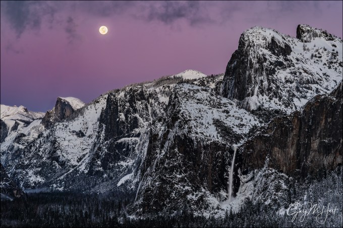
Nightfall, Full Moon and Yosemite Valley, Yosemite
Sony a7R III
Sony 24-105 f/4 G
1/6 second
F/10
ISO 100
As aggressively as I seek creative ways to express nature with my camera, and as important as I think that is, sometimes a scene is so beautiful that it’s best to just get out of the way and let the scene speak for itself. I had one of those experiences last month at Tunnel View in Yosemite.
There’s a reason Tunnel View is one of the most photographed vistas in the world: El Capitan, Half Dome, Cathedral Rocks, Bridalveil Fall—each would be a landscape icon by itself; put them all together in one view and, well…. But the view this evening was truly transcendent, even by Yosemite standards. In Yosemite Valley below, trees and granite still glazed with the snowy vestiges of a departing storm seemed to throb with their own luminance. And above Half Dome a full moon rose through a sky that had been cleansed of all impurities by the departing storm, an otherworldly canvas of indigo, violet, and magenta.
On these crystal-clear, winter-twilight moonrises, the beauty rises with the moon, reaching a crescendo about 20 minutes after sunset, after which the color quickly fades and the landscape darkens. Unfortunately, a some point before the crescendo, the dynamic range becomes so extreme that no camera (not even the dynamic range monster Sony a7RIII) can simultaneously extract usable detail from a daylight-bright moon and dark landscape.
I’d driven to Yosemite solely to photograph this moonrise, an eight hour roundtrip for 40-minutes of photography. Starting with the moon’s arrival about 20 minutes before sunset, I’d juggled three camera bodies and two tripods, first shooting ultra long, then gradually widening to include more of the snowy landscape. Already my captures had more than justified the time and miles the trip would cost me, but watching the moon traverse the deepening hues of Earth’s shadow, I wasn’t ready to stop.
I’ve learned that with a scene this spectacular, conveying the majesty doesn’t require me to pursue the ideal foreground, or do creative things with motion, light, or depth of field. In fact, I’ve come to realize that sometimes a scene can be so beautiful that creative interpretations can dilute or distract from the very beauty that moves me. On this evening in particular, I didn’t want to inject myself into that breathtaking moment, I just wanted to share it.
To simply my images, I opted for a series of frames that used tried-and-true compositions that I’d accumulated after years (decades) of photographing here, the compositions I suggest as “starters” for people who are new to Yosemite, or use myself to jump-start my inspiration: relatively tight horizontal and vertical frames of El Capitan, Half Dome, Bridalveil Fall; El Capitan and Half Dome; or Half Dome and Bridalveil Fall. In the image I share above I concentrated on Half Dome and Bridalveil Fall, capping my frame with the wispy fringes of a large cloud that hovered above Yosemite Valley.
Simplifying my compositions had the added benefit of freeing all of my (limited) brain cells to concentrate on the very difficult exposure. The margin for error when photographing a moon this far after sunset is minuscule—if you don’t get the exposure just right, there’s no fixing it in Photoshop later: too dark and there’s too much noise in the shadows; too bright and lunar detail is permanently erased. The problem starts with the understandable inclination to expose the scene to make the landscape look good on the LCD, pretty much guaranteeing that the moon will be toast. Compounding this problem is the histogram, which most of us have justifiably come to trust as the final arbiter for all exposures. But when a twilight moon (bright moon, dark sky) is involved, even the histogram will fail you because the moon is such a small part of the scene, it barely (if at all) registers on the histogram.
Rather than the histogram, for these dark sky moon images I monitor my LCD’s highlight alert (“blinking highlights”), which is usually the only way to to tell that the moon has been overexposed. If the moon is flashing, I know I’ve given the scene too much light and need to back off until the flashing stops—no matter how dark the foreground looks. This is where it’s essential to know your camera, and how far you can push its exposure beyond where the histogram and highlight alert warn you that you’ve gone too far.
When I’m photographing a full moon rising into a darkening sky, I push the exposure to the point where my highlight alert just starts blinking (only the brightest parts of the moon, not the entire disk, are flashing), then I give it just a little more exposure. I know my Sony a7RIII well enough to know that I can still give it a full stop of light beyond this initial flash point and still recover the highlights later. The shadows? In a scene like this they’ll look nearly black, a reality my histogram will confirm, but I never cease to be amazed by how much detail I can pull out of my a7RIII’s shadows in Lightroom and Photoshop.
I continued shooting for several minutes after this frame, and discovered later that even my final capture contained usable highlights and shadows. I chose this image, captured nearly five minutes before I quit, because it contained the best combination of color, lunar detail, and clean (relatively noise-free) Yosemite Valley.
Photograph the full moon above Half Dome with me this December
Workshop Schedule || Purchase Prints
Letting Nature Speak for Itself
Click an image for a closer look, and a slide show


